Introduction


Relm4 is an idiomatic GUI library inspired by Elm and based on gtk4-rs. It is a new version of relm that’s built from scratch and is compatible with GTK4 and libadwaita.
Why Relm4
We believe that GUI development should be easy, productive and delightful.
The gtk4-rs crate already provides everything you need to write modern, beautiful and cross-platform applications.
Built on top of this foundation, Relm4 makes developing more idiomatic, simpler and faster and enables you to become productive in just a few hours.
Requirements
To work with Relm4, you should understand most basic language features of the Rust programming language. We recommend to at least be familiar with the content of the chapters 1, 3-6, 8, 10 and 13 of the Rust book.
I also recommend reading the gtk4-rs book for getting more insight into development with gtk4-rs. Yet, knowledge of GTK4 or gtk4-rs is not required in this book.
Helpful links:
Cargo:
Add the packages you need to your Cargo.toml:
relm4 = "0.9.1"
relm4-components = "0.9.1"
Issues and feedback
If you find a mistake or something unclear in Relm4 or this book, let us know! Simply open up an issue or start a discussion over at GitHub or chat with us on Matrix.
Platform support
All platforms supported by GTK4 are available for Relm4 as well:
- Linux
- Windows
- macOS
Examples
If you prefer learning directly from examples, we got you covered!
Many code examples in this book and many other examples can also be found in the git-repository. Whenever an example is discussed in the book, the introduction will mention the name of the example and provide a link to it.
To setup the examples run
git clone https://github.com/Relm4/Relm4.git
And to run an example, simply type
cargo run --example NAME
To get a list of all examples, run
cargo run --example
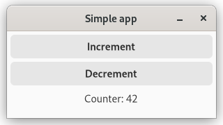
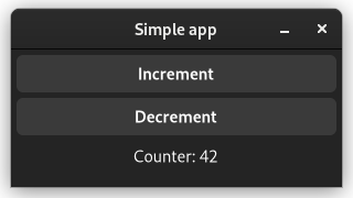
Screenshots
As a sneak peak here are screenshots of some examples.
| Light Theme | Dark Theme |
|---|---|
 |  |
 |  |
Special thanks
We want to thank all contributors of relm especially antoyo for building relm that inspired much of the work on Relm4.
Also, we want to thank all contributors of gtk-rs that put a lot of effort into the project for creating outstanding Rust bindings for GTK4.
We want to thank tronta, Eduardo Flores, Andy Russell, Aaron Erhardt for contributing a lot of improvements to this book.
Basic concepts
Before we start building our app, we need to understand the basic concepts of Relm4. If you have experience with GTK and Rust, you will probably breeze through this section, but if you don’t, this section is for you.
We will explain in detail how Relm4 works and how to use it. After this section, we will be building a simple counter app.
Model
Like a person, a computer needs a brain to be functional. It needs to process our messages and remember the results.
Relm4 uses the term model as a data type that represents the application state, the memory of your application.
For example, to store a counter value, we can store a u8 in our model:
struct AppModel {
    counter: u8,
}
Messages
To help the computer understand what we want to tell it, we first translate user interactions into messages.
In Relm4, a message can be any data type, but most often, an enum is used.
enum AppMsg {
    Increment,
    Decrement,
}
Computers are capable of both sending and receiving messages and similarly, components in Relm4 can send and receive messages.
This is accomplished by having two types of messages: Input and Output.
Input messages
Input messages are a way for our components to receive information, think of them as our inbox 📬.
Let’s look at it with a simple MailboxComponent example:
We have our Inbox, capable of receiving emails from other people.
enum Inbox {
    GetEmail(Email),
}
These messages are received by our component and handled in the update function.
fn update(&mut self, message: Self::Input, ...) {
    match message {
        Inbox::GetEmail(email) => self.emails.push(email)
    }
}
Our MailboxComponent can not only receive emails from other people, but we can also send emails to ourselves.
Components work in the same way, they can either receive messages from other components or send themselves messages to update their own model.
Output messages
Output messages are sent by components to other components and handled differently depending on the type of components that receives them. We can think of them as our outbox 🚚.
Let’s take our previous MailboxComponent example and add the following.
enum Outbox {
    SendEmail(Email),
}
We can modify our previous example to forward the emails to somebody else.
fn update(&mut self, message: Self::Input, sender: ComponentSender<Self>) {
    match message {
        Inbox::GetEmail(email) => sender.output(Outbox::SendEmail(email)),
    }
}
Usually, output messages are handled by the parent component, which is the component that creates and stores our MailboxComponent.
You can think of it like a tree with one component at the root and many child components that branch out.
Widgets
GTK4 provides widgets as building blocks for your UI, like buttons, input fields or text areas. They can visualize data and also receive user inputs. In Relm4, user inputs are usually directly translated into input messages for our components.
It’s important to understand that widgets behave similar to Rc.
Most importantly, this means that:
- Cloning a widget doesn’t create a new instance, but just increases the reference count.
- Widgets are kept alive automatically. Dropping widgets that are still used somewhere does not destroy them, but just decreases the reference count.
- Widgets are not thread-safe. Widgets don’t implement
Sendand can only be used on the main thread.
Components
Components are the fundamental building blocks of Relm4. To create a component you need to implement the Component trait.
The Component trait
The Component trait is the base of every component inside Relm4, it defines how a component should behave, communicate and produce widgets.
The SimpleComponent trait
The SimpleComponent trait is a convenience trait that implements the Component trait, but removes some advanced features that are not relevant for most use-cases.
For each implementation of SimpleComponent, Relm4 will automatically implement Component as well. Thus, it can also be used instead of Component. This mechanism is called blanket implementation and is used for traits like From in the standard library as well.
Your first app
For our first app, let’s create something original: a counter app.
| GTK Light | GTK Dark |
|---|---|
 |  |
| Adwaita Light | Adwaita Dark |
|---|---|
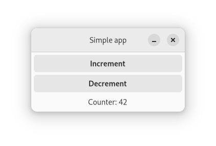 | 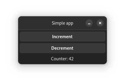 |
In this app, we will have a counter which can be incremented and decremented by pressing the corresponding buttons.
The app we will write in this chapter is also available here. Run
cargo run --example simple_manualfrom the example directory if you want to see the code in action.
Application architecture
Often, programming concepts are easier to understand when explained with examples or metaphors from the real world. To understand how Relm4 apps work, you can think about a computer as a person.
Our job as a programmer is to ensure that the users of our app will be able to communicate with the computer through the UI. Since the computer can’t understand our human language, it needs some help from us to get the communication going.
Let’s have a look at what we need to get this done!
Messages
For our app, we just want to tell the computer to either increment or decrement a counter.
enum AppMsg {
    Increment,
    Decrement,
}
The model
For our counter app, the computer only needs to remember the counter value, so an u8 is all we need.
struct AppModel {
    counter: u8,
}
The widgets
GTK4 offers the computer widgets that allow it to take input and to respond. Widgets are simply parts of an UI like buttons, input fields or text areas. To be able to update the widgets in our program, we can put them all into a struct.
For our application, we use a window with two buttons to increase and decrease the counter and a label to display the counter value. We also need a box as a container to house our buttons and label, since a window can only have one child.
In our case, we will only update the label when we increment or decrement the counter, so we don’t really need to store everything inside the struct.
struct AppWidgets {
    label: gtk::Label,
}
Although, if you want to, you can.
Implement a component with SimpleComponent.
The last step we need is to tell the computer how to initialize and update the widgets.
All that is left to do is to implement the SimpleComponent trait for your model, which tells the computer exactly how to visualize its memory.
Let’s do this step by step. First, we’ll have a look at the beginning of the trait impl.
impl SimpleComponent for AppModel {The first thing you need to do is to define some generic types necessary to make our component work.
    /// The type of the messages that this component can receive.
    type Input = AppMsg;
    /// The type of the messages that this component can send.
    type Output = ();
    /// The type of data with which this component will be initialized.
    type Init = u8;
    /// The root GTK widget that this component will create.
    type Root = gtk::Window;
    /// A data structure that contains the widgets that you will need to update.
    type Widgets = AppWidgets;
The types defined in the trait tell our component how it should communicate with other components and what type of widgets should be produced.
The Root type is the outermost widget of the app. Components can choose this type freely, but the main component must use a Window.
Since the window widget is our root widget, we are going to create it in the init_root function.
    fn init_root() -> Self::Root {
        gtk::Window::builder()
            .title("Simple app")
            .default_width(300)
            .default_height(100)
            .build()
    }
Next up, we want to initialize our UI and the model.
Don’t worry about the amount of manual code you need for handling widgets. In the next chapter, we’ll see how this can be done easier.
All of these widgets will be created in the init function. We get our Root window and the Init variables to create our widgets with.
    /// Initialize the UI and model.
    fn init(
        counter: Self::Init,
        window: Self::Root,
        sender: ComponentSender<Self>,
    ) -> relm4::ComponentParts<Self> {
        let model = AppModel { counter };

        let vbox = gtk::Box::builder()
            .orientation(gtk::Orientation::Vertical)
            .spacing(5)
            .build();

        let inc_button = gtk::Button::with_label("Increment");
        let dec_button = gtk::Button::with_label("Decrement");

        let label = gtk::Label::new(Some(&format!("Counter: {}", model.counter)));
        label.set_margin_all(5);

        window.set_child(Some(&vbox));
        vbox.set_margin_all(5);
        vbox.append(&inc_button);
        vbox.append(&dec_button);
        vbox.append(&label);

        inc_button.connect_clicked(clone!(
            #[strong]
            sender,
            move |_| {
                sender.input(AppMsg::Increment);
            }
        ));

        dec_button.connect_clicked(clone!(
            #[strong]
            sender,
            move |_| {
                sender.input(AppMsg::Decrement);
            }
        ));

        let widgets = AppWidgets { label };

        ComponentParts { model, widgets }
    }
First, we initialize each of our widgets, mostly by using builder patterns.
Then we connect the widgets so that GTK4 knows how they are related to each other. The buttons and the label are added as children of the box, and the box is added as the child of the window.
Next, we connect the “clicked” event for both buttons and send a message from the closures to the computer. To do this, we only need to move a cloned sender into the closures and send the message. Now every time we click our buttons, a message will be sent to update our counter!
Of course, the computer needs to do more than just remembering things, it also needs to process information. Here, both the model and message types come into play.
The update function of the SimpleComponent trait tells the computer how to process messages and how to update its memory.
    fn update(&mut self, message: Self::Input, _sender: ComponentSender<Self>) {
        match message {
            AppMsg::Increment => {
                self.counter = self.counter.wrapping_add(1);
            }
            AppMsg::Decrement => {
                self.counter = self.counter.wrapping_sub(1);
            }
        }
    }
wrapping_add(1)andwrapping_sub(1)are like+1and-1, but don’t panic on overflows.
We see that the update function receives a message and updates the model according to your instructions.
Still our UI will not update when the counter is changed. To do this, we need to implement the update_view function that modifies the UI according to the changes in the model.
    /// Update the view to represent the updated model.
    fn update_view(&self, widgets: &mut Self::Widgets, _sender: ComponentSender<Self>) {
        widgets
            .label
            .set_label(&format!("Counter: {}", self.counter));
    }
Running the App
The last step is to run the app we just wrote. To do so, we just need to initialize our model and pass it into RelmApp::new().
fn main() {
    let app = RelmApp::new("relm4.test.simple_manual");
    app.run::<AppModel>(0);
}
🎉 Congratulations! You just wrote your first app with Relm4! 🎉
Summary
Let’s summarize what we learned in this chapter.
A Relm4 application has three important types:
- The model type that stores the application state, the memory of our app.
- The message type that describes which information can be sent to update the model.
- The widgets type that stores our widgets.
Also, there are two important functions:
updatereceives a message and updates the model accordingly.update_viewreceives the updated model and updates the widgets accordingly.
The app does all those things in a loop. It waits for messages and once a message is received, it runs update and then view.

Relm4 separates the data and the UI. The UI never knows which message was sent, but can only read the model. This might seem like a limitation, but it helps you to create maintainable, stable and consistent applications.
Conclusion
I hope this chapter made everything clear for you :)
If you found a mistake or there was something unclear, please open an issue here.
As you have seen, initializing the UI was by far the largest part of our app, with roughly one half of the total code. In the next chapter, we will have a look at the relm4-macros crate, which provides a macro that helps us reduce the amount of code we need to implement the Widgets trait.
As you might have noticed, storing
inc_button,dec_buttonandvboxin our widgetsstructis not necessary because GTK will keep them alive automatically. Therefore, we can remove them fromAppWidgetsto avoid compiler warnings.
The complete code
Let’s review our code in one piece to see how all these parts work together:
use gtk::glib::clone;
use gtk::prelude::{BoxExt, ButtonExt, GtkWindowExt};
use relm4::{gtk, ComponentParts, ComponentSender, RelmApp, RelmWidgetExt, SimpleComponent};

struct AppModel {
    counter: u8,
}

#[derive(Debug)]
enum AppMsg {
    Increment,
    Decrement,
}

struct AppWidgets {
    label: gtk::Label,
}

impl SimpleComponent for AppModel {

    /// The type of the messages that this component can receive.
    type Input = AppMsg;
    /// The type of the messages that this component can send.
    type Output = ();
    /// The type of data with which this component will be initialized.
    type Init = u8;
    /// The root GTK widget that this component will create.
    type Root = gtk::Window;
    /// A data structure that contains the widgets that you will need to update.
    type Widgets = AppWidgets;

    fn init_root() -> Self::Root {
        gtk::Window::builder()
            .title("Simple app")
            .default_width(300)
            .default_height(100)
            .build()
    }

    /// Initialize the UI and model.
    fn init(
        counter: Self::Init,
        window: Self::Root,
        sender: ComponentSender<Self>,
    ) -> relm4::ComponentParts<Self> {
        let model = AppModel { counter };

        let vbox = gtk::Box::builder()
            .orientation(gtk::Orientation::Vertical)
            .spacing(5)
            .build();

        let inc_button = gtk::Button::with_label("Increment");
        let dec_button = gtk::Button::with_label("Decrement");

        let label = gtk::Label::new(Some(&format!("Counter: {}", model.counter)));
        label.set_margin_all(5);

        window.set_child(Some(&vbox));
        vbox.set_margin_all(5);
        vbox.append(&inc_button);
        vbox.append(&dec_button);
        vbox.append(&label);

        inc_button.connect_clicked(clone!(
            #[strong]
            sender,
            move |_| {
                sender.input(AppMsg::Increment);
            }
        ));

        dec_button.connect_clicked(clone!(
            #[strong]
            sender,
            move |_| {
                sender.input(AppMsg::Decrement);
            }
        ));

        let widgets = AppWidgets { label };

        ComponentParts { model, widgets }
    }

    fn update(&mut self, message: Self::Input, _sender: ComponentSender<Self>) {
        match message {
            AppMsg::Increment => {
                self.counter = self.counter.wrapping_add(1);
            }
            AppMsg::Decrement => {
                self.counter = self.counter.wrapping_sub(1);
            }
        }
    }

    /// Update the view to represent the updated model.
    fn update_view(&self, widgets: &mut Self::Widgets, _sender: ComponentSender<Self>) {
        widgets
            .label
            .set_label(&format!("Counter: {}", self.counter));
    }
}

fn main() {
    let app = RelmApp::new("relm4.test.simple_manual");
    app.run::<AppModel>(0);
}
The component macro
To simplify the implementation of the Component trait, let’s use the relm4-macros crate!
The app will look and behave identically to our first app from the previous chapter. Only the implementation is different.
The app we will write in this chapter is also available here. Run
cargo run --example simplefrom the example directory if you want to see the code in action.
What’s different
The component macro will simplify creating the Widgets struct. The update code remains untouched, so we can reuse most of the code from the previous chapter.
Let’s have a look at how to define a component with the macro and go through the code step by step:
#[relm4::component]
impl SimpleComponent for AppModel {
    type Init = u8;

    type Input = AppMsg;
    type Output = ();

    view! {
        gtk::Window {
            set_title: Some("Simple app"),
            set_default_width: 300,
            set_default_height: 100,

            gtk::Box {
                set_orientation: gtk::Orientation::Vertical,
                set_spacing: 5,
                set_margin_all: 5,

                gtk::Button {
                    set_label: "Increment",
                    connect_clicked => AppMsg::Increment
                },

                gtk::Button::with_label("Decrement") {
                    connect_clicked => AppMsg::Decrement
                },

                gtk::Label {
                    #[watch]
                    set_label: &format!("Counter: {}", model.counter),
                    set_margin_all: 5,
                }
            }
        }
    }

    // Initialize the UI.
    fn init(
        counter: Self::Init,
        root: Self::Root,
        sender: ComponentSender<Self>,
    ) -> ComponentParts<Self> {
        let model = AppModel { counter };

        // Insert the macro code generation here
        let widgets = view_output!();

        ComponentParts { model, widgets }
    }

    fn update(&mut self, msg: Self::Input, _sender: ComponentSender<Self>) {
        match msg {
            AppMsg::Increment => {
                self.counter = self.counter.wrapping_add(1);
            }
            AppMsg::Decrement => {
                self.counter = self.counter.wrapping_sub(1);
            }
        }
    }
}
The associated types don’t change. We still have to define the model, the input parameters, and the message types. However, the Widgets type is never explicitly defined in the code, but generated by the macro.
And then… wait, where do we define the Root type? Actually, the macro knows that the outermost widget becomes automatically the root widget.
Next up - the heart of the component macro - the nested view! macro. Here, we can easily define widgets and assign properties to them.
Properties
As you see, we start with the gtk::Window which is our root. Then we open up brackets and assign properties to the window. There’s not much magic here but actually set_title is a method provided by gtk4-rs. So technically, the macro creates code like this:
window.set_title(Some("Simple app"));Widgets
We assign a child to the window by nesting another widget inside it. Widgets may be nested indefinitely:
gtk::Box {Sometimes we want to use a constructor function to initialize our widgets. For the second button we used the gtk::Button::with_label function. This function returns a new button with the “Decrement” label already set, so we don’t have to call set_label afterwards.
gtk::Button::with_label("Decrement") {Events
To connect events, we use this general syntax:
method_name[cloned_var1, cloned_var2, ...] => move |args, ...| { code... }Again, there’s no magic. The macro will simply assign a closure to a method. Because closures often need to capture local variables that don’t implement the Copy trait, we need to clone these variables. Therefore, we can list the variables we want to clone in the square brackets after the method name.
For simple cases there’s even a shorter syntax for just sending one input message that works with most event handlers. So instead of this:
method_name[sender] => move |_| { sender.input(Msg); },You can simply write this:
method_name => Msg,This is what we used in this example:
connect_clicked => AppMsg::DecrementUI updates
The last special syntax of the component macro we’ll cover here is the #[watch] attribute. It’s just like the normal initialization except that it also updates the property in the view function. Without it, the counter label would never be updated.
                    #[watch]
                    set_label: &format!("Counter: {}", model.counter),
The full reference for the syntax of the widget macro can be found here.
Constructing the Widgets
After we’ve defined our widgets, we need to construct them. This is done with the view_output! macro, which returns a fully-initialized instance of our Widgets struct.
        // Insert the macro code generation here
        let widgets = view_output!();
The complete code
Let’s review our code in one piece one more time to see how all these parts work together:
use gtk::prelude::{BoxExt, ButtonExt, GtkWindowExt, OrientableExt};
use relm4::{gtk, ComponentParts, ComponentSender, RelmApp, RelmWidgetExt, SimpleComponent};

struct AppModel {
    counter: u8,
}

#[derive(Debug)]
enum AppMsg {
    Increment,
    Decrement,
}

#[relm4::component]
impl SimpleComponent for AppModel {
    type Init = u8;

    type Input = AppMsg;
    type Output = ();

    view! {
        gtk::Window {
            set_title: Some("Simple app"),
            set_default_width: 300,
            set_default_height: 100,

            gtk::Box {
                set_orientation: gtk::Orientation::Vertical,
                set_spacing: 5,
                set_margin_all: 5,

                gtk::Button {
                    set_label: "Increment",
                    connect_clicked => AppMsg::Increment
                },

                gtk::Button::with_label("Decrement") {
                    connect_clicked => AppMsg::Decrement
                },

                gtk::Label {
                    #[watch]
                    set_label: &format!("Counter: {}", model.counter),
                    set_margin_all: 5,
                }
            }
        }
    }

    // Initialize the UI.
    fn init(
        counter: Self::Init,
        root: Self::Root,
        sender: ComponentSender<Self>,
    ) -> ComponentParts<Self> {
        let model = AppModel { counter };

        // Insert the macro code generation here
        let widgets = view_output!();

        ComponentParts { model, widgets }
    }

    fn update(&mut self, msg: Self::Input, _sender: ComponentSender<Self>) {
        match msg {
            AppMsg::Increment => {
                self.counter = self.counter.wrapping_add(1);
            }
            AppMsg::Decrement => {
                self.counter = self.counter.wrapping_sub(1);
            }
        }
    }
}

fn main() {
    let app = RelmApp::new("relm4.test.simple");
    app.run::<AppModel>(0);
}
Tips and tricks
This chapter comes quite early in the book because it is quite helpful for beginners, but is certainly also useful for more advanced users. It contains the most common tips and tricks you will need while using Relm4. In case you have a problem, you can simply return to this chapter and might find something helpful very quickly. We recommend to have at least a short look at this chapter, but there’s no crucial information in here so you can already continue with the next chapter if you want.
Advanced view macro features
Some features of the view macro are explained very late in the book and are easy to overlook. Here’s a short summary of those features, which you might find useful. If you found something interesting, you can look for more details in the macro reference chapter.
- Initialization using a builder pattern
- Pass additional arguments
- Pass
Some(widget) ifandmatchstatements to dynamically select visible widgets- Use the return value of assignments
- Optional and iterative assignments
Common pitfalls
The Elm architecture itself is pretty simple, but as your application grows, small oversights can sometimes cause large problems.
Message recursion
Relm4 components use a simple update loop: Receive a message, update the model and then update the view.
Usually, this works as intended, but if updating the view somehow creates a new, identical message, your code will be stuck in an infinite loop and your app will freeze.
To prevent this, the view macro has the block_signal attribute which is explained here.
Sending errors
Sending messages in Relm4 can lead to panics under certain circumstances.
The most common mistake is dropping a Controller.
This will cause the entire runtime of the component to be dropped together with all it’s receivers.
Sending message to this component afterwards will not work because the receiving side is not available anymore.
To avoid this problem, you can either store the Controller in the model of its parent components or call detach_runtime().
Also note that sending output messages will not work if you detach a component, again because this means that no receiver is available.
In this case it might be desired to ignore sending errors.
Common compiler errors
Relm4’s macros try to make your life easier, but sometimes the created error messages are rather confusing. This is not something that can be fully fixed in the macro itself due to the limitations of the Rust programming language, but we try to summarize some common errors in this section.
Private type in public interface
The #[component] and #[factory] macros will automatically generate a struct for storing your widgets.
This struct must have the same visibility as the model because it is associated with the Component or FactoryComponent implementation of the model.
To tell the macro to generate a public widgets type, you can simply use #[component(pub)] or #[factory(pub)].
Method container_add is missing
Relm4 implements the ContainerExt trait for many widgets that allows you simply nest widgets in the view macro.
gtk::Box {
    gtk::Label {
        // ...
    }
}
Unfortunately, this trait can’t always be implemented because some widgets don’t have a obvious method for adding children.
For gtk::Box it is relatively simple and just uses the append() method internally.
However, gtk::Header has three possible locations to add children: start, center and end.
Implementing RelmContainerExt for such a type is not possible because it’s not clear what the default behavior should be.
Other types such as gtk::Grid even need more information to place children.
In this case, you can simply pass the method name before declaring the child widget.
Also, we often need a reference (&) because most methods in gtk-rs take references.
gtk::HeaderBar {
pack_start = >k::Label {
// ...
}
},
gtk::Grid {
attach[0, 0, 1, 1] = >k::Label {
// ...
}
}Working with gtk-rs
The structure and design of most gtk-rs crates is often a bit different from most other Rust crates. Because GTK is based on GObject, a C library that implements object-oriented programming, the gtk-rs developers had to come up with some clever ideas to integrate the C code into Rust.
Reading docs
Looking at the documentation of gtk::Box makes it look like this type has just a new() and a builder() method.
However, this is not quite true as the gtk::Box type comes with plenty of methods.
To find those methods, you have to look at “implements” section, which contains a list of traits implemented by this type.
In particular, BoxExt gives you a lot of useful methods.
Another very important trait in the list is WidgetExt which is implemented by all widgets.
In the same fashion, you can find the available methods of other widgets.
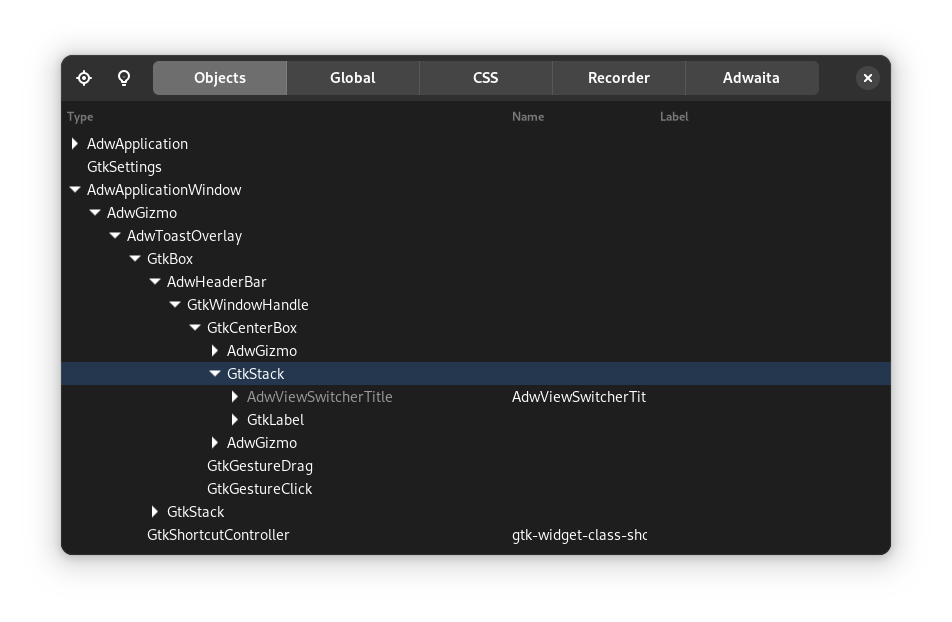
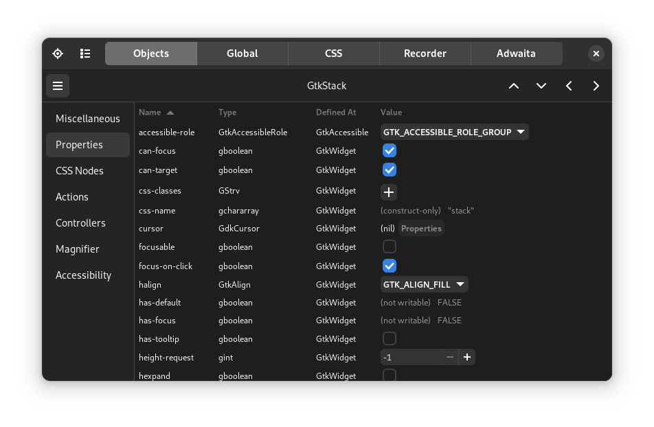
Using the inspector
GTK has a built-in inspector that has similar features as browser developer tools. You can use them to look at individual widgets, modify their properties, apply custom CSS and much more. In particular, it is very useful for finding the best values before integrating them into your code.
To use the inspector, you only need to press Ctrl+Shift+D while you have a GTK application opened (this not just works for Relm4, but all GTK based apps).
You should see an overview over all your widgets, which you can expand row by row.
Yet, to select widgets, it is more convenient to use the button in the top left which allows you to select a widget by clicking on your app.
Once you have selected a widget, you can modify its properties.
You can also use the CSS tab to apply custom CSS to your application. Once you entered your rules, make sure the pause button is not selected. For example, you could try setting a border for every widget:
* {
    border: 1px solid red;
}
| Widget overview | Widget properties |
|---|---|
 |  |
Demo applications
Both GTK4, libadwaita and ASHPD (a library for portals) have demo applications. Those are very useful when searching for widgets and other features, especially when combined with the inspector.
- Setup gnome-nightly flatpak remote:
flatpak remote-add --if-not-exists gnome-nightly https://nightly.gnome.org/gnome-nightly.flatpakrepo - Install the GTK4 demo:
flatpak install gnome-nightly org.gtk.Demo4 - Install the Adwaita demo:
flatpak install gnome-nightly org.gnome.Adwaita1.Demo - Install the ASHPD demo:
flatpak install flathub com.belmoussaoui.ashpd.demo
Our ecosystem
Relm4 also offers a few extra crates and projects to make your life easier:
- relm4-template: A template for flatpak apps that saves a lot of time for setting up new projects
- relm4-icons: Over 2000 icons, ready to use for your app
- relm4-components: A collection of handy components
Guaranteed helpful: Our matrix chat
In case you didn’t find the answer to your question in this book, feel free to ask it in our matrix chat or in a GitHub discussion (you can find all links in our README). We are always happy to help you! After all, this chapter was assembled from the most common questions we got from either GitHub or the matrix chat.
Efficient UI updates
Relm4 follows the Elm programming model which means that data and widgets are separated. At first glance this might cause a problem. Larger applications need to efficiently update their widgets because rebuilding the whole UI for every update is not an option. But since data and widgets are separated, how do we know which UI elements need to be updated?
Let’s have a look at the following example: Imagine you have an app with 1000 counters and you only increment the first counter. The model receives the increment message for the first counter and increments it. Now the view function gets the updated model with 1000 counters and… well, has no idea what has changed! So instead of one UI update we need to do 1000 because we don’t know which of our counters was modified.
There are two concepts in Relm4 to avoid unnecessary UI updates:
- Trackers identify modifications of fields in
structs to only trigger updates to the affected UI elements. - Factories track changes in data structures similar to
std::collectionsin order to perform also minimal UI updates. They are used to generate multiple similar widgets, e.g. a row of buttons, from a data collection.
Both concepts are explained in the following chapters.
Tracker
A tracker in this context simply means a data type that’s able to track changes to itself. For example, if we increment the counter of the model we used for our first app, the model might tell us later that the counter changed during the last update function.
Relm4 does not promote any implementation of a tracker. You’re free to use any implementation you like, you can even implement a tracker yourself. In this example however, we’ll use the tracker crate that provides a simple macro that implements a tracker for us automatically.
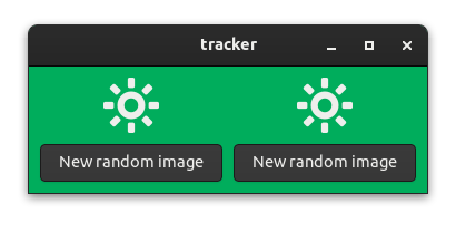
Using this technique, we will implement a small program which displays two randomly picked icons controlled by two buttons:
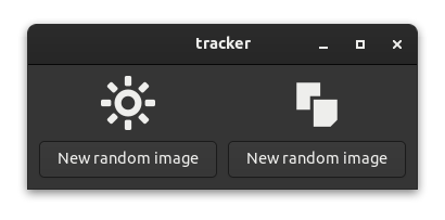
When pressing a button, the icon above it will change. The background of the application will become green when the two icons are identical:
The tracker crate
The tracker::track macro implements the following methods for your struct fields:
-
get_{field_name}()
Get an immutable reference to your field. -
get_mut_{field_name}()
Get a mutable reference to your field. Assumes the field will be modified and marks it as changed. -
set_{field_name}(value)
Get a mutable reference to your field. Marks the field as changed only if the new value isn’t equal with the previous value. -
update_{field_name}(fn)
Update your mutable field with a function or a closure. Assumes the field will be modified and marks it as changed.
To check for changes you can call {struct_var_name}.changed(StructName::{field_name}()) and it will return a bool indication whether the field was updated.
To reset all previous changes, you can call {struct_var_name}.reset().
A tracker example
First we have to add the tracker library to Cargo.toml:
tracker = "0.2.2"
Now let’s have a look at a small example.
#[tracker::track]
struct Test {
    x: u8,
    y: u64,
}

fn main() {
    let mut t = Test {
        x: 0,
        y: 0,
        // the macro generates a new variable called
        // "tracker" which stores the changes
        tracker: 0,
    };

    t.set_x(42);
    // let's check whether the change was detected
    assert!(t.changed(Test::x()));

    // reset t so we don't track old changes
    t.reset();

    t.set_x(42);
    // same value, so no change
    assert!(!t.changed(Test::x()));
}
So in short, the tracker::track macro provides various getters and setters that will mark struct fields as changed. You also get a method that checks for changes and a method to reset the changes.
Using trackers in Relm4 apps
Let’s build a simple app that shows two random icons and allows the user to set either of them to a new random icon. As a bonus, we want to show a fancy background color if both icons are the same.
The app we will write in this chapter is also available here. Run
cargo run --example trackerfrom the example directory if you want to see the code in action.
The icons
Before selecting random icons, we need implement two functions, one for return random image name from the default GTK icon theme, and another that makes sure that when the images are updated, their names are not repeated.
const ICON_LIST: &[&str] = &[
    "bookmark-new-symbolic",
    "edit-copy-symbolic",
    "edit-cut-symbolic",
    "edit-find-symbolic",
    "starred-symbolic",
    "system-run-symbolic",
    "emoji-objects-symbolic",
    "emoji-nature-symbolic",
    "display-brightness-symbolic",
];

fn random_icon_name() -> &'static str {
    ICON_LIST
        .iter()
        .choose(&mut rand::rng())
        .expect("Could not choose a random icon")
}

// Returns a random icon different from the excluded one (avoids repeats).
fn gen_unique_icon(exclude: &'static str) -> &'static str {
    let mut rnd = random_icon_name();
    while rnd == exclude {
        rnd = random_icon_name()
    }
    rnd
}
The model
For our model we only need to store the two icon names and whether both of them are identical.
#[tracker::track]
struct AppModel {
    first_icon: &'static str,
    second_icon: &'static str,
    identical: bool,
}
The message type is also pretty simple: we just want to update one of the icons.
#[derive(Debug)]
enum AppInput {
    UpdateFirst,
    UpdateSecond,
}
There are a few notable things for the Component’s update implementation.
First, we call self.reset() at the top of the function body. This ensures that the tracker will be reset so we don’t track old changes.
Also, we use setters instead of assignments because we want to track these changes. Yet, you could still use the assignment operator if you want to apply changes without notifying the tracker.
The gen_unique_icon() function ensures the new icon won’t match the current one, preventing visually identical updates.
    fn update(&mut self, message: Self::Input, _sender: ComponentSender<Self>) {
        // reset tracker value of the model
        self.reset();

        match message {
            AppInput::UpdateFirst => {
                self.set_first_icon(gen_unique_icon(self.first_icon));
            }
            AppInput::UpdateSecond => {
                self.set_second_icon(gen_unique_icon(self.second_icon));
            }
        }
        self.set_identical(self.first_icon == self.second_icon);
    }
The view
Now we reached the interesting part of the code where we can actually make use of the tracker. Let’s have a look at the complete view! macro call:
view! {
#[root]
gtk::ApplicationWindow {
#[track = "model.changed(AppModel::identical())"]
set_class_active: ("identical", model.identical),
gtk::Box {
set_orientation: gtk::Orientation::Horizontal,
set_spacing: 10,
set_margin_all: 10,
gtk::Box {
set_orientation: gtk::Orientation::Vertical,
set_spacing: 10,
gtk::Image {
set_pixel_size: 50,
#[track = "model.changed(AppModel::first_icon())"]
set_icon_name: Some(model.first_icon),
},
gtk::Button {
set_label: "New random image",
connect_clicked[sender] => move |_| {
sender.input(AppInput::UpdateFirst)
}
}
},
append = >k::Box {
set_orientation: gtk::Orientation::Vertical,
set_spacing: 10,
gtk::Image {
set_pixel_size: 50,
#[track = "model.changed(AppModel::second_icon())"]
set_icon_name: Some(model.second_icon),
},
gtk::Button {
set_label: "New random image",
connect_clicked[sender] => move |_| {
sender.input(AppInput::UpdateSecond)
}
}
},
}
}
}The main function
In this example, we need some additional code in fn main() to add custom CSS that sets the background color for elements with class name “identical”.
Later, we just need to assign the “identical” class name to a widget to make it match the CSS selector.
fn main() {
    let app = RelmApp::new("relm4.test.simple");
    relm4::set_global_css(".identical { background: #00ad5c; }");
    app.run::<AppModel>(());
}
The #[track] attribute
The #[track] attribute is applied to method invocations in our view code. It allows us to add a condition to the update: if the condition is true, the method will be called, otherwise, it will be skipped. The attribute syntax looks like this:
#[track = "<boolean expression>"]Let’s have a look at its first appearance:
            #[track = "model.changed(AppModel::identical())"]
            set_class_active: ("identical", model.identical),
The set_class_active method is used to either activate or disable a CSS class. It takes two parameters, the first is the class itself and the second is a boolean which specifies if the class should be added (true) or removed (false).
The value of the #[track] attribute is parsed as a boolean expression. This expression will be used as a condition to check whether something has changed. If this condition is true, the set_class_active method will be called with the parameters it guards.
The macro expansion for method calls annotated with the #[track] attribute look roughly like this:
if model.changed(AppModel::identical()) {
    self.main_window.set_class_active("identical", model.identical);
}
That’s all. It’s pretty simple, actually. We just use a condition that allows us to update our widgets only when needed.
The second #[track] attribute works similarly:
                        #[track = "model.changed(AppModel::first_icon())"]
                        set_icon_name: Some(model.first_icon),
Using a tracker as debugging helper
Since the
#[track]attribute parses expressions, you can use the following syntax to debug your trackers:
#[track = "{ println!("Update widget"); argument }"]
Initializing the model
There’s one last thing to point out. When initializing our model, we need to initialize the tracker field as well. The initial value doesn’t really matter because we call reset() in the update function anyway, but usually 0 is used.
        let model = AppModel {
            first_icon: random_icon_name(),
            second_icon: random_icon_name(),
            identical: false,
            tracker: 0,
        };
The complete code
Let’s look at our code again in one piece to see how all these parts work together:
use gtk::prelude::{BoxExt, ButtonExt, OrientableExt};
use rand::prelude::IteratorRandom;
use relm4::{gtk, ComponentParts, ComponentSender, RelmApp, RelmWidgetExt, SimpleComponent};
const ICON_LIST: &[&str] = &[
"bookmark-new-symbolic",
"edit-copy-symbolic",
"edit-cut-symbolic",
"edit-find-symbolic",
"starred-symbolic",
"system-run-symbolic",
"emoji-objects-symbolic",
"emoji-nature-symbolic",
"display-brightness-symbolic",
];
fn random_icon_name() -> &'static str {
ICON_LIST
.iter()
.choose(&mut rand::rng())
.expect("Could not choose a random icon")
}
// Returns a random icon different from the excluded one (avoids repeats).
fn gen_unique_icon(exclude: &'static str) -> &'static str {
let mut rnd = random_icon_name();
while rnd == exclude {
rnd = random_icon_name()
}
rnd
}
// The track proc macro allows to easily track changes to different
// fields of the model
#[tracker::track]
struct AppModel {
first_icon: &'static str,
second_icon: &'static str,
identical: bool,
}
#[derive(Debug)]
enum AppInput {
UpdateFirst,
UpdateSecond,
}
#[relm4::component]
impl SimpleComponent for AppModel {
type Init = ();
type Input = AppInput;
type Output = ();
view! {
#[root]
gtk::ApplicationWindow {
#[track = "model.changed(AppModel::identical())"]
set_class_active: ("identical", model.identical),
gtk::Box {
set_orientation: gtk::Orientation::Horizontal,
set_spacing: 10,
set_margin_all: 10,
gtk::Box {
set_orientation: gtk::Orientation::Vertical,
set_spacing: 10,
gtk::Image {
set_pixel_size: 50,
#[track = "model.changed(AppModel::first_icon())"]
set_icon_name: Some(model.first_icon),
},
gtk::Button {
set_label: "New random image",
connect_clicked[sender] => move |_| {
sender.input(AppInput::UpdateFirst)
}
}
},
append = >k::Box {
set_orientation: gtk::Orientation::Vertical,
set_spacing: 10,
gtk::Image {
set_pixel_size: 50,
#[track = "model.changed(AppModel::second_icon())"]
set_icon_name: Some(model.second_icon),
},
gtk::Button {
set_label: "New random image",
connect_clicked[sender] => move |_| {
sender.input(AppInput::UpdateSecond)
}
}
},
}
}
}
// Initialize the UI.
fn init(
_params: Self::Init,
root: Self::Root,
sender: ComponentSender<Self>,
) -> ComponentParts<Self> {
let model = AppModel {
first_icon: random_icon_name(),
second_icon: random_icon_name(),
identical: false,
tracker: 0,
};
// Insert the macro code generation here
let widgets = view_output!();
ComponentParts { model, widgets }
}
fn update(&mut self, message: Self::Input, _sender: ComponentSender<Self>) {
// reset tracker value of the model
self.reset();
match message {
AppInput::UpdateFirst => {
self.set_first_icon(gen_unique_icon(self.first_icon));
}
AppInput::UpdateSecond => {
self.set_second_icon(gen_unique_icon(self.second_icon));
}
}
self.set_identical(self.first_icon == self.second_icon);
}
}
fn main() {
let app = RelmApp::new("relm4.test.simple");
relm4::set_global_css(".identical { background: #00ad5c; }");
app.run::<AppModel>(());
}Factory
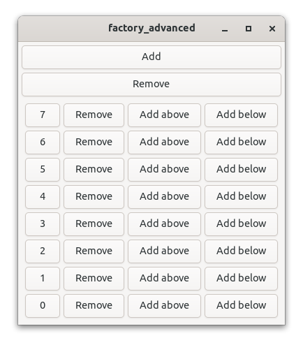
Factories define how to generate widgets from data collections. GTK also has factories, yet Relm4 uses its own factory implementation which is much easier to use in regular Rust code.
This app will have a dynamic number of counters. Also, the counters can be moved up and down by the user.
Factories in Relm4
Factories allow you to visualize data in a natural way.
If you wanted to store a set of counter values in regular Rust code, you’d probably use Vec<u8>.
However, you can’t simply generate widgets from a Vec.
This is where factories are really useful.
Custom collection types like FactoryVecDeque allow you to work with collections of data almost as comfortable as if they were stored in a Vec.
At the same time, factories allow you to automatically visualize the data with widgets.
Additionally, factories are very efficient by reducing the amount of UI updates to a minimum.
The app we will write in this chapter is also available here. Run
cargo run --example factoryfrom the example directory if you want to see the code in action.
The model
First, we define the struct Counter that just stores the value of a single counter.
Later, we will use a FactoryVecDeque to store our counters.
#[derive(Debug)]
struct Counter {
    value: u8,
}
The input message type
Each counter should be able to increment and decrement.
#[derive(Debug)]
enum CounterMsg {
    Increment,
    Decrement,
}
The output message type
A neat feature of factories is that each element can easily forward their output messages to the input of their parent component.
For example, this is necessary for modifications that require access to the whole FactoryVecDeque, like moving an element to a new position.
Therefore, these actions are covered by the output type.
The actions we want to perform “from outside” are
- Move a counter up
- Move a counter down
- Move a counter to the first position
Accordingly, our message type looks like this:
#[derive(Debug)]
enum CounterOutput {
    SendFront(DynamicIndex),
    MoveUp(DynamicIndex),
    MoveDown(DynamicIndex),
}
You might wonder why DynamicIndex is used here.
First, the parent component needs to know which element should be moved, which is defined by the index.
Further, elements can move in the FactoryVecDeque.
If we used usize as index instead, it could happen that the index points to another element by the time it is processed.
The factory implementation
Factories use the FactoryComponent trait which is very similar to regular components with some minor adjustments.
For example, FactoryComponent needs the #[relm4::factory] attribute macro and a few more associated types in the trait implementation.
#[relm4::factory]
impl FactoryComponent for Counter {
    type Init = u8;
    type Input = CounterMsg;
    type Output = CounterOutput;
    type CommandOutput = ();
    type ParentWidget = gtk::Box;
Let’s look at the associated types one by one:
- Init: The data required to initialize
Counter, in this case the initial counter value. - Input: The input message type.
- Output: The output message type.
- CommandOutput: The command output message type, we don’t need it here.
- ParentWidget: The container widget used to store the widgets of the factory, for example
gtk::Box.
Creating the widget
The widget creation works as usual with our trusty view macro.
The only difference is that we use self to refer to the model due to differences in the FactoryComponent trait.
    view! {
        #[root]
        gtk::Box {
            set_orientation: gtk::Orientation::Horizontal,
            set_spacing: 10,

            #[name(label)]
            gtk::Label {
                #[watch]
                set_label: &self.value.to_string(),
                set_width_chars: 3,
            },

            #[name(add_button)]
            gtk::Button {
                set_label: "+",
                connect_clicked => CounterMsg::Increment,
            },

            #[name(remove_button)]
            gtk::Button {
                set_label: "-",
                connect_clicked => CounterMsg::Decrement,
            },

            #[name(move_up_button)]
            gtk::Button {
                set_label: "Up",
                connect_clicked[sender, index] => move |_| {
                    sender.output(CounterOutput::MoveUp(index.clone())).unwrap();
                }
            },

            #[name(move_down_button)]
            gtk::Button {
                set_label: "Down",
                connect_clicked[sender, index] => move |_| {
                    sender.output(CounterOutput::MoveDown(index.clone())).unwrap();
                }
            },

            #[name(to_front_button)]
            gtk::Button {
                set_label: "To Start",
                connect_clicked[sender, index] => move |_| {
                    sender.output(CounterOutput::SendFront(index.clone())).unwrap();
                }
            }
        }
    }
Initializing the model
FactoryComponent has separate functions for initializing the model and the widgets.
This means, that we are a bit less flexible, but don’t need view_output!() here.
Also, we just need to implement the init_model function because init_widgets is already implemented by the macro.
    fn init_model(value: Self::Init, _index: &DynamicIndex, _sender: FactorySender<Self>) -> Self {
        Self { value }
    }
The main component
Now, we have implemented the FactoryComponent type for the elements in our factory.
The only thing left to do is to write our main component to complete our app.
The component types
For the main component we implement the familiar SimpleComponent trait.
First we define the model and the input message type and then start the trait implementation.
struct App {
    created_widgets: u8,
    counters: FactoryVecDeque<Counter>,
}

#[derive(Debug)]
enum AppMsg {
    AddCounter,
    RemoveCounter,
    SendFront(DynamicIndex),
    MoveUp(DynamicIndex),
    MoveDown(DynamicIndex),
}

#[relm4::component]
impl SimpleComponent for App {
    type Init = u8;
    type Input = AppMsg;
    type Output = ();
Initializing the factory
We skip the view macro for a moment and look at the init method.
You see that we are initializing the FactoryVecDeque using a builder pattern.
First, we call FactoryVecDeque::builder() to create the builder and use launch() to set the root widget of the factory.
This widget will store all the widgets created by the factory.
Then, we use the forward() method to pass all output messages of our factory (with type CounterOutput) to the input of our component (with type AppMsg).
The last trick we have up our sleeves is to define a local variable counter_box that is a reference to the container widget of our factory.
We’ll use it in the view macro in the next section.
    // Initialize the UI.
    fn init(
        counter: Self::Init,
        root: Self::Root,
        sender: ComponentSender<Self>,
    ) -> ComponentParts<Self> {
        let counters = FactoryVecDeque::builder()
            .launch(gtk::Box::default())
            .forward(sender.input_sender(), |output| match output {
                CounterOutput::SendFront(index) => AppMsg::SendFront(index),
                CounterOutput::MoveUp(index) => AppMsg::MoveUp(index),
                CounterOutput::MoveDown(index) => AppMsg::MoveDown(index),
            });

        let model = App {
            created_widgets: counter,
            counters,
        };

        let counter_box = model.counters.widget();
        let widgets = view_output!();

        ComponentParts { model, widgets }
    }
Initializing the widgets
The familiar view macro comes into play again.
Most things should look familiar, but this time we use a #[local_ref] attribute for the last widget to use the local variable we defined in the previous section.
This trick allows us to initialize the model with its FactoryVecDeque before the widgets, which is more convenient in most cases.
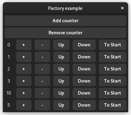
    view! {
        gtk::Window {
            set_title: Some("Factory example"),
            set_default_size: (300, 100),

            gtk::Box {
                set_orientation: gtk::Orientation::Vertical,
                set_spacing: 5,
                set_margin_all: 5,

                gtk::Button {
                    set_label: "Add counter",
                    connect_clicked => AppMsg::AddCounter,
                },

                gtk::Button {
                    set_label: "Remove counter",
                    connect_clicked => AppMsg::RemoveCounter,
                },

                #[local_ref]
                counter_box -> gtk::Box {
                    set_orientation: gtk::Orientation::Vertical,
                    set_spacing: 5,
                }
            }
        }
    }
The main update function
This time the main update function has actually quite a bit to do.
The code should be quite readable if you worked with Vec or VecDeque before.
One thing stands out though: We see a lot of calls to guard().
In fact, all mutating methods of FactoryVecDeque need an RAII-guard.
This is similar to a MutexGuard you get from locking a mutex.
The reason for this is simple. As long as the guard is alive, we can perform multiple operations. Once we’re done, we just drop the guard (or rather leave the current scope) and this will cause the factory to update its widgets automatically. The neat thing: You can never forget to render changes, and the update algorithm can optimize widget updates for efficiency.
    fn update(&mut self, msg: Self::Input, _sender: ComponentSender<Self>) {
        match msg {
            AppMsg::AddCounter => {
                self.counters.guard().push_back(self.created_widgets);
                self.created_widgets = self.created_widgets.wrapping_add(1);
            }
            AppMsg::RemoveCounter => {
                self.counters.guard().pop_back();
            }
            AppMsg::SendFront(index) => {
                self.counters.guard().move_front(index.current_index());
            }
            AppMsg::MoveDown(index) => {
                let index = index.current_index();
                let new_index = index + 1;
                // Already at the end?
                if new_index < self.counters.len() {
                    self.counters.guard().move_to(index, new_index);
                }
            }
            AppMsg::MoveUp(index) => {
                let index = index.current_index();
                // Already at the start?
                if index != 0 {
                    self.counters.guard().move_to(index, index - 1);
                }
            }
        }
    }
The main function
Awesome, we almost made it!
We only need to define the main function to run our application.
fn main() {
    let app = RelmApp::new("relm4.example.factory");
    app.run::<App>(0);
}
The complete code
Let’s review our code in one piece one more time to see how all these parts work together:
use gtk::prelude::{BoxExt, ButtonExt, GtkWindowExt, OrientableExt};
use relm4::factory::{DynamicIndex, FactoryComponent, FactorySender, FactoryVecDeque};
use relm4::{gtk, ComponentParts, ComponentSender, RelmApp, RelmWidgetExt, SimpleComponent};

#[derive(Debug)]
struct Counter {
    value: u8,
}

#[derive(Debug)]
enum CounterMsg {
    Increment,
    Decrement,
}

#[derive(Debug)]
enum CounterOutput {
    SendFront(DynamicIndex),
    MoveUp(DynamicIndex),
    MoveDown(DynamicIndex),
}

#[relm4::factory]
impl FactoryComponent for Counter {
    type Init = u8;
    type Input = CounterMsg;
    type Output = CounterOutput;
    type CommandOutput = ();
    type ParentWidget = gtk::Box;

    view! {
        #[root]
        gtk::Box {
            set_orientation: gtk::Orientation::Horizontal,
            set_spacing: 10,

            #[name(label)]
            gtk::Label {
                #[watch]
                set_label: &self.value.to_string(),
                set_width_chars: 3,
            },

            #[name(add_button)]
            gtk::Button {
                set_label: "+",
                connect_clicked => CounterMsg::Increment,
            },

            #[name(remove_button)]
            gtk::Button {
                set_label: "-",
                connect_clicked => CounterMsg::Decrement,
            },

            #[name(move_up_button)]
            gtk::Button {
                set_label: "Up",
                connect_clicked[sender, index] => move |_| {
                    sender.output(CounterOutput::MoveUp(index.clone())).unwrap();
                }
            },

            #[name(move_down_button)]
            gtk::Button {
                set_label: "Down",
                connect_clicked[sender, index] => move |_| {
                    sender.output(CounterOutput::MoveDown(index.clone())).unwrap();
                }
            },

            #[name(to_front_button)]
            gtk::Button {
                set_label: "To Start",
                connect_clicked[sender, index] => move |_| {
                    sender.output(CounterOutput::SendFront(index.clone())).unwrap();
                }
            }
        }
    }

    fn init_model(value: Self::Init, _index: &DynamicIndex, _sender: FactorySender<Self>) -> Self {
        Self { value }
    }

    fn update(&mut self, msg: Self::Input, _sender: FactorySender<Self>) {
        match msg {
            CounterMsg::Increment => {
                self.value = self.value.wrapping_add(1);
            }
            CounterMsg::Decrement => {
                self.value = self.value.wrapping_sub(1);
            }
        }
    }
}

struct App {
    created_widgets: u8,
    counters: FactoryVecDeque<Counter>,
}

#[derive(Debug)]
enum AppMsg {
    AddCounter,
    RemoveCounter,
    SendFront(DynamicIndex),
    MoveUp(DynamicIndex),
    MoveDown(DynamicIndex),
}

#[relm4::component]
impl SimpleComponent for App {
    type Init = u8;
    type Input = AppMsg;
    type Output = ();

    view! {
        gtk::Window {
            set_title: Some("Factory example"),
            set_default_size: (300, 100),

            gtk::Box {
                set_orientation: gtk::Orientation::Vertical,
                set_spacing: 5,
                set_margin_all: 5,

                gtk::Button {
                    set_label: "Add counter",
                    connect_clicked => AppMsg::AddCounter,
                },

                gtk::Button {
                    set_label: "Remove counter",
                    connect_clicked => AppMsg::RemoveCounter,
                },

                #[local_ref]
                counter_box -> gtk::Box {
                    set_orientation: gtk::Orientation::Vertical,
                    set_spacing: 5,
                }
            }
        }
    }

    // Initialize the UI.
    fn init(
        counter: Self::Init,
        root: Self::Root,
        sender: ComponentSender<Self>,
    ) -> ComponentParts<Self> {
        let counters = FactoryVecDeque::builder()
            .launch(gtk::Box::default())
            .forward(sender.input_sender(), |output| match output {
                CounterOutput::SendFront(index) => AppMsg::SendFront(index),
                CounterOutput::MoveUp(index) => AppMsg::MoveUp(index),
                CounterOutput::MoveDown(index) => AppMsg::MoveDown(index),
            });

        let model = App {
            created_widgets: counter,
            counters,
        };

        let counter_box = model.counters.widget();
        let widgets = view_output!();

        ComponentParts { model, widgets }
    }

    fn update(&mut self, msg: Self::Input, _sender: ComponentSender<Self>) {
        match msg {
            AppMsg::AddCounter => {
                self.counters.guard().push_back(self.created_widgets);
                self.created_widgets = self.created_widgets.wrapping_add(1);
            }
            AppMsg::RemoveCounter => {
                self.counters.guard().pop_back();
            }
            AppMsg::SendFront(index) => {
                self.counters.guard().move_front(index.current_index());
            }
            AppMsg::MoveDown(index) => {
                let index = index.current_index();
                let new_index = index + 1;
                // Already at the end?
                if new_index < self.counters.len() {
                    self.counters.guard().move_to(index, new_index);
                }
            }
            AppMsg::MoveUp(index) => {
                let index = index.current_index();
                // Already at the start?
                if index != 0 {
                    self.counters.guard().move_to(index, index - 1);
                }
            }
        }
    }
}

fn main() {
    let app = RelmApp::new("relm4.example.factory");
    app.run::<App>(0);
}
The position function
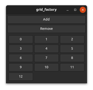
Most widgets such as gtk::Box don’t use the position function because they are one-dimensional and place widgets relative to each other. However, a few widgets such as gtk::Grid use fixed positions and need the position function to work inside a factory.
The task of the position function is mainly to map the index to a certain position/area (x, y, width and height) of a factory widget within the parent widget (view).
The code we will use in this chapter is based on the grid_factory example here. Run
cargo run --example grid_factoryfrom the example directory if you want to see the code in action.
How it works
Let’s take a grid as an example. For a grid, there are many possibilities to place your widgets. You can, for example, place three, four or five widgets per row or you could place a certain amount of widgets per column. You can even create patterns like a chess grid if you want to.
However, we want to use a factory for generating our widgets, which means we only have the index to calculate the desired two-dimensional position. In the simplest case, we create a layout that places a certain amount of widgets per row or per column.

To place three elements per row from left to right in a gtk::Grid we could use the following position function.
    fn position(&self, index: &usize) -> GridPosition {
        let index = *index as i32;

        let row = index / 3;
        let column = index % 3;

        GridPosition {
            column,
            row,
            width: 1,
            height: 1,
        }
    }
And indeed, it works as expected.
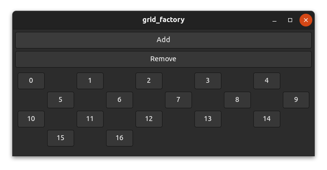
A chess grid
Let’s have a look at a more complex layout. It’s unlikely that this would be used in a real application, but it’s still interesting to have a look at it.
To create a chess grid layout, we need to place our widgets only on fields of one color and leave the other fields empty.

Actually, the code isn’t too complicated.
    fn position(&self, index: &usize) -> GridPosition {
        let index = *index as i32;

        // add a new row for every 5 elements
        let row = index / 5;
        // use every second column and move columns in uneven rows by 1
        let column = (index % 5) * 2 + row % 2;

        GridPosition {
            column,
            row,
            width: 1,
            height: 1,
        }
    }
And as you can see, it works!
Components
Technically, we already used components in the previous chapters. So far, we’ve only used one component per application, but in this chapter, we’re going to use multiple components to structure our app.
Components are independent parts of your application that can communicate with each other. They are used in a parent-child model: The main app component can have several components and each component can have child components and so on. This means that each component has a parent, except for the main app component which is at the top of this tree structure.
To showcase this, we will create a small application which opens a dialog when the user tries to close it. The header bar and the dialog will be implemented as standalone components.
When to use components
Components are very useful for separating parts of the UI into smaller, more manageable parts. They are not necessary but for larger applications, they can be very helpful.
Message handling
Components store their child components inside the model as a Controller<ChildModel> and handle output messages in the init function by calling the forward method.
        let header: Controller<HeaderModel> =
            HeaderModel::builder()
                .launch(())
                .forward(sender.input_sender(), |msg| match msg {
                    HeaderOutput::View => AppMsg::SetMode(AppMode::View),
                    HeaderOutput::Edit => AppMsg::SetMode(AppMode::Edit),
                    HeaderOutput::Export => AppMsg::SetMode(AppMode::Export),
                });
The forward method will redirect the output messages from the child component and transform them into the parent’s input messages.
Components are independent from each another so a component can be used easily with several different parent components. Therefore, the child component doesn’t know which type its parent component will have. Thus, the
forwardmethod allows the parent component to transform the output messages of child components to a message type it can handle properly.In this example,
HeaderOutputmessages are translated intoAppMsg.
Example application
Let’s write a small example app to see how components can be used in action. For this example, we write parts of an app that can edit images.
The app we will write in this chapter is also available here. Run
cargo run --example componentsfrom the example directory if you want to see the code in action.
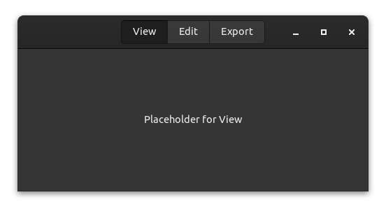
The header bar
Our first component will be a header bar. There are not a lot of advantages for writing this as component except for reducing the complexity in other parts of our UI.
The header bar will have three buttons for three modes that our application can have:
- View: View the image.
- Edit: Edit the image.
- Export: Export the image in different formats.
We will not implement the actual functionality, but instead use placeholders to keep things simple.
The model
Usually you want to store everything that affects only your component in the state of the component. However, in this case, there is no state that can be stored in the component, but only state that affects the root component (app). Therefore, we leave the model empty and only send messages to the root component.
struct HeaderModel;The message type allows us to switch between the modes.
#[derive(Debug)]
enum HeaderOutput {
    View,
    Edit,
    Export,
}
Our component needs no update method, because the view can emit the component’s output messages as part of its click signal handlers, as we will see in the next section.
The widgets
There’s nothing special about widgets of a child component. The only difference to the main app component is that the root widget doesn’t need to be a gtk::Window. Instead, we use a gtk::HeaderBar here, but theoretically the root widget doesn’t even need to be a widget at all (which can be useful in special cases).
view! {
#[root]
gtk::HeaderBar {
#[wrap(Some)]
set_title_widget = >k::Box {
add_css_class: "linked",
#[name = "group"]
gtk::ToggleButton {
set_label: "View",
set_active: true,
connect_toggled[sender] => move |btn| {
if btn.is_active() {
sender.output(HeaderOutput::View).unwrap()
}
},
},
gtk::ToggleButton {
set_label: "Edit",
set_group: Some(&group),
connect_toggled[sender] => move |btn| {
if btn.is_active() {
sender.output(HeaderOutput::Edit).unwrap()
}
},
},
gtk::ToggleButton {
set_label: "Export",
set_group: Some(&group),
connect_toggled[sender] => move |btn| {
if btn.is_active() {
sender.output(HeaderOutput::Export).unwrap()
}
},
},
}
}
}The close alert
As with a normal application used to edit files, we want to notify the user before they accidentally close the application and discard all progress. For this — you might have guessed it already — we will use another component.
The model
The state of the dialog only needs to store whether or not it’s hidden.
struct DialogModel {
    hidden: bool,
}
The message contains three options:
- Show is used by the parent to display the dialog.
- Accept is used internally to indicate that the user agreed to close the application.
- Cancel is used internally to indicate that the user changes his mind and doesn’t want to close the application.
#[derive(Debug)]
enum DialogInput {
    Show,
    Accept,
    Cancel,
}

#[derive(Debug)]
enum DialogOutput {
    Close,
}
The widgets
Unlike the last component, the DialogModel component doesn’t send its output messages from a signal handler. Instead, the response signal handler sends input messages to itself, handles them in update, and then sends output messages if necessary. This is a common pattern for more complex components.
If your component accepts non-internal inputs as well, you may want to mark the internal variants as
#[doc(hidden)]so that users of your component know they’re only intended for internal use.
view! {
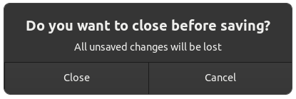
gtk::MessageDialog {
set_modal: true,
#[watch]
set_visible: !model.hidden,
set_text: Some("Do you want to close before saving?"),
set_secondary_text: Some("All unsaved changes will be lost"),
add_button: ("Close", gtk::ResponseType::Accept),
add_button: ("Cancel", gtk::ResponseType::Cancel),
connect_response[sender] => move |_, resp| {
sender.input(if resp == gtk::ResponseType::Accept {
DialogInput::Accept
} else {
DialogInput::Cancel
})
}
}
}In the update implementation, we match the input messages and emit an output if needed.
    fn update(&mut self, msg: Self::Input, sender: ComponentSender<Self>) {
        match msg {
            DialogInput::Show => self.hidden = false,
            DialogInput::Accept => {
                self.hidden = true;
                sender.output(DialogOutput::Close).unwrap()
            }
            DialogInput::Cancel => self.hidden = true,
        }
    }
The main app
Now all parts come together to form a single app.
The model
First, let’s define the model of the main app and its messages.
#[derive(Debug)]
enum AppMode {
    View,
    Edit,
    Export,
}

#[derive(Debug)]
enum AppMsg {
    SetMode(AppMode),
    CloseRequest,
    Close,
}

struct AppModel {
    mode: AppMode,
    header: Controller<HeaderModel>,
    dialog: Controller<DialogModel>,
}
The AppMode struct stores the modes the application can be in. The SetMode message is transformed from the output of our header bar component to update the state of the main application when someone presses a button in the header bar. The Close message is transformed from the output of the dialog component to indicate that the window should be closed.
In the model, we store the current AppMode as well as a Controller for each of our child components.
The update function of the model is pretty straightforward.
    fn update(&mut self, msg: Self::Input, _sender: ComponentSender<Self>) {
        match msg {
            AppMsg::SetMode(mode) => {
                self.mode = mode;
            }
            AppMsg::CloseRequest => {
                self.dialog.sender().send(DialogInput::Show).unwrap();
            }
            AppMsg::Close => {
                relm4::main_application().quit();
            }
        }
    }
We can retrieve a sender for the child component by calling the sender() method on the associated Controller, and then send messages of the associated Input type through it.
Controllers
When initializing the app component, we construct the child components by passing the appropriate Init and forwarding any desired inputs and outputs. This is done through a builder provided by Component implementations. We pass the initial parameters via the launch method, and then retrieve the final Controller by calling the forward method. In addition to starting the component, the forward method allows us to take the outputs of the component, transform them with a mapping function, and then pass the result as an input message to another sender (in this case, the input sender of the app component). If you don’t need to forward any outputs, you can start the component with the detach method instead.
    fn init(
        params: Self::Init,
        root: Self::Root,
        sender: ComponentSender<Self>,
    ) -> ComponentParts<Self> {
        let header: Controller<HeaderModel> =
            HeaderModel::builder()
                .launch(())
                .forward(sender.input_sender(), |msg| match msg {
                    HeaderOutput::View => AppMsg::SetMode(AppMode::View),
                    HeaderOutput::Edit => AppMsg::SetMode(AppMode::Edit),
                    HeaderOutput::Export => AppMsg::SetMode(AppMode::Export),
                });

        let dialog = DialogModel::builder()
            .transient_for(&root)
            .launch(true)
            .forward(sender.input_sender(), |msg| match msg {
                DialogOutput::Close => AppMsg::Close,
            });

        let model = AppModel {
            mode: params,
            header,
            dialog,
        };

        let widgets = view_output!();
        ComponentParts { model, widgets }
    }
Also, we set the set_transient_for property, which actually uses the main window. The dialog should set his parent window so that GTK can handle the dialog better. The GTK docs state: “[set_transient_for] allows window managers to e.g. keep the dialog on top of the main window, or center the dialog over the main window”.
#[derive(Debug)]
enum AppMode {
    View,
    Edit,
    Export,
}

#[derive(Debug)]
enum AppMsg {
    SetMode(AppMode),
    CloseRequest,
    Close,
}

struct AppModel {
    mode: AppMode,
    header: Controller<HeaderModel>,
    dialog: Controller<DialogModel>,
}
The widgets
We’re almost done! Lastly, let’s take a look at the app widgets.
    view! {
        main_window = gtk::Window {
            set_default_width: 500,
            set_default_height: 250,
            set_titlebar: Some(model.header.widget()),

            gtk::Label {
                #[watch]
                set_label: &format!("Placeholder for {:?}", model.mode),
            },
            connect_close_request[sender] => move |_| {
                sender.input(AppMsg::CloseRequest);
                gtk::glib::Propagation::Stop
            }
        }
    }
Most notably, we retrieve the root widget of our header component through the widget() method on the associated Controller to set it as a child of the main window.
Conclusion
You now know most of the secrets that Relm4 offers. Components can be powerful and if they are implemented correctly, they are even reusable across different apps. The relm4-components crate offers several reusable components you can use in your applications. In the following chapters, we’ll look at an even simpler component type called worker, how to implement reusable components yourself and how to use components with async code and multiple threads.
The complete code
Let’s review our code in one piece one more time to see how all these parts work together:
use gtk::prelude::{
ApplicationExt, ButtonExt, DialogExt, GtkWindowExt, ToggleButtonExt, WidgetExt,
};
use relm4::*;
struct HeaderModel;
#[derive(Debug)]
enum HeaderOutput {
View,
Edit,
Export,
}
#[relm4::component]
impl SimpleComponent for HeaderModel {
type Init = ();
type Input = ();
type Output = HeaderOutput;
view! {
#[root]
gtk::HeaderBar {
#[wrap(Some)]
set_title_widget = >k::Box {
add_css_class: "linked",
#[name = "group"]
gtk::ToggleButton {
set_label: "View",
set_active: true,
connect_toggled[sender] => move |btn| {
if btn.is_active() {
sender.output(HeaderOutput::View).unwrap()
}
},
},
gtk::ToggleButton {
set_label: "Edit",
set_group: Some(&group),
connect_toggled[sender] => move |btn| {
if btn.is_active() {
sender.output(HeaderOutput::Edit).unwrap()
}
},
},
gtk::ToggleButton {
set_label: "Export",
set_group: Some(&group),
connect_toggled[sender] => move |btn| {
if btn.is_active() {
sender.output(HeaderOutput::Export).unwrap()
}
},
},
}
}
}
fn init(
_params: Self::Init,
root: Self::Root,
sender: ComponentSender<Self>,
) -> ComponentParts<Self> {
let model = HeaderModel;
let widgets = view_output!();
ComponentParts { model, widgets }
}
}
struct DialogModel {
hidden: bool,
}
#[derive(Debug)]
enum DialogInput {
Show,
Accept,
Cancel,
}
#[derive(Debug)]
enum DialogOutput {
Close,
}
#[relm4::component]
impl SimpleComponent for DialogModel {
type Init = bool;
type Input = DialogInput;
type Output = DialogOutput;
view! {
gtk::MessageDialog {
set_modal: true,
#[watch]
set_visible: !model.hidden,
set_text: Some("Do you want to close before saving?"),
set_secondary_text: Some("All unsaved changes will be lost"),
add_button: ("Close", gtk::ResponseType::Accept),
add_button: ("Cancel", gtk::ResponseType::Cancel),
connect_response[sender] => move |_, resp| {
sender.input(if resp == gtk::ResponseType::Accept {
DialogInput::Accept
} else {
DialogInput::Cancel
})
}
}
}
fn init(
params: Self::Init,
root: Self::Root,
sender: ComponentSender<Self>,
) -> ComponentParts<Self> {
let model = DialogModel { hidden: params };
let widgets = view_output!();
ComponentParts { model, widgets }
}
fn update(&mut self, msg: Self::Input, sender: ComponentSender<Self>) {
match msg {
DialogInput::Show => self.hidden = false,
DialogInput::Accept => {
self.hidden = true;
sender.output(DialogOutput::Close).unwrap()
}
DialogInput::Cancel => self.hidden = true,
}
}
}
#[derive(Debug)]
enum AppMode {
View,
Edit,
Export,
}
#[derive(Debug)]
enum AppMsg {
SetMode(AppMode),
CloseRequest,
Close,
}
struct AppModel {
mode: AppMode,
header: Controller<HeaderModel>,
dialog: Controller<DialogModel>,
}
#[relm4::component]
impl SimpleComponent for AppModel {
type Init = AppMode;
type Input = AppMsg;
type Output = ();
view! {
main_window = gtk::Window {
set_default_width: 500,
set_default_height: 250,
set_titlebar: Some(model.header.widget()),
gtk::Label {
#[watch]
set_label: &format!("Placeholder for {:?}", model.mode),
},
connect_close_request[sender] => move |_| {
sender.input(AppMsg::CloseRequest);
gtk::glib::Propagation::Stop
}
}
}
fn init(
params: Self::Init,
root: Self::Root,
sender: ComponentSender<Self>,
) -> ComponentParts<Self> {
let header: Controller<HeaderModel> =
HeaderModel::builder()
.launch(())
.forward(sender.input_sender(), |msg| match msg {
HeaderOutput::View => AppMsg::SetMode(AppMode::View),
HeaderOutput::Edit => AppMsg::SetMode(AppMode::Edit),
HeaderOutput::Export => AppMsg::SetMode(AppMode::Export),
});
let dialog = DialogModel::builder()
.transient_for(&root)
.launch(true)
.forward(sender.input_sender(), |msg| match msg {
DialogOutput::Close => AppMsg::Close,
});
let model = AppModel {
mode: params,
header,
dialog,
};
let widgets = view_output!();
ComponentParts { model, widgets }
}
fn update(&mut self, msg: Self::Input, _sender: ComponentSender<Self>) {
match msg {
AppMsg::SetMode(mode) => {
self.mode = mode;
}
AppMsg::CloseRequest => {
self.dialog.sender().send(DialogInput::Show).unwrap();
}
AppMsg::Close => {
relm4::main_application().quit();
}
}
}
}
fn main() {
let relm = RelmApp::new("ewlm4.test.components");
relm.run::<AppModel>(AppMode::Edit);
}Introduction
Most user inputs are fairly easy to process. After receiving a message, you process it in the update function and update the view. Everything only takes a couple of milliseconds at most, so the user won’t even notice the slight delay.
However, when you have to perform complex calculations or I/O-bound operations that take more than a couple of milliseconds to complete, the user will start noticing that the app doesn’t feel reactive or “snappy” anymore. For example, such operations are performing network requests, filesystems operations or calculating the last digit of π.
To better visualize what happens, let’s look at the following image. The expected behavior is on the left, where processing of updates is fast and the app spends most of the time idle, waiting for new user inputs (aka events). Yet on the right, the update function is very slow and blocks the entire application so that no other events can be processed in the meantime and the view update is delayed.
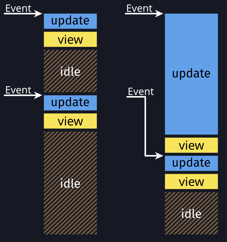
The behavior on the right will freeze the entire application and should be avoided. Fortunately, Relm4 gives you plenty of options to keep your application responsive.
Understanding the problem
In general, we can divide the problem into two categories:
- CPU-bound operations take a lot of time because actual work needs to be done by the CPU.
- I/O-bound operations take a lot of time because we have to wait for something to happen, for example, a response from a server. This means that we have CPU resources to do other things in the meantime, but to use them, we need a mechanism like async/await.
CPU-bound and other synchronous operations
Let’s look at an example of a CPU-bound operation.
For an app that generates cryptographic keys, you might define a generate_rsa_key() function.
This function takes some time to compute because generating the key is a difficult calculation so we can treat it as if it was implemented like this:
fn generate_rsa_key() {
    std::thread::sleep(Duration::from_secs(10));
}
If our component receives a GenerateKey message, we start generating the key.
    fn update(&mut self, msg: Self::Input, _sender: ComponentSender<Self>) {
        match msg {
            AppMsg::GenerateKey => {
                self.rsa_key = generate_rsa_key();
            }
        }
    }
Unfortunately, this will freeze our app. There’s no trick to avoid this, the CPU must do a lot of work to calculate the result. However, we can offload this work to other threads to keep our application responsive.
Possible solutions for this problem are:
- Workers: A component without widgets that runs on its own thread
- Commands: Offload tasks to a runtime in the background and receive a message when the task completes
Both are covered in the following chapters.
I/O-bound and other async operations
Let’s say we also need to perform a web-request to fetch existing encryption keys from a server. In theory, we could use a blocking HTTP client which would put us in the same situation as before. However, using async/await allows us to use the CPU for other things while we’re waiting for the response. The resulting asynchronous function could look like this.
async fn fetch_rsa_key() {
    tokio::time::sleep(Duration::from_secs(10)).await;
}
Since we now have an asynchronous function, we can’t simply call it like a regular function. Again, there are two options to make this work:
- Async components and factories: Asynchronous traits for components and factories
- Commands: Offload tasks to a runtime in the background and receive a message when the task completes
Workers
Workers are simply components that don’t have any widgets. They can be quite useful for applications that need to handle long tasks while remaining responsive. In particular, they are suitable for CPU-bound tasks which need to be handled one at the time because they run on a different thread.
Implementing a worker
A worker is implemented similarly to a component by using the Worker trait.
Since workers don’t have widgets, you don’t need to provide a Widgets type.
#[derive(Debug)]
enum AppMsg {
    Increment,
    Decrement,
}

#[derive(Debug)]
enum AsyncHandlerMsg {
    DelayedIncrement,
    DelayedDecrement,
}

struct AsyncHandler;

impl Worker for AsyncHandler {
    type Init = ();
    type Input = AsyncHandlerMsg;
    type Output = AppMsg;

    fn init(_init: Self::Init, _sender: ComponentSender<Self>) -> Self {
        Self
    }

    fn update(&mut self, msg: AsyncHandlerMsg, sender: ComponentSender<Self>) {
        // Simulating heavy CPU-bound task
        std::thread::sleep(Duration::from_secs(1));

        // Send the result of the calculation back
        match msg {
            AsyncHandlerMsg::DelayedIncrement => sender.output(AppMsg::Increment),
            AsyncHandlerMsg::DelayedDecrement => sender.output(AppMsg::Decrement),
        }
        .unwrap()
    }
}
Workers are constructed similarly to components, too.
Use the provided builder to retrieve a WorkerController.
    fn init(_: (), root: Self::Root, sender: ComponentSender<Self>) -> ComponentParts<Self> {
        let model = AppModel {
            counter: 0,
            worker: AsyncHandler::builder()
                .detach_worker(())
                .forward(sender.input_sender(), identity),
        };

        let widgets = view_output!();

        ComponentParts { model, widgets }
    }
Through the WorkerController, you can send and receive messages from the worker.
The worker’s update function will run on a separate thread, so your other components won’t be blocked.
struct AppModel {
    counter: u8,
    worker: WorkerController<AsyncHandler>,
}
Commands
In this chapter, we’ll have a look at commands, which are a simple yet extremely powerful mechanism to offload both CPU-bound and I/O-bound tasks to a separate runtime.
Commands are background tasks that can be spawned using a ComponentSender or FactorySender.
They run until they return their result as a CommandOutput message that will be processed by the component.
First, we define our message type so we can use it for the associated CommandOutput type in our component.
#[derive(Debug)]
enum CommandMsg {
    Data(RemoteData),
}
impl Component for CommandModel {
type CommandOutput = CommandMsg;Note: This only works with the
Componenttrait. The simplifiedSimpleComponenttrait doesn’t support commands.
In our update function, we start a new command using the oneshot_command() method.
This method allows us to spawn a future that will yield exactly one CommandOutput message at completion.
From the command, we call an asynchronous function that will handle the web request for us.
Once the future completes, the command returns a CommandMsg.
    fn update(&mut self, msg: Self::Input, sender: ComponentSender<Self>, _: &Self::Root) {
        match msg {
            CommandModelMsg::FetchData => {
                sender.oneshot_command(async {
                    // Run async background task
                    CommandMsg::Data(fetch_data().await)
                });
            }
        }
    }
Now, we can process the CommandMsg similar to regular app updates.
The method we use is called update_cmd() and is very similar to the regular update() function.
Only the message type is CommandOutput instead of Input.
From here, we can simply assign the result of the web request to our model.
    fn update_cmd(
        &mut self,
        message: Self::CommandOutput,
        _sender: ComponentSender<Self>,
        _: &Self::Root,
    ) {
        match message {
            CommandMsg::Data(data) => self.remote_data = data,
        }
    }
That’s it! It’s really as simple as starting a task and processing a message on completion.
With the
command()method, you are even more flexible because you can send multiple messages.
Synchronous tasks
You can use commands for synchronous operations, too.
Compared to the asynchronous methods, we need to add the spawn_ prefix to the method name to get the synchronous version.
Then, you can just pass a closure or a function pointer as task.
    fn update(&mut self, msg: Self::Input, sender: ComponentSender<Self>, _: &Self::Root) {
        match msg {
            CommandModelMsg::FetchData => {
                sender.spawn_oneshot_command(|| {
                    // Run CPU-bound background task
                    CommandMsg::Data(compute_result())
                });
            }
        }
    }
The rest is identical to the asynchronous version.
    fn update_cmd(
        &mut self,
        message: Self::CommandOutput,
        _sender: ComponentSender<Self>,
        _: &Self::Root,
    ) {
        match message {
            CommandMsg::Data(data) => self.remote_data = data,
        }
    }
Configuration
Commands run on a tokio runtime.
If you spawn a lot of commands in your application or want to fine-tune the runtime, you can set two static variables at the start of your main function to override the default value.
For example, Relm4 only uses one thread for asynchronous background tasks, which might not be enough.
Setting RELM_THREADS to 4 will increase the thread count by 3 additional threads.
Note: Setting the static variables must be done early. As soon as the runtime is initialized (which happens when it’s accessed for the first time), the values cannot be changed anymore.
Async components and factories
Asynchronous components and factories are almost identical compared to regular components and factories.
The only major difference is that they have asynchronous init, update and update_cmd methods.
This allows you to await almost everywhere from within the component.
The app we will write in this chapter is also available here. Run
cargo run --example simple_asyncfrom the example directory if you want to see the code in action.
Because Rust doesn’t support async traits yet, we need macros to add support for this feature.
To tell the component macro that we’re using an async trait, we pass the async parameter to it.
The component macro will then utilize the async_trait crate behind the scenes to make everything work.
Also, we need to use AsyncComponent instead of Component as trait.
Apart from that, the first section is identical.
Similarly, the
factorymacro needs theasyncparameter for async factories and the trait changes fromFactoryComponenttoAsyncFactoryComponent.
#[relm4::component(async)]
impl AsyncComponent for App {
    type Init = u8;
    type Input = Msg;
    type Output = ();
    type CommandOutput = ();
Most functions of async component and factory traits are asynchronous, which allows us to await on futures within those functions.
Apart from that, only a couple of types need to be adjusted for the async versions of the traits, for example AsyncComponentSender and AsyncComponentParts.
    async fn init(
        counter: Self::Init,
        root: Self::Root,
        sender: AsyncComponentSender<Self>,
    ) -> AsyncComponentParts<Self> {
        tokio::time::sleep(Duration::from_secs(1)).await;

        let model = App { counter };

        // Insert the code generation of the view! macro here
        let widgets = view_output!();

        AsyncComponentParts { model, widgets }
    }
Awaiting in the init function allows us to perform a late initialization. Depending on how you implement the init function, it might take a long time to complete. Not showing anything in this case can look very odd. Therefore, Relm4 allows you to specify widgets that will be displayed while your async component is initialized.
If your init function doesn’t await or completes quickly, you don’t need to implement
init_loading_widgets.
    fn init_loading_widgets(root: Self::Root) -> Option<LoadingWidgets> {
        view! {
            #[local]
            root {
                set_title: Some("Simple app"),
                set_default_size: (300, 100),

                // This will be removed automatically by
                // LoadingWidgets when the full view has loaded
                #[name(spinner)]
                gtk::Spinner {
                    start: (),
                    set_halign: gtk::Align::Center,
                }
            }
        }
        Some(LoadingWidgets::new(root, spinner))
    }
In this case, we do some basic initialization of our root widget upfront and also add a Spinner for a nice loading animation.
As soon as the init function returns, the temporary spinner will be removed automatically and the widgets from the view! macro will be inserted instead.
Finally, the update function completes the trait implementation.
Notably, awaiting slow futures will block the processing of further messages.
In other words, the update function can only process one message afters the other.
Because we use async however, this only affects each async component individually and all other components won’t be affected.
If you want to process multiple messages at the same time, you should consider using commands.
    async fn update(
        &mut self,
        msg: Self::Input,
        _sender: AsyncComponentSender<Self>,
        _root: &Self::Root,
    ) {
        tokio::time::sleep(Duration::from_secs(1)).await;
        match msg {
            Msg::Increment => {
                self.counter = self.counter.wrapping_add(1);
            }
            Msg::Decrement => {
                self.counter = self.counter.wrapping_sub(1);
            }
        }
    }
The complete code
use std::time::Duration;

use gtk::prelude::*;
use relm4::{
    component::{AsyncComponent, AsyncComponentParts, AsyncComponentSender},
    gtk,
    loading_widgets::LoadingWidgets,
    view, RelmApp, RelmWidgetExt,
};

struct App {
    counter: u8,
}

#[derive(Debug)]
enum Msg {
    Increment,
    Decrement,
}

#[relm4::component(async)]
impl AsyncComponent for App {
    type Init = u8;
    type Input = Msg;
    type Output = ();
    type CommandOutput = ();

    view! {
        gtk::Window {
            gtk::Box {
                set_orientation: gtk::Orientation::Vertical,
                set_spacing: 5,
                set_margin_all: 5,

                gtk::Button {
                    set_label: "Increment",
                    connect_clicked => Msg::Increment,
                },

                gtk::Button {
                    set_label: "Decrement",
                    connect_clicked => Msg::Decrement,
                },

                gtk::Label {
                    #[watch]
                    set_label: &format!("Counter: {}", model.counter),
                    set_margin_all: 5,
                }
            }
        }
    }

    fn init_loading_widgets(root: Self::Root) -> Option<LoadingWidgets> {
        view! {
            #[local]
            root {
                set_title: Some("Simple app"),
                set_default_size: (300, 100),

                // This will be removed automatically by
                // LoadingWidgets when the full view has loaded
                #[name(spinner)]
                gtk::Spinner {
                    start: (),
                    set_halign: gtk::Align::Center,
                }
            }
        }
        Some(LoadingWidgets::new(root, spinner))
    }

    async fn init(
        counter: Self::Init,
        root: Self::Root,
        sender: AsyncComponentSender<Self>,
    ) -> AsyncComponentParts<Self> {
        tokio::time::sleep(Duration::from_secs(1)).await;

        let model = App { counter };

        // Insert the code generation of the view! macro here
        let widgets = view_output!();

        AsyncComponentParts { model, widgets }
    }

    async fn update(
        &mut self,
        msg: Self::Input,
        _sender: AsyncComponentSender<Self>,
        _root: &Self::Root,
    ) {
        tokio::time::sleep(Duration::from_secs(1)).await;
        match msg {
            Msg::Increment => {
                self.counter = self.counter.wrapping_add(1);
            }
            Msg::Decrement => {
                self.counter = self.counter.wrapping_sub(1);
            }
        }
    }
}

fn main() {
    let app = RelmApp::new("relm4.example.simple_async");
    app.run_async::<App>(0);
}
Overview
| Option | Synchronous | Async | Non-blocking | !Send |
|---|---|---|---|---|
| Workers | ✅ | ❌ | ❌ | ❌ |
| Async components and factories | ❌ | ✅ | ❌ | ✅ |
| Commands | ✅ | ✅ | ✅ | ❌ |
In this context, non-blocking means you can have run multiple instances at the same time.
!Send means that the types involved don’t need to implement Send so you can use widgets or Rc for example.
Summary
-
Async components and factories:
- Run asynchronous tasks on the main runtime
- Allow other components to keep running while awaiting futures
- Await during initialization or updates
-
Commands:
- Run tasks on a runtime in the background
- Supports both synchronous and asynchronous tasks
- Run several tasks in parallel
- Drop tasks as soon as the component is destroyed
-
Workers:
- Handle IO-bound or CPU-intensive tasks one at the time on a different thread
- The update function should be executed in another thread
- You need a model to store state for processing messages
Child components
In this chapter, we will implement a simple alert dialog as a reusable child component.
The alert example in the Relm4 repository implements a simple app for the alert component that we will write in this chapter. It’s an other variant of a counter app, yet this time a dialog will be displayed if the counter does not match 42 when closing. The main difference in the implementation is, that the dialog is implemented as component that can be reused in other applications.
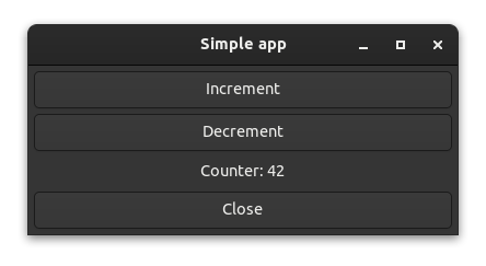
This is how the dialog looks like in the alert example:
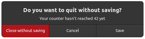
If you want to see an alert component very similar to the one we will write in this chapter, have a look at the “alert” example. Run
cargo run --example alertfrom the relm4-components/examples directory if you want to see the code in action.
The alert component
The alert component is defined similar to the other components we’ve implemented in this book.
Our model stores whether the component is visible and the configuration.
/// Alert dialog component.
pub struct Alert {
    settings: AlertSettings,
    is_active: bool,
}
We define a Widgets, Init, Input and Output type as usual.
    type Widgets = AlertWidgets;
    type Init = AlertSettings;
    type Input = AlertMsg;
    type Output = AlertResponse;
The Init param is a settings object that is used to configure the component.
This maximizes the reusability of the component by letting it adapt to different use-cases.
/// Configuration for the alert dialog component
pub struct AlertSettings {
    /// Large text
    pub text: String,
    /// Optional secondary, smaller text
    pub secondary_text: Option<String>,
    /// Modal dialogs freeze other windows as long they are visible
    pub is_modal: bool,
    /// Sets color of the accept button to red if the theme supports it
    pub destructive_accept: bool,
    /// Text for confirm button
    pub confirm_label: String,
    /// Text for cancel button
    pub cancel_label: String,
    /// Text for third option button. If [`None`] the third button won't be created.
    pub option_label: Option<String>,
}
In the Input type, this component uses #[doc(hidden)] on the Response variant. This is a useful pattern for component-internal messages that are not intended to be sent by outside callers. This allows us to update the component when the underlying dialog reports a response, but not display the Response variant in the component’s documentation.
/// Messages that can be sent to the alert dialog component
#[derive(Debug)]
pub enum AlertMsg {
    /// Message sent by the parent to view the dialog
    Show,

    #[doc(hidden)]
    Response(gtk::ResponseType),
}
The Output type allows us to report the user’s response back to a parent component.
/// User action performed on the alert dialog.
#[derive(Debug)]
pub enum AlertResponse {
    /// User clicked confirm button.
    Confirm,

    /// User clicked cancel button.
    Cancel,

    /// User clicked user-supplied option.
    Option,
}
The update function handles the Show message from our parent component and the Response messages generated by user interactions. It also sends the appropriate messages to the parent through the output sender.
    fn update(&mut self, input: AlertMsg, sender: ComponentSender<Self>) {
        match input {
            AlertMsg::Show => {
                self.is_active = true;
            }
            AlertMsg::Response(ty) => {
                self.is_active = false;
                sender
                    .output(match ty {
                        gtk::ResponseType::Accept => AlertResponse::Confirm,
                        gtk::ResponseType::Other(_) => AlertResponse::Option,
                        _ => AlertResponse::Cancel,
                    })
                    .unwrap();
            }
        }
    }
When initializing the model, we conditionally set up some widgets based on the settings passed by the caller. We set is_active to false since the dialog is not currently displayed.
    fn init(
        settings: AlertSettings,
        root: Self::Root,
        sender: ComponentSender<Self>,
    ) -> ComponentParts<Self> {
        let model = Alert {
            settings,
            is_active: false,
        };

        let widgets = view_output!();

        if let Some(option_label) = &model.settings.option_label {
            widgets
                .dialog
                .add_button(option_label, gtk::ResponseType::Other(0));
        }

        if model.settings.destructive_accept {
            let accept_widget = widgets
                .dialog
                .widget_for_response(gtk::ResponseType::Accept)
                .expect("No button for accept response set");
            accept_widget.add_css_class("destructive-action");
        }

        ComponentParts { model, widgets }
    }
Lastly, the view. Note that the component connects to the response
signal of the underlying dialog and sends an input to itself when a response is received.
    view! {
        #[name = "dialog"]
        gtk::MessageDialog {
            set_message_type: gtk::MessageType::Question,
            #[watch]
            set_visible: model.is_active,
            connect_response[sender] => move |_, response| {
                sender.input(AlertMsg::Response(response));
            },

            // Apply configuration
            set_text: Some(&model.settings.text),
            set_secondary_text: model.settings.secondary_text.as_deref(),
            set_modal: model.settings.is_modal,
            add_button: (&model.settings.confirm_label, gtk::ResponseType::Accept),
            add_button: (&model.settings.cancel_label, gtk::ResponseType::Cancel),
        }
    }
Usage
With the component complete, let’s use it!
struct App {
    counter: u8,
    alert_toggle: bool,
    dialog: Controller<Alert>,
    second_dialog: Controller<Alert>,
}
#[derive(Debug)]
enum AppMsg {
Increment,
Decrement,
CloseRequest,
Save,
Close,
Ignore,
}
#[relm4::component]
impl SimpleComponent for App {
type Input = AppMsg;
type Output = ();
type Init = ();
view! {
main_window = gtk::ApplicationWindow {
set_title: Some("Simple app"),
set_default_width: 300,
set_default_height: 100,
connect_close_request[sender] => move |_| {
sender.input(AppMsg::CloseRequest);
gtk::glib::Propagation::Stop
},
gtk::Box {
set_orientation: gtk::Orientation::Vertical,
set_margin_all: 5,
set_spacing: 5,
append = >k::Button {
set_label: "Increment",
connect_clicked[sender] => move |_| {
sender.input(AppMsg::Increment);
},
},
append = >k::Button {
set_label: "Decrement",
connect_clicked[sender] => move |_| {
sender.input(AppMsg::Decrement);
},
},
append = >k::Label {
set_margin_all: 5,
#[watch]
set_label: &format!("Counter: {}", model.counter),
},
append = >k::Button {
set_label: "Close",
connect_clicked[sender] => move |_| {
sender.input(AppMsg::CloseRequest);
},
},
},
}
}
fn update(&mut self, msg: AppMsg, _sender: ComponentSender<Self>) {
match msg {
AppMsg::Increment => {
self.counter = self.counter.wrapping_add(1);
}
AppMsg::Decrement => {
self.counter = self.counter.wrapping_sub(1);
}
AppMsg::CloseRequest => {
if self.counter == 42 {
relm4::main_application().quit();
} else {
self.alert_toggle = !self.alert_toggle;
if self.alert_toggle {
self.dialog.emit(AlertMsg::Show);
} else {
self.second_dialog.emit(AlertMsg::Show);
}
}
}
AppMsg::Save => {
println!("* Open save dialog here *");
}
AppMsg::Close => {
relm4::main_application().quit();
}
AppMsg::Ignore => (),
}
}
    fn init(_: (), root: Self::Root, sender: ComponentSender<Self>) -> ComponentParts<Self> {
        let model = App {
            counter: 0,
            alert_toggle: false,
            dialog: Alert::builder()
                .transient_for(&root)
                .launch(AlertSettings {
                    text: String::from("Do you want to quit without saving? (First alert)"),
                    secondary_text: Some(String::from("Your counter hasn't reached 42 yet")),
                    confirm_label: String::from("Close without saving"),
                    cancel_label: String::from("Cancel"),
                    option_label: Some(String::from("Save")),
                    is_modal: true,
                    destructive_accept: true,
                })
                .forward(sender.input_sender(), convert_alert_response),
            second_dialog: Alert::builder()
                .transient_for(&root)
                .launch(AlertSettings {
                    text: String::from("Do you want to quit without saving? (Second alert)"),
                    secondary_text: Some(String::from("Your counter hasn't reached 42 yet")),
                    confirm_label: String::from("Close without saving"),
                    cancel_label: String::from("Cancel"),
                    option_label: Some(String::from("Save")),
                    is_modal: true,
                    destructive_accept: true,
                })
                .forward(sender.input_sender(), convert_alert_response),
        };

        let widgets = view_output!();

        ComponentParts { model, widgets }
    }
}
fn convert_alert_response(response: AlertResponse) -> AppMsg {
match response {
AlertResponse::Confirm => AppMsg::Close,
AlertResponse::Cancel => AppMsg::Ignore,
AlertResponse::Option => AppMsg::Save,
}
}
fn main() {
let app = RelmApp::new("relm4.example.alert");
app.run::<App>(());
}This is mostly stuff that we’ve already done in previous chapters, but there are a few additional things to know about interacting with child components.
Notably, we need to wrap the types of the child components in Controllers to be able to store them in the App model.
struct App {
counter: u8,
alert_toggle: bool,
dialog: Controller<Alert>,
second_dialog: Controller<Alert>,
}We initialize them with the builder pattern in the init method.
fn init(_: (), root: Self::Root, sender: ComponentSender<Self>) -> ComponentParts<Self> {
let model = App {
counter: 0,
alert_toggle: false,
dialog: Alert::builder()
.transient_for(&root)
.launch(AlertSettings {
text: String::from("Do you want to quit without saving? (First alert)"),
secondary_text: Some(String::from("Your counter hasn't reached 42 yet")),
confirm_label: String::from("Close without saving"),
cancel_label: String::from("Cancel"),
option_label: Some(String::from("Save")),
is_modal: true,
destructive_accept: true,
})
.forward(sender.input_sender(), convert_alert_response),
second_dialog: Alert::builder()
.transient_for(&root)
.launch(AlertSettings {
text: String::from("Do you want to quit without saving? (Second alert)"),
secondary_text: Some(String::from("Your counter hasn't reached 42 yet")),
confirm_label: String::from("Close without saving"),
cancel_label: String::from("Cancel"),
option_label: Some(String::from("Save")),
is_modal: true,
destructive_accept: true,
})
.forward(sender.input_sender(), convert_alert_response),
};
let widgets = view_output!();
ComponentParts { model, widgets }
}We call transient_for(root) on the builder to indicate to GTK that our root widget is transient for the main application window. This allows window managers to handle the dialog window differently, e.g. by drawing it on top of other windows.
See the set_transient_for documentation for more information.
            AppMsg::CloseRequest => {
                if self.counter == 42 {
                    relm4::main_application().quit();
                } else {
                    self.alert_toggle = !self.alert_toggle;
                    if self.alert_toggle {
                        self.dialog.emit(AlertMsg::Show);
                    } else {
                        self.second_dialog.emit(AlertMsg::Show);
                    }
                }
            }
That’s it! You can find more examples of reusable components in the relm4-components crate here. You can also contribute your own reusable components to relm4-components :)
The complete code
Let’s review all our code in one piece one more time to see how all these parts work together:
use gtk::prelude::*;
use relm4::prelude::*;
use relm4::Controller;
/// Configuration for the alert dialog component
pub struct AlertSettings {
/// Large text
pub text: String,
/// Optional secondary, smaller text
pub secondary_text: Option<String>,
/// Modal dialogs freeze other windows as long they are visible
pub is_modal: bool,
/// Sets color of the accept button to red if the theme supports it
pub destructive_accept: bool,
/// Text for confirm button
pub confirm_label: String,
/// Text for cancel button
pub cancel_label: String,
/// Text for third option button. If [`None`] the third button won't be created.
pub option_label: Option<String>,
}
/// Alert dialog component.
pub struct Alert {
settings: AlertSettings,
is_active: bool,
}
/// Messages that can be sent to the alert dialog component
#[derive(Debug)]
pub enum AlertMsg {
/// Message sent by the parent to view the dialog
Show,
#[doc(hidden)]
Response(gtk::ResponseType),
}
/// User action performed on the alert dialog.
#[derive(Debug)]
pub enum AlertResponse {
/// User clicked confirm button.
Confirm,
/// User clicked cancel button.
Cancel,
/// User clicked user-supplied option.
Option,
}
/// Widgets of the alert dialog component.
#[relm4::component(pub)]
impl SimpleComponent for Alert {
type Widgets = AlertWidgets;
type Init = AlertSettings;
type Input = AlertMsg;
type Output = AlertResponse;
view! {
#[name = "dialog"]
gtk::MessageDialog {
set_message_type: gtk::MessageType::Question,
#[watch]
set_visible: model.is_active,
connect_response[sender] => move |_, response| {
sender.input(AlertMsg::Response(response));
},
// Apply configuration
set_text: Some(&model.settings.text),
set_secondary_text: model.settings.secondary_text.as_deref(),
set_modal: model.settings.is_modal,
add_button: (&model.settings.confirm_label, gtk::ResponseType::Accept),
add_button: (&model.settings.cancel_label, gtk::ResponseType::Cancel),
}
}
fn init(
settings: AlertSettings,
root: Self::Root,
sender: ComponentSender<Self>,
) -> ComponentParts<Self> {
let model = Alert {
settings,
is_active: false,
};
let widgets = view_output!();
if let Some(option_label) = &model.settings.option_label {
widgets
.dialog
.add_button(option_label, gtk::ResponseType::Other(0));
}
if model.settings.destructive_accept {
let accept_widget = widgets
.dialog
.widget_for_response(gtk::ResponseType::Accept)
.expect("No button for accept response set");
accept_widget.add_css_class("destructive-action");
}
ComponentParts { model, widgets }
}
fn update(&mut self, input: AlertMsg, sender: ComponentSender<Self>) {
match input {
AlertMsg::Show => {
self.is_active = true;
}
AlertMsg::Response(ty) => {
self.is_active = false;
sender
.output(match ty {
gtk::ResponseType::Accept => AlertResponse::Confirm,
gtk::ResponseType::Other(_) => AlertResponse::Option,
_ => AlertResponse::Cancel,
})
.unwrap();
}
}
}
}
struct App {
counter: u8,
alert_toggle: bool,
dialog: Controller<Alert>,
second_dialog: Controller<Alert>,
}
#[derive(Debug)]
enum AppMsg {
Increment,
Decrement,
CloseRequest,
Save,
Close,
Ignore,
}
#[relm4::component]
impl SimpleComponent for App {
type Input = AppMsg;
type Output = ();
type Init = ();
view! {
main_window = gtk::ApplicationWindow {
set_title: Some("Simple app"),
set_default_width: 300,
set_default_height: 100,
connect_close_request[sender] => move |_| {
sender.input(AppMsg::CloseRequest);
gtk::glib::Propagation::Stop
},
gtk::Box {
set_orientation: gtk::Orientation::Vertical,
set_margin_all: 5,
set_spacing: 5,
append = >k::Button {
set_label: "Increment",
connect_clicked[sender] => move |_| {
sender.input(AppMsg::Increment);
},
},
append = >k::Button {
set_label: "Decrement",
connect_clicked[sender] => move |_| {
sender.input(AppMsg::Decrement);
},
},
append = >k::Label {
set_margin_all: 5,
#[watch]
set_label: &format!("Counter: {}", model.counter),
},
append = >k::Button {
set_label: "Close",
connect_clicked[sender] => move |_| {
sender.input(AppMsg::CloseRequest);
},
},
},
}
}
fn update(&mut self, msg: AppMsg, _sender: ComponentSender<Self>) {
match msg {
AppMsg::Increment => {
self.counter = self.counter.wrapping_add(1);
}
AppMsg::Decrement => {
self.counter = self.counter.wrapping_sub(1);
}
AppMsg::CloseRequest => {
if self.counter == 42 {
relm4::main_application().quit();
} else {
self.alert_toggle = !self.alert_toggle;
if self.alert_toggle {
self.dialog.emit(AlertMsg::Show);
} else {
self.second_dialog.emit(AlertMsg::Show);
}
}
}
AppMsg::Save => {
println!("* Open save dialog here *");
}
AppMsg::Close => {
relm4::main_application().quit();
}
AppMsg::Ignore => (),
}
}
fn init(_: (), root: Self::Root, sender: ComponentSender<Self>) -> ComponentParts<Self> {
let model = App {
counter: 0,
alert_toggle: false,
dialog: Alert::builder()
.transient_for(&root)
.launch(AlertSettings {
text: String::from("Do you want to quit without saving? (First alert)"),
secondary_text: Some(String::from("Your counter hasn't reached 42 yet")),
confirm_label: String::from("Close without saving"),
cancel_label: String::from("Cancel"),
option_label: Some(String::from("Save")),
is_modal: true,
destructive_accept: true,
})
.forward(sender.input_sender(), convert_alert_response),
second_dialog: Alert::builder()
.transient_for(&root)
.launch(AlertSettings {
text: String::from("Do you want to quit without saving? (Second alert)"),
secondary_text: Some(String::from("Your counter hasn't reached 42 yet")),
confirm_label: String::from("Close without saving"),
cancel_label: String::from("Cancel"),
option_label: Some(String::from("Save")),
is_modal: true,
destructive_accept: true,
})
.forward(sender.input_sender(), convert_alert_response),
};
let widgets = view_output!();
ComponentParts { model, widgets }
}
}
fn convert_alert_response(response: AlertResponse) -> AppMsg {
match response {
AlertResponse::Confirm => AppMsg::Close,
AlertResponse::Cancel => AppMsg::Ignore,
AlertResponse::Option => AppMsg::Save,
}
}
fn main() {
let app = RelmApp::new("relm4.example.alert");
app.run::<App>(());
}Widget templates
Widget templates are a simple way to define reusable UI elements. When building complex UIs, they allow you to focus on the application logic instead of complex trees of widgets. Yet most importantly, widget templates help you to reduce redundant code. For example, if you use a widget with the same properties multiple times in your code, templates will make your code a lot shorter.
The app we will write in this chapter is also available here. Run
cargo run --example widget_templatefrom the example directory if you want to see the code in action.
Defining templates
To define a widget template, you need to implement the WidgetTemplate trait for a new type.
You could do this manually, but the easiest solution is to use the #[relm4::widget_template] attribute macro.
The macro will create the type and implement the trait for you.
For example, the following code block will create a template for a gtk::Box with a certain margin and custom CSS.
#[relm4::widget_template]
impl WidgetTemplate for MyBox {
    view! {
        gtk::Box {
            set_margin_all: 10,
            // Make the boxes visible
            inline_css: "border: 2px solid blue",
        }
    }
}
Similarly, we can create a template for a gtk::Spinner that already spins when it’s created.
#[relm4::widget_template]
impl WidgetTemplate for MySpinner {
    view! {
        gtk::Spinner {
            set_spinning: true,
        }
    }
}
To create public templates, you can use
#[relm4::widget_template(pub)], similar to the#[relm4::component(pub)]macro.
Template children
Templates are more than just pre-initialized widgets.
They can also have children, which can be referred to later as template children.
This is very useful if you use nested widget in you UI, because the template allows you to flatten the structure.
In other words, no matter how deeply nested a template child is, it will always be accessible directly from the template.
We’ll see how this works in the next section, but first we’ll create a deeply nested template.
We use the templates we defined earlier by using the #[template] attribute.
Also, we assign the name child_label to our last widget, which is all we need to make it a template child.
In general, naming a widget in a template is all that’s needed to make it a template child.
#[relm4::widget_template]
impl WidgetTemplate for CustomBox {
    view! {
        gtk::Box {
            set_orientation: gtk::Orientation::Vertical,
            set_margin_all: 5,
            set_spacing: 5,

            #[template]
            MyBox {
                #[template]
                MySpinner,

                #[template]
                MyBox {
                    #[template]
                    MySpinner,

                    #[template]
                    MyBox {
                        #[template]
                        MySpinner,

                        // Deeply nested!
                        #[name = "child_label"]
                        gtk::Label {
                            set_label: "This is a test",
                        }
                    }
                }
            }
        }
    }
}
Using templates
To use templates in a component, we use the #[template] and #[template_child] attributes.
In this case, we use the CustomBox type we just defined with the #[template] attribute we already used.
To access its child_label template child, we only need to use the #[template_child] attribute and the name of the child.
As you can see, we now have access to the child_label widget, which actually is wrapped into 4 gtk::Box widgets.
We can even use assign or overwrite properties of the template and its children, similar to regular widgets.
Here, we use the #[watch] attribute to update the label with the latest counter value.
#[relm4::component]
impl SimpleComponent for AppModel {
    type Init = u8;
    type Input = AppMsg;
    type Output = ();

    view! {
        gtk::Window {
            set_title: Some("Widget template"),
            set_default_width: 300,
            set_default_height: 100,

            #[template]
            CustomBox {
                gtk::Button {
                    set_label: "Increment",
                    connect_clicked[sender] => move |_| {
                        sender.input(AppMsg::Increment);
                    },
                },
                gtk::Button {
                    set_label: "Decrement",
                    connect_clicked[sender] => move |_| {
                        sender.input(AppMsg::Decrement);
                    },
                },
                #[template_child]
                child_label {
                    #[watch]
                    set_label: &format!("Counter: {}", model.counter),
                }
            },
        }
    }
Some notes on orders
If you run this code, you will notice that the label appears above the two buttons, which is contrary to our widget definition.
This happens because widget templates are initialized before other modifications happen.
The CustomBox template will initialize its child_label and append it to its internal gtk::Box widget and only then the two buttons are added.
However, you can work around this by using methods like prepend, append or insert_child_after (if you use a gtk::Box as container) or by splitting your templates into smaller ones.
To make template children appear in the same order as they are used, widget templates would require dynamic initialization of its children. This would increase the complexity of the internal implementation by a lot (or might not be possible at all) and is therefore not planned at the moment.
The complete code
use gtk::prelude::{BoxExt, ButtonExt, GtkWindowExt, OrientableExt};
use relm4::{
    gtk, ComponentParts, ComponentSender, RelmApp, RelmWidgetExt, SimpleComponent, WidgetTemplate,
};

#[relm4::widget_template]
impl WidgetTemplate for MyBox {
    view! {
        gtk::Box {
            set_margin_all: 10,
            // Make the boxes visible
            inline_css: "border: 2px solid blue",
        }
    }
}

#[relm4::widget_template]
impl WidgetTemplate for MySpinner {
    view! {
        gtk::Spinner {
            set_spinning: true,
        }
    }
}

#[relm4::widget_template]
impl WidgetTemplate for CustomBox {
    view! {
        gtk::Box {
            set_orientation: gtk::Orientation::Vertical,
            set_margin_all: 5,
            set_spacing: 5,

            #[template]
            MyBox {
                #[template]
                MySpinner,

                #[template]
                MyBox {
                    #[template]
                    MySpinner,

                    #[template]
                    MyBox {
                        #[template]
                        MySpinner,

                        // Deeply nested!
                        #[name = "child_label"]
                        gtk::Label {
                            set_label: "This is a test",
                        }
                    }
                }
            }
        }
    }
}

#[derive(Default)]
struct AppModel {
    counter: u8,
}

#[derive(Debug)]
enum AppMsg {
    Increment,
    Decrement,
}

#[relm4::component]
impl SimpleComponent for AppModel {
    type Init = u8;
    type Input = AppMsg;
    type Output = ();

    view! {
        gtk::Window {
            set_title: Some("Widget template"),
            set_default_width: 300,
            set_default_height: 100,

            #[template]
            CustomBox {
                gtk::Button {
                    set_label: "Increment",
                    connect_clicked[sender] => move |_| {
                        sender.input(AppMsg::Increment);
                    },
                },
                gtk::Button {
                    set_label: "Decrement",
                    connect_clicked[sender] => move |_| {
                        sender.input(AppMsg::Decrement);
                    },
                },
                #[template_child]
                child_label {
                    #[watch]
                    set_label: &format!("Counter: {}", model.counter),
                }
            },
        }
    }

    fn init(
        counter: Self::Init,
        root: Self::Root,
        sender: ComponentSender<Self>,
    ) -> ComponentParts<Self> {
        let model = Self { counter };

        let widgets = view_output!();

        ComponentParts { model, widgets }
    }

    fn update(&mut self, msg: AppMsg, _sender: ComponentSender<Self>) {
        match msg {
            AppMsg::Increment => {
                self.counter = self.counter.wrapping_add(1);
            }
            AppMsg::Decrement => {
                self.counter = self.counter.wrapping_sub(1);
            }
        }
    }
}

fn main() {
    let app = RelmApp::new("relm4.example.widget_template");
    app.run::<AppModel>(0);
}
Accessing Nested Template Elements
Starting from the version 0.6.2, you can access nested elements on templates.
Imagine a template called “MainWindow” which contains pages as Widget Templates:
#[relm4::widget_template]
impl WidgetTemplate for MainWindow {
    view! {
        gtk::Window {
            set_title: Some("Nested Widget template"),
            set_default_width: 300,
            set_default_height: 100,

            gtk::Box {
                set_orientation: gtk::Orientation::Vertical,

                #[name(stk_pages)]
                gtk::Stack {
                    set_margin_all: 7,

                    #[template]
                    #[name = "home_page"]
                    add_child = &HomePage {} -> {
                        set_name: "main",
                    },

                    #[template]
                    #[name = "settings_page"]
                    add_child = &SettingsPage {} -> {
                        set_name: "settings",
                    },
                },

            },
        }
    }
}
SettingsPage and HomePage are also a widget template:
#[relm4::widget_template]
impl WidgetTemplate for HomePage {
view! {
gtk::Box {
set_orientation: gtk::Orientation::Vertical,
set_spacing: 3,
#[name = "btn_go_settings"]
gtk::Button {
#[wrap(Some)]
set_child = >k::Image {
set_icon_name: Some("emblem-system-symbolic"),
},
},
}
}
}#[relm4::widget_template]
impl WidgetTemplate for SettingsPage {
view! {
gtk::Box {
set_orientation: gtk::Orientation::Vertical,
set_spacing: 3,
#[name = "btn_dark_mode"]
gtk::Button {
#[wrap(Some)]
set_child = >k::Image {
set_icon_name: Some("night-light-symbolic"),
},
},
#[name = "btn_go_homepage"]
gtk::Button {
#[wrap(Some)]
set_child = >k::Image {
set_icon_name: Some("user-home-symbolic"),
},
},
}
}
}If you want to handle MainWindow->SettingsPage->btn_dark_mode’s clicked event, you can simply do it like this:
#[derive(Default)]
struct AppModel {
    current_page: &'static str,
}

#[derive(Debug)]
enum Message {
    PageHome,
    PageSettings,
    DarkMode,
}

#[relm4::component]
impl SimpleComponent for AppModel {
    type Init = ();
    type Input = Message;
    type Output = ();

    view! {

        #[template]
        MainWindow {

            #[template_child]
            settings_page.btn_dark_mode {
                connect_clicked => Message::DarkMode
            },

            #[template_child]
            settings_page.btn_go_homepage {
                connect_clicked => Message::PageHome
            },

            #[template_child]
            home_page.btn_go_settings {
                connect_clicked => Message::PageSettings
            },

            #[template_child]
            stk_pages {
                #[watch]
                set_visible_child_name: model.current_page,
            }
        },
    }
The complete code
use gtk::prelude::{BoxExt, ButtonExt, GtkWindowExt, OrientableExt};
use relm4::{gtk, ComponentParts, ComponentSender, RelmApp, RelmWidgetExt, SimpleComponent, WidgetTemplate};
#[relm4::widget_template]
impl WidgetTemplate for HomePage {
view! {
gtk::Box {
set_orientation: gtk::Orientation::Vertical,
set_spacing: 3,
#[name = "btn_go_settings"]
gtk::Button {
#[wrap(Some)]
set_child = >k::Image {
set_icon_name: Some("emblem-system-symbolic"),
},
},
}
}
}
#[relm4::widget_template]
impl WidgetTemplate for SettingsPage {
view! {
gtk::Box {
set_orientation: gtk::Orientation::Vertical,
set_spacing: 3,
#[name = "btn_dark_mode"]
gtk::Button {
#[wrap(Some)]
set_child = >k::Image {
set_icon_name: Some("night-light-symbolic"),
},
},
#[name = "btn_go_homepage"]
gtk::Button {
#[wrap(Some)]
set_child = >k::Image {
set_icon_name: Some("user-home-symbolic"),
},
},
}
}
}
#[relm4::widget_template]
impl WidgetTemplate for MainWindow {
view! {
gtk::Window {
set_title: Some("Nested Widget template"),
set_default_width: 300,
set_default_height: 100,
gtk::Box {
set_orientation: gtk::Orientation::Vertical,
#[name(stk_pages)]
gtk::Stack {
set_margin_all: 7,
#[template]
#[name = "home_page"]
add_child = &HomePage {} -> {
set_name: "main",
},
#[template]
#[name = "settings_page"]
add_child = &SettingsPage {} -> {
set_name: "settings",
},
},
},
}
}
}
#[derive(Default)]
struct AppModel {
current_page: &'static str,
}
#[derive(Debug)]
enum Message {
PageHome,
PageSettings,
DarkMode,
}
#[relm4::component]
impl SimpleComponent for AppModel {
type Init = ();
type Input = Message;
type Output = ();
view! {
#[template]
MainWindow {
#[template_child]
settings_page.btn_dark_mode {
connect_clicked => Message::DarkMode
},
#[template_child]
settings_page.btn_go_homepage {
connect_clicked => Message::PageHome
},
#[template_child]
home_page.btn_go_settings {
connect_clicked => Message::PageSettings
},
#[template_child]
stk_pages {
#[watch]
set_visible_child_name: model.current_page,
}
},
}
fn init(
_init_param: Self::Init,
root: Self::Root,
sender: ComponentSender<Self>,
) -> ComponentParts<Self> {
let model = Self {
current_page: "main",
};
let widgets = view_output!();
ComponentParts { model, widgets }
}
fn update(&mut self, msg: Message, _sender: ComponentSender<Self>) {
match msg {
Message::DarkMode => {
println!("Mode changed");
}
Message::PageHome => {
self.current_page = "main";
}
Message::PageSettings => {
self.current_page = "settings";
}
}
}
}
fn main() {
let relm = RelmApp::new("relm4.test.widget_template_nested_access");
relm.run::<AppModel>(());
}Command Line Interfaces
The handling of CLI arguments in Relm4 has some specifics you should be aware of.
The first one is that Relm4/GTK tries to parse the arguments again even if you parsed them yourself already.
This means the program will crash with an error like Unknown option --non-gtk-arg.
To fix this you can use the with_args method to provide the arguments the GTK app should parse.
The easiest way is to just provide an empty Vec but this has the disadvantage that the standard GTK arguments don’t work anymore.
We will now make it work in combination with the popular clap crate.
To be precise we will use the derive feature which you can learn about in the clap documentation but it works with the builder pattern too of course.
To pass a Vec of GTK arguments we need to separate the arguments we want to consume ourselves from those we want to pass to GTK.
In clap you can achieve this using a combination of allow_hyphen_values and trailing_var_arg.
#[derive(Parser, Debug)]
#[command(version, about, long_about = None)]
struct Args {
    /// some argument to test
    #[arg(long)]
    non_gtk_arg: bool,

    /// Unknown arguments or everything after -- gets passed through to GTK.
    #[arg(allow_hyphen_values = true, trailing_var_arg = true)]
    gtk_options: Vec<String>,
}
Now in our main function we can parse the CLI arguments using Args::parse() and pass args.gtk_options to GTK/Relm4.
The first argument is (as per convention) the program invocation so we need to add that first:
    let program_invocation = std::env::args().next().unwrap();
    let mut gtk_args = vec![program_invocation];
    gtk_args.extend(args.gtk_options.clone());

    let app = RelmApp::new("relm4.test.helloworld_cli");
    app.with_args(gtk_args).run::<AppModel>(());
Result
To compile, run and pass arguments to the built binary in one command we can use cargo run -- and pass our arguments after that.
If you wonder what the
--means: This is the end of options convention: “The first – argument that is not an option-argument should be accepted as a delimiter indicating the end of options. Any following arguments should be treated as operands, even if they begin with the ‘-’ character.”
We can now look at the result using cargo run -- --help:
Usage: cli [OPTIONS] [GTK_OPTIONS]...

Arguments:
  [GTK_OPTIONS]...  Unknown arguments or everything after -- gets passed through to GTK

Options:
      --non-gtk-arg  some argument to test
  -h, --help         Print help
  -V, --version      Print version
This is the help text provided by clap.
If you want to see the GTK help text you can use cargo run -- -- --help:
Usage:
  cli [OPTION?]

Help Options:
  -h, --help                 Show help options
  --help-all                 Show all help options
  --help-gapplication        Show GApplication options
And if the GTK option is unique and not used by your program the (second) -- is not needed anymore, e.g. cargo run -- --help-all:
Usage:
  cli [OPTION?]

Help Options:
  -h, --help                 Show help options
  --help-all                 Show all help options
  --help-gapplication        Show GApplication options

GApplication Options:
  --gapplication-service     Enter GApplication service mode (use from D-Bus service files)
Of course you can replace cargo run -- by your binary name later, e.g.: your-cool-app --help-all.
The complete code
Here is a minimal working example code with some debug output:
use clap::Parser;
use gtk::prelude::GtkWindowExt;
use relm4::{gtk, ComponentParts, ComponentSender, RelmApp, SimpleComponent};

struct AppModel {}

#[relm4::component]
impl SimpleComponent for AppModel {
    type Init = ();
    type Input = ();
    type Output = ();

    view! {
        gtk::Window {
            set_title: Some("Hello world with CLI"),
            set_default_width: 300,
            set_default_height: 100,

            gtk::Label {
                set_label: "Hello world!",
            }
        }
    }

    fn init(
        _init: Self::Init,
        root: Self::Root,
        _sender: ComponentSender<Self>,
    ) -> ComponentParts<Self> {
        let model = AppModel {};
        let widgets = view_output!();

        ComponentParts { model, widgets }
    }
}

#[derive(Parser, Debug)]
#[command(version, about, long_about = None)]
struct Args {
    /// some argument to test
    #[arg(long)]
    non_gtk_arg: bool,

    /// Unknown arguments or everything after -- gets passed through to GTK.
    #[arg(allow_hyphen_values = true, trailing_var_arg = true)]
    gtk_options: Vec<String>,
}

fn main() {
    let args = Args::parse();
    dbg!(&args);

    let program_invocation = std::env::args().next().unwrap();
    let mut gtk_args = vec![program_invocation];
    gtk_args.extend(args.gtk_options.clone());

    let app = RelmApp::new("relm4.test.helloworld_cli");
    app.with_args(gtk_args).run::<AppModel>(());
}
gtk-rs overview
So far, we only discussed which features Relm4 provides. Yet, Relm4 is based on GTK, which itself has many useful features. Let’s have a look at it!
This is just an overview. I’ve linked the relevant sections of the gtk-rs book but if you want to get familiar with all the features, I recommend reading the book from the start.
GObjects
GTK is an object-oriented framework that uses the GObject library to implement objects. GObjects have some really useful features that we will discuss in the following sections.
Subclassing
Like many other OOP frameworks or languages, GObjects can inherit from other GObjects. This is called subclassing. In the case of GTK, that’s really helpful because it allows us to create custom widgets.
For example, you could use subclassing to create your own button widget that acts as a counter. Or you can create a custom application window that better suits your application.
Read more about subclassing in the gtk-rs book.
Properties
Each GObject can have properties that work similar to the fields of a structure in Rust. You can set them and you can read (get) them. But one thing that’s particularly cool is that properties can be bound to other properties.
For example, you could bind the “visible” property of a widget to the “active” property of a gtk::ToggleButton. This would allow you to show or hide the widget using the toggle button and the best part is, that it’s done fully automatically!
Read more about properties in the gtk-rs book.
Signals
GObjects can not only have properties but also signals. Actually, we’ve been using signals all the time, for example, by using the connect_clicked method on a button. This method simply adds an event handler function for the “click” signal.
You can create your own signals in custom widgets. You can also use emit to emit signals on you widgets manually.
Read more about signals in the gtk-rs book.
Settings
Most applications need to store settings at some point. GTK makes that pretty simple. You can use gtk::Settings to store your settings and keep them stored after your app has been closed.
Read more about settings in the gtk-rs book.
Lists
Relm4 has factories for generating widgets from collections of data. GTK has a similar mechanism that should be used for large list. Because GTK knows which widgets of a list are actually shown it can optimize the rendering and memory usage a lot better.
Read more about lists in the gtk-rs book.
Composite templates
Relm4 leaves it up to you how to create your UI. You can do it manually like in our first app, you can do with the widget macro or you can use the interface builder from GTK.
With composite templates, you can use a XML file to specify your widgets and properties.
Read more about the composite templates in the gtk-rs book.
Resource Bundles
Some Relm4 apps require static assets or resources (such as icons or images) to function.
In GTK apps, static assets are transformed into GResource bundles, which are then loaded by the app. This guide shows how to set up GResource bundles within a Relm4 project.
Cargo
This demonstrates a Cargo-only approach to including resources (i.e. it does not require extra build tools like Meson, or out-of-band shell scripts).
data directory
We add the static resources (in this example, icon files), plus a gresource descriptor, to the project’s data folder:
data/
  icons/
    icon-foo.svg
    icon-bar.svg
  icons.gresource.xml
The icons are placed under the data/icons directory.
The icons.gresource.xml file looks like this (adapt it as required, e.g. using -symbolic icon names):
<?xml version="1.0" encoding="UTF-8"?>
<gresources>
    <gresource prefix="com/example/Foobar/icons/24x24/actions/">
        <file preprocess="xml-stripblanks" alias="icon-foo.svg">icons/icon-foo.svg</file>
        <file preprocess="xml-stripblanks" alias="icon-bar.svg">icons/icon-bar.svg</file>
    </gresource>
</gresources>
Cargo.toml
In Cargo.toml, we add a build dependency on glib-build-tools. This gives us access to the glib_build_tools::compile_resources function which we will need later:
[package]
name = "foobar"

[build-dependencies]
glib-build-tools = "0.17.10"
Note: you should ensure that the glib-build-tools version aligns with the general GLib version you are building for.
build.rs
In build.rs, we call the compile_resources function which creates a GResource bundle from the icons:
use glib_build_tools::compile_resources;

fn main() {
    compile_resources(
        &["data"],
        "data/icons.gresource.xml",
        "icons.gresource",
    );
}
main.rs
In main.rs (or wherever you initialise your Relm4 app), we load the icons.gresource bundle that Cargo generates:
fn initialize_custom_icons() {
    gio::resources_register_include!("icons.gresource").unwrap();

    let display = gdk::Display::default().unwrap();
    let theme = gtk::IconTheme::for_display(&display);
    theme.add_resource_path("/com/example/Foobar/icons");
}

fn main() {
    let app = RelmApp::new("com.example.Foobar");

    // (optional) initialize default icons
    relm4_icons::initialize_icons();

    // custom icons
    initialize_custom_icons();
}
It should now be possible to reference the resources by name within your app, for example:
#![allow(unused)]
fn main() {
view! {
    gtk::Button {
        set_icon_name: "icon-foo"
    }
}
}
Continuous Integration
We recommend that you establish a CI build for your Relm4 app. This guide describes how to do it, and the caveats you must observe to make the build work.
GitHub Actions
Starting with Relm 0.6.1, you can set up a CI build for your app on GitHub Actions.
We recommend that you use the gtk4-rs container approach, as shown below:
name: Rust

on:
  push:
    branches: [ "main" ]
  pull_request:
    branches: [ "main" ]

jobs:
  build:
    runs-on: ubuntu-latest
    container:
      image: ghcr.io/gtk-rs/gtk4-rs/gtk4:latest # TODO enable minor version tags / pinning
    steps:
    - uses: actions/checkout@v3
    - uses: actions-rs/toolchain@v1
      with:
        profile: minimal
        toolchain: stable
    - name: Build
      run: cargo build
    - name: Test
      run: cargo test
Note: You can alternatively just run the cargo build on the ubuntu-latest base image. However, this will tie your Relm app’s GNOME and GTK version to Ubuntu’s 2-year LTS release cycle, so you will not be able to use newer GNOME / GTK versions in the meantime. We therefore recommend that most projects use the gtk4-rs container approach instead.
The component macro reference
There are quite a few of examples where the component macro is used in this book. Still, we haven’t covered everything in the previous chapters, and it’s also nice to have all the information in one place. This chapter serves as an exhaustive reference for the component macro syntax.
The component attribute macro expects a trait implementation of SimpleComponent, Component, or FactoryComponent on a user-provided struct that holds the component’s state.
Public widgets
If you want to make the Widgets struct generated by the macro public, you can provide pub (or any other visibility) as an argument to the attribute macro.
#[relm4::component(pub)]The view! macro
The view! macro allows us to easily define widgets and mutate their properties.
Constructing widgets
All components must have a root widget in their view! macro, such as gtk::Window or gtk::Box.
Widgets are constructed by providing the type of the widget followed by curly braces.
This will construct the widget using its Default implementation.
view! {
    gtk::Window {
        ...
    }
}
Some, widgets don’t have a Default implementation or it may be more convenient to use a constructor method.
In this case, you can use the following syntax:
// Constructor method
gtk::Label::new(Some("Label from constructor method")) { /* ... */ }

// Builder pattern
gtk::Label::builder()
    .label("Label from builder pattern")
    .selectable(true)
    .build() { /* ... */ }
You can also use regular functions. Because macro often needs to know the type of the widget for code generation, you may need to specify it.
set_property_name = new_box() -> gtk::Box { ... }Child widgets
Child widgets are added by nesting the declarations.
view! {
    gtk::Window {
        gtk::Box {

        }
    }
}
If another method is needed to assign a child, you can call it instead like this:
gtk::Box {
// Use append
append = >k::Label { ... }
}Use & in front of the widget type to assign a reference.
A common mistake is to accidentally use
:instead of=for assigning widgets.
If the widget needs to be wrapped in another type (commonly Option), use the wrap attribute:
#[wrap(Some)]
set_property_name = gtk::Box { ... }
Sometimes you need to pass additional arguments along with the widget, for example when calling gtk::Grid::attach. You can do this by providing the additional arguments in square brackets after the method:
gtk::Grid {
// Attach the label to a grid
attach[0, 0, 1, 2]= >k::Label { ... }
}This will expand to __grid.attach(__label, 0, 0, 1, 2)
Naming widgets
Widgets may be given a name with the name attribute. These names are accessible as fields on the Widgets struct generated by the macro.
#[name = "important_label"]
gtk::Label { ... }

// ...

let widgets = view_output!();
let label = &widgets.important_label;
Names can also be assigned with this syntax:
set_child: important_label = gtk::Label { ... }Conditional widgets
The view macro allows you to include if and match statements for conditionally showing widgets.
Internally, the macro will use a gtk::Stack, so you can also use different transition types.
if model.value % 2 == 0 {
    gtk::Label {
        set_label: "The value is even",
    }
} else {
    gtk::Label {
        set_label: "The value is odd",
    }
}
// Use a transition type to set an animation when the visible widget changes
#[transition = "SlideRight"]
match model.value {
0..=9 => {
gtk::Label {
set_label: "The value is below 10",
},
}
_ => {
gtk::Label {
set_label: "The value is equal or above 10",
},
}
}If your conditional widget uses a match statement over an enum, you can destructure the enum in the match arms to access its variables with the help of the #[track] or #[watch] macros:
enum Foo {
    Bar(f32),
    Baz(String),
}

struct FooView {
    foo: Foo
}

impl Component for FooView {
    type Init = Foo;

    // snip

    view! {
        #[root]
        gtk::Box {
            append = match &model.foo {
                Foo::Bar(num_value) => {
                    gtk::SpinButton {
                        // adding the `watch` macro lets you reference the destructured variables
                        #[watch]
                        set_value: num_value
                    }
                }
                Foo::Baz(str_value) => {
                    gtk::Label {
                        #[watch]
                        set_text: &str_value
                    }
                }
            }
        }
    }

    // snip
}
Please note: if you attempt to destructure in the normal way - without the track or watch macros - you will get a compilation error, and Rust will ‘fail to see’ the destructured variables at the point where your code uses them. This is due to limitations in Relm4’s component initialization strategy. Please ensure that you use one of those macros to avoid this.
Returned widgets
Sometimes, methods used for assigning widgets return another widget.
For example, gtk::Stack::add_child() allows you to add a widget to the stack, but also returns a gtk::StackPage widget.
To get access to this widget, you can use a special syntax of the view macro:
gtk::Stack {
add_child = >k::Label {
set_label: "placeholder",
} -> {
// Access the returned widgets (in this case gtk::StackPage)
set_title: "page title",
}
}The returned widget can be named with the following syntax:
method = &Widget { ... } -> NAME: RETURNED_TYPE { ... }and can be subsequently accessed via the Widgets struct.
In factories the returned widget is a parameter of the FactoryComponent::init_widgets() method.
You can use the #[local_ref] attribute to access it in the view macro, for example when the factory widget is a Stack which returns a StackPage:
    view! {
        #[root]
        root = gtk::Box {
            set_orientation: gtk::Orientation::Horizontal,
            set_halign: gtk::Align::Center,
            set_spacing: 10,
            set_margin_all: 12,

            #[name(label)]
            gtk::Label {
                set_use_markup: true,
                #[watch]
                set_label: &format!("<b>Counter value: {}</b>", self.value),
                set_width_chars: 3,
            },

        },
        #[local_ref]
        returned_widget -> gtk::StackPage {
            set_name: &self.name,
            set_title: &self.name,
        }
    }
Properties
Properties are initialized and mutated by calling methods within the widget types.
Check the documentation for each widget type to see what methods are available.
Generally properties are set via setter methods, but any methods on the widget can also be called.
Many of these methods are part of an extension trait associated with the widget type.
These traits must be in scope to call their methods.
For example, if you want to use the set_default_width method from the GtkWindowExt trait, you must import the trait directly or glob import it from the prelude (use gtk::prelude::*;).
To initialize a property with a value:
set_property_name: value,Initialize a property only if its value is Some, and do nothing if it’s None:
set_property_name?: value,Call a method that has multiple arguments:
set_property_name: (value1, value2, ...),Initialize and automatically update a property.
#[watch]
set_property_name: (value1, value2, ...),
Initialize and automatically update a property with a tracker.
The track_expression can be any expression that returns a bool.
If it’s true, it indicates that the method should be called:
#[track(track_expression)]
set_property_name: (value1, value2, ...),
Initialize a property by iterating over an iterator.
You can use this for repeated calls to setter functions, like add_class_name in case you have multiple class names in a Vec.
#[iterate]
set_property_name: iterator,
Trait disambiguation
It is possible that several traits implement the same method for a type.
If both traits are in scope and you want to use the duplicated method name, you need to tell Rust which trait it should use.
To specify the intended trait, use the TraitName::method syntax, similar to Rust’s fully qualified syntax for trait disambiguation.
You can also use the full path of the trait if desired.
Signals
When connecting signals emitted by widgets you can clone fields that you need in the closure (for example, the component sender) by listing the corresponding fields in square brackets.
connect_name[cloned_var1, cloned_var2, ...] => move |arg1, arg2, ...| { ... }There is a shorthand for sending a message per event handlers like ComponentSender or AsyncComponentSender.
connect_clicked => AppMsg::Increase,A member of a struct or the result of a method can also be used inside the closure by assigning it to a variable.
connect_name[sender = components.sender.clone()] => move |...| { ... }Blocking signals temporarily
Some signals are not only emitted after a user interaction, but also when you change values though your code, for example by using #[watch].
This might not be the desired behavior and can even cause your application to freeze under certain circumstances.
To avoid this, you can name signal handlers by using an @ and a name after the signal closure.
Then, you can use the signal handler name in the #[block_signal(handler_name)] attribute to deactivate the signal handler while you edit a value.
                gtk::ToggleButton {
                    set_label: "Counter is even",
                    #[watch]
                    #[block_signal(toggle_handler)]
                    set_active: counter.value.is_multiple_of(2),

                    connect_toggled[sender] => move |_| {
                        sender.input(AppMsg::Increment);
                    } @toggle_handler,
                },
Manual code
Sometimes the macro isn’t flexible enough. In this case, you can always use manual code that will not be modified by the macro.
Here’s a list of all the options available.
#[relm4_macros::component]
impl SimpleComponent for App {
    // ...

    view! {
        // ...
    }

    additional_fields! {
        // ...
    }

    fn pre_view() {
        // ...
    }

    fn post_view() {
        // ...
    }
}
Add more fields to your widgets
The widgets struct is automatically generated by the macro, but you can also add fields manually.
additional_fields! {
    test: u8,
}
Initialize the variable in the init function by naming a local variable like your custom field.
let test = 0;

let widgets = view_output!();
Manual view
You can also implement your own view logic, which will be added to the view code that the macro generates.
Code inside pre_view() will run before the code of the macro, and post_view() will run after it.
Code inside these “functions” isn’t like a normal function! The macro disallows returning early in
pre_viewto ensure that the code of the macro will always be executed.
Macro expansion
To better understand the component macro, we will examine how the different parts of the macro are translated into real Rust code (aka the macro expansion). Therefore, we will write a small app that uses as many component macro features as possible.
The boilerplate
First, let’s have a look at the parts of the code that are later used by the macro.
The model
The model simply stores a counter.
#[tracker::track]
struct AppModel {
    value: u8,
}
The message type
The message type is the same as in our first app. It includes a message to increment and decrement the counter.
#[derive(Debug)]
enum AppMsg {
    Increment,
    Decrement,
}
The macro
Before we break it down into smaller parts, let’s take a look at the macro as a whole. If you’re unfamiliar with the macro syntax, check out the previous chapter. There’s a lot here, but that’s because the macro supports a lot of functions!
#[relm4::component]
impl SimpleComponent for AppModel {
type Init = AppInit;
type Input = AppMsg;
type Output = ();
view! {
#[root]
#[name(main_window)]
gtk::Window {
set_title: Some("Macro reference example"),
set_default_width: 300,
set_default_height: 100,
gtk::Box {
set_orientation: gtk::Orientation::Vertical,
set_spacing: 5,
set_margin_all: 5,
append: inc_button = >k::Button {
set_label: "Increment",
// Only set this if `icon_name` is Some
set_icon_name?: icon_name,
connect_clicked[sender] => move |_| {
sender.input(AppMsg::Increment);
}
},
gtk::Button {
set_label: "Decrement",
connect_clicked[sender] => move |_| {
sender.input(AppMsg::Decrement);
}
},
gtk::Grid {
attach[1, 1, 1, 1] = >k::Label {
// Alternative: #[track = "counter.value.is_multiple_of(10)"]
#[track(counter.value.is_multiple_of(10))]
set_label: &format!("Grid works! ({})", counter.value),
}
},
// A conditional widget
// Alternative: #[transition = "SlideLeft"]
#[transition(SlideLeft)]
append = if counter.value.is_multiple_of(2) {
gtk::Label {
set_label: "Value is even",
}
} else if counter.value.is_multiple_of(3) {
gtk::Label {
set_label: "Value is dividable by 3",
}
} else {
gtk::Label {
set_label: "Value is odd",
}
},
#[transition = "SlideRight"]
append: match_stack = match counter.value {
(0..=2) => {
gtk::Label {
set_label: "Value is smaller than 3",
}
},
_ => {
gtk::Label {
set_label: "Value is higher than 2",
}
}
},
append = >k::Label,
gtk::Label::builder()
.label("Builder pattern works!")
.selectable(true)
.build(),
gtk::Label::new(Some("Constructors work!")),
/// Counter label
gtk::Label {
#[watch]
set_label: &format!("Counter: {}", counter.value),
#[track]
set_margin_all: counter.value.into(),
},
gtk::ToggleButton {
set_label: "Counter is even",
#[watch]
#[block_signal(toggle_handler)]
set_active: counter.value.is_multiple_of(2),
connect_toggled[sender] => move |_| {
sender.input(AppMsg::Increment);
} @toggle_handler,
},
#[local]
local_label -> gtk::Label {
set_opacity: 0.7,
},
#[local_ref]
local_ref_label -> gtk::Label {
set_opacity: 0.7,
set_size_request: (40, 40),
},
}
},
gtk::Window {
set_title: Some("Another window"),
set_default_width: 300,
set_default_height: 100,
set_transient_for: Some(&main_window),
// Empty args
hide: (),
#[watch]
set_visible: counter.value == 42,
#[name = "my_label_name"]
gtk::Label {
set_label: "You made it to 42!",
}
}
}
additional_fields! {
test_field: u8,
}
// Initialize the UI.
fn init(
init: Self::Init,
renamed_root: Self::Root,
sender: ComponentSender<Self>,
) -> ComponentParts<Self> {
let counter = AppModel {
value: init.counter,
tracker: 0,
};
let test_field = 0;
// Set icon name randomly to Some("go-up-symbolic") or None
let icon_name = rand::random::<bool>().then_some("go-up-symbolic");
let local_label = gtk::Label::new(Some("local_label"));
let local_ref_label_value = gtk::Label::new(Some("local_ref_label"));
let local_ref_label = &local_ref_label_value;
// Insert the macro code generation here
let widgets = view_output!();
ComponentParts {
model: counter,
widgets,
}
}
fn update(&mut self, msg: Self::Input, _sender: ComponentSender<Self>) {
self.reset();
match msg {
AppMsg::Increment => {
self.set_value(self.value.wrapping_add(1));
}
AppMsg::Decrement => {
self.set_value(self.value.wrapping_sub(1));
}
}
}
}The expansion
The macro expansion is not supposed to be readable, so the code might look a bit ugly.
The widgets struct
The fields of the widgets struct cover all widgets we created, plus the additional fields we added manually. Named fields like main_window and inc_button keep their names. Unnamed fields will get automatically generated names with an unique ID. You should never refer to unnamed fields in your code because their names might change. At the end, we can find the additional field called test_field that we added manually.
#[allow(dead_code)]
struct AppWidgets {
    #[allow(missing_docs)]
    main_window: gtk::Window,
    #[allow(missing_docs)]
    _gtk_box_14: gtk::Box,
    #[allow(missing_docs)]
    inc_button: gtk::Button,
    #[allow(missing_docs)]
    _gtk_button_0: gtk::Button,
    #[allow(missing_docs)]
    _gtk_grid_2: gtk::Grid,
    #[allow(missing_docs)]
    _gtk_label_1: gtk::Label,
    #[allow(missing_docs)]
    _conditional_widget_3: relm4::gtk::Stack,
    #[allow(missing_docs)]
    _gtk_label_4: gtk::Label,
    #[allow(missing_docs)]
    _gtk_label_5: gtk::Label,
    #[allow(missing_docs)]
    _gtk_label_6: gtk::Label,
    #[allow(missing_docs)]
    match_stack: relm4::gtk::Stack,
    #[allow(missing_docs)]
    _gtk_label_7: gtk::Label,
    #[allow(missing_docs)]
    _gtk_label_8: gtk::Label,
    #[allow(missing_docs)]
    _gtk_label_9: gtk::Label,
    #[allow(missing_docs)]
    _gtk_label_builder_10: gtk::Label,
    #[allow(missing_docs)]
    _gtk_label_new_11: gtk::Label,
    /// Counter label
    _gtk_label_12: gtk::Label,
    #[allow(missing_docs)]
    _gtk_togglebutton_13: gtk::ToggleButton,
    #[allow(missing_docs)]
    toggle_handler: relm4::gtk::glib::signal::SignalHandlerId,
    #[allow(missing_docs)]
    local_label: gtk::Label,
    #[allow(missing_docs)]
    local_ref_label: gtk::Label,
    #[allow(missing_docs)]
    _gtk_window_15: gtk::Window,
    #[allow(missing_docs)]
    my_label_name: gtk::Label,
    test_field: u8,
}
The SimpleComponent trait implementation
The next thing the macro does is generating the SimpleComponent trait implementation block.
The start of the implementation block is very similar to the implementation block we use in the macro. Most notably, the Root type is automatically inserted, as is the implementation of init_root. All attributes and comments you add to the widget macro before the impl block should be kept as well.
impl SimpleComponent for AppModel {
    type Init = AppInit;
    type Input = AppMsg;
    type Output = ();
    type Widgets = AppWidgets;
    fn update(&mut self, msg: Self::Input, _sender: ComponentSender<Self>) {
        self.reset();
        match msg {
            AppMsg::Increment => {
                self.set_value(self.value.wrapping_add(1));
            }
            AppMsg::Decrement => {
                self.set_value(self.value.wrapping_sub(1));
            }
        }
    }
    type Root = gtk::Window;
    fn init_root() -> Self::Root {
        let main_window = gtk::Window::default();
        main_window
    }
Initialization before the view_output entrypoint
A large part of the code generated by the macro is dedicated to the initialization of the view. This code is “expanded” from the view_output!() entrypoint. First, let’s find the code we wrote before the entry point:
    fn init(
        init: Self::Init,
        renamed_root: &Self::Root,
        sender: ComponentSender<Self>,
    ) -> ComponentParts<Self> {
        let counter = AppModel {
            value: init.counter,
            tracker: 0,
        };
        let test_field = 0;
        let icon_name = rand::random::<bool>().then(|| "go-up-symbolic");
        let local_label = gtk::Label::new(Some("local_label"));
        let local_ref_label_value = gtk::Label::new(Some("local_ref_label"));
        let local_ref_label = &local_ref_label_value;
Next, the macro initializes all widgets. Widgets defined by their type are initialized with their Default implementation. Any constructors or functions that are invoked manually are left unchanged in the output.
        let main_window = renamed_root.clone();
        let _gtk_box_14 = gtk::Box::default();
        let inc_button = gtk::Button::default();
        let _gtk_button_0 = gtk::Button::default();
        let _gtk_grid_2 = gtk::Grid::default();
        let _gtk_label_1 = gtk::Label::default();
        let _conditional_widget_3 = relm4::gtk::Stack::default();
        _conditional_widget_3
            .set_transition_type(relm4::gtk::StackTransitionType::SlideLeft);
        let _gtk_label_4 = gtk::Label::default();
        let _gtk_label_5 = gtk::Label::default();
        let _gtk_label_6 = gtk::Label::default();
        let match_stack = relm4::gtk::Stack::default();
        match_stack.set_transition_type(relm4::gtk::StackTransitionType::SlideRight);
        let _gtk_label_7 = gtk::Label::default();
        let _gtk_label_8 = gtk::Label::default();
        let _gtk_label_9 = gtk::Label::default();
        let _gtk_label_builder_10 = gtk::Label::builder()
            .label("Builder pattern works!")
            .selectable(true)
            .build();
        let _gtk_label_new_11 = gtk::Label::new(Some("Constructors work!"));
        let _gtk_label_12 = gtk::Label::default();
        let _gtk_togglebutton_13 = gtk::ToggleButton::default();
        let _gtk_window_15 = gtk::Window::default();
        let my_label_name = gtk::Label::default();
Assigning properties
Assigning properties looks pretty normal as well. In the middle we have an optional assignment that uses an if let statement to only assign properties that match Some(data). In the macro we marked this line with a ?.
        main_window.set_title(Some("Macro reference example"));
        main_window.set_default_width(300);
        main_window.set_default_height(100);
        relm4::RelmContainerExt::container_add(&main_window, &_gtk_box_14);
        _gtk_box_14.set_orientation(gtk::Orientation::Vertical);
        _gtk_box_14.set_spacing(5);
        _gtk_box_14.set_margin_all(5);
        _gtk_box_14.append(&inc_button);
        inc_button.set_label("Increment");
        if let Some(__p_assign) = icon_name {
            inc_button.set_icon_name(__p_assign);
        }
        relm4::RelmContainerExt::container_add(&_gtk_box_14, &_gtk_button_0);
        _gtk_button_0.set_label("Decrement");
        relm4::RelmContainerExt::container_add(&_gtk_box_14, &_gtk_grid_2);
        _gtk_grid_2.attach(&_gtk_label_1, 1, 1, 1, 1);
        _gtk_label_1
            .set_label(
                &{
                    let res = ::alloc::fmt::format(
                        ::core::fmt::Arguments::new_v1(
                            &["Grid works! (", ")"],
                            &[::core::fmt::ArgumentV1::new_display(&counter.value)],
                        ),
                    );
                    res
                },
            );
        _gtk_box_14.append(&_conditional_widget_3);
        _conditional_widget_3.add_named(&_gtk_label_4, Some("0"));
        _gtk_label_4.set_label("Value is even");
        _conditional_widget_3.add_named(&_gtk_label_5, Some("1"));
        _gtk_label_5.set_label("Value is dividable by 3");
        _conditional_widget_3.add_named(&_gtk_label_6, Some("2"));
        _gtk_label_6.set_label("Value is odd");
        _gtk_box_14.append(&match_stack);
        match_stack.add_named(&_gtk_label_7, Some("0"));
        _gtk_label_7.set_label("Value is smaller than 3");
        match_stack.add_named(&_gtk_label_8, Some("1"));
        _gtk_label_8.set_label("Value is higher than 2");
        _gtk_box_14.append(&_gtk_label_9);
Events
Now the macro generates the code for connecting events.
        {
            #[allow(clippy::redundant_clone)]
            #[allow(clippy::clone_on_copy)]
            let sender = sender.clone();
            inc_button
                .connect_clicked(move |_| {
                    sender.input(AppMsg::Increment);
                });
        }
        {
            #[allow(clippy::redundant_clone)]
            #[allow(clippy::clone_on_copy)]
            let sender = sender.clone();
            _gtk_button_0
                .connect_clicked(move |_| {
                    sender.input(AppMsg::Decrement);
                });
        }
        let toggle_handler = {
            #[allow(clippy::redundant_clone)]
            #[allow(clippy::clone_on_copy)]
            let sender = sender.clone();
            _gtk_togglebutton_13
                .connect_toggled(move |_| {
                    sender.input(AppMsg::Increment);
                })
        };
The code looks very similar to what we wrote in the macro.
append: inc_button = >k::Button {
set_label: "Increment",
// Only set this if `icon_name` is Some
set_icon_name?: icon_name,
connect_clicked[sender] => move |_| {
sender.input(AppMsg::Increment);
}
},
gtk::Button {
set_label: "Decrement",
connect_clicked[sender] => move |_| {
sender.input(AppMsg::Decrement);
}
},Most notably, the sender we put in the square brackets is cloned as we requested.
Initialization after the view_output entrypoint
At the end we find the construction of the widgets struct and the construction of the ComponentParts, which was after the view_output! entrypoint.
        let widgets = Self::Widgets {
            main_window,
            _gtk_box_14,
            inc_button,
            _gtk_button_0,
            _gtk_grid_2,
            _gtk_label_1,
            _conditional_widget_3,
            _gtk_label_4,
            _gtk_label_5,
            _gtk_label_6,
            match_stack,
            _gtk_label_7,
            _gtk_label_8,
            _gtk_label_9,
            _gtk_label_builder_10,
            _gtk_label_new_11,
            _gtk_label_12,
            _gtk_togglebutton_13,
            toggle_handler,
            local_label,
            local_ref_label: local_ref_label.clone(),
            _gtk_window_15,
            my_label_name,
            test_field,
        };
        ComponentParts {
            model: counter,
            widgets,
        }
UI updates
The last step of the macro is to generate the update logic within the update_view function. Any code present in the pre_view and post_view “functions” will be expanded before or after the generated code. Note that the generated code returns a private struct to prevent early returns in pre_view from skipping the rest of the view update code.
    /// Update the view to represent the updated model.
    fn update_view(&self, widgets: &mut Self::Widgets, sender: ComponentSender<Self>) {
        struct __DoNotReturnManually;
        let _no_manual_return: __DoNotReturnManually = (move || {
            #[allow(unused_variables)]
            let Self::Widgets {
                main_window,
                _gtk_box_14,
                inc_button,
                _gtk_button_0,
                _gtk_grid_2,
                _gtk_label_1,
                _conditional_widget_3,
                _gtk_label_4,
                _gtk_label_5,
                _gtk_label_6,
                match_stack,
                _gtk_label_7,
                _gtk_label_8,
                _gtk_label_9,
                _gtk_label_builder_10,
                _gtk_label_new_11,
                _gtk_label_12,
                _gtk_togglebutton_13,
                toggle_handler,
                local_label,
                local_ref_label,
                _gtk_window_15,
                my_label_name,
                test_field,
            } = widgets;
            #[allow(unused_variables)]
            let counter = self;
            if (counter.value % 10 == 0) {
                _gtk_label_1
                    .set_label(
                        &{
                            let res = ::alloc::fmt::format(
                                ::core::fmt::Arguments::new_v1(
                                    &["Grid works! (", ")"],
                                    &[::core::fmt::ArgumentV1::new_display(&counter.value)],
                                ),
                            );
                            res
                        },
                    );
            }
            let __current_page = _conditional_widget_3
                .visible_child_name()
                .map_or("".to_string(), |s| s.as_str().to_string());
            _conditional_widget_3
                .set_visible_child_name(
                    if counter.value % 2 == 0 {
                        let __page_active: bool = (__current_page == "0");
                        "0"
                    } else if counter.value % 3 == 0 {
                        let __page_active: bool = (__current_page == "1");
                        "1"
                    } else {
                        let __page_active: bool = (__current_page == "2");
                        "2"
                    },
                );
            let __current_page = match_stack
                .visible_child_name()
                .map_or("".to_string(), |s| s.as_str().to_string());
            match_stack
                .set_visible_child_name(
                    match counter.value {
                        (0..=2) => {
                            let __page_active: bool = (__current_page == "0");
                            "0"
                        }
                        _ => {
                            let __page_active: bool = (__current_page == "1");
                            "1"
                        }
                    },
                );
            _gtk_label_12
                .set_label(
                    &{
                        let res = ::alloc::fmt::format(
                            ::core::fmt::Arguments::new_v1(
                                &["Counter: "],
                                &[::core::fmt::ArgumentV1::new_display(&counter.value)],
                            ),
                        );
                        res
                    },
                );
            if (counter.changed(Self::value())) {
                _gtk_label_12.set_margin_all(counter.value.into());
            }
            {
                use relm4::WidgetRef;
                #[allow(clippy::needless_borrow)]
                relm4::gtk::prelude::ObjectExt::block_signal(
                    _gtk_togglebutton_13.widget_ref(),
                    &toggle_handler,
                );
            }
            _gtk_togglebutton_13.set_active(counter.value % 2 == 0);
            {
                use relm4::WidgetRef;
                #[allow(clippy::needless_borrow)]
                relm4::gtk::prelude::ObjectExt::unblock_signal(
                    _gtk_togglebutton_13.widget_ref(),
                    &toggle_handler,
                );
            }
            _gtk_window_15.set_visible(counter.value == 42);
            (move || {})();
            __DoNotReturnManually
        })();
    }
Generated UI updates
Within the generated update logic, the macro generates its own code to support more efficient updates.
Updates from the #[watch] attribute are unconditional.
            _gtk_label_12
                .set_label(
                    &{
                        let res = ::alloc::fmt::format(
                            ::core::fmt::Arguments::new_v1(
                                &["Counter: "],
                                &[::core::fmt::ArgumentV1::new_display(&counter.value)],
                            ),
                        );
                        res
                    },
                );
Updates from expressions annotated with #[track] are conditional based on whether the value changed, or based on if an expression is a certain value.
            if (counter.changed(Self::value())) {
                _gtk_label_12.set_margin_all(counter.value.into());
            }
_conditional_widget_3
.set_visible_child_name(
if counter.value % 2 == 0 {
let __page_active: bool = (__current_page == "0");
"0"
} else if counter.value % 3 == 0 {
let __page_active: bool = (__current_page == "1");
"1"
} else {
let __page_active: bool = (__current_page == "2");
"2"
},
);Conclusion
Congrats for making it this far 🎉! You’re now a real expert of Relm4!
As you have seen, the macro is nothing magical. It simply works with the information you give it.
The whole macro expansion
If you want to look at the whole macro expansion at once, here it is.
#![feature(prelude_import)]
//! This example is a modified version of the `macro_reference` example in the [main Relm4
//! repository][Relm4 repo].
//!
//! [Relm4 repo]: https://github.com/Relm4/Relm4/blob/main/examples/macro_reference.rs
#[prelude_import]
use std::prelude::rust_2021::*;
#[macro_use]
extern crate std;
use gtk::prelude::{
BoxExt, ButtonExt, GridExt, GtkWindowExt, OrientableExt, ToggleButtonExt, WidgetExt,
};
use relm4::{gtk, ComponentParts, ComponentSender, RelmApp, SimpleComponent, WidgetPlus};
struct AppModel {
value: u8,
tracker: u8,
}
impl AppModel {
#[allow(dead_code, non_snake_case)]
/// Get an immutable reference to this field.
fn get_value(&self) -> &u8 {
&self.value
}
#[allow(dead_code, non_snake_case)]
/// Get a mutable reference to this field. Marks the field as changed.
fn get_mut_value(&mut self) -> &mut u8 {
self.tracker |= Self::value();
&mut self.value
}
#[allow(dead_code, non_snake_case)]
/// Use a closure to update this field. Marks the field as changed.
fn update_value<F: Fn(&mut u8)>(&mut self, f: F) {
self.tracker |= Self::value();
f(&mut self.value);
}
#[allow(dead_code, non_snake_case)]
/// Get bit mask to look for changes on this field.
fn value() -> u8 {
1 << 0usize
}
#[allow(dead_code, non_snake_case)]
/// Setter method. Will mark field as changed.
fn set_value(&mut self, value: u8) {
if self.value != value {
self.tracker |= Self::value();
}
self.value = value;
}
#[allow(dead_code)]
/// Use this to check whether any changes made to this struct.
fn track_all() -> u8 {
u8::MAX
}
#[allow(dead_code)]
/// Use this to mark all fields of the struct as changed.
fn mark_all_changed(&mut self) {
self.tracker = u8::MAX;
}
/// Check for changes made to this struct.
fn changed(&self, mask: u8) -> bool {
self.tracker & mask != 0
}
/// Resets the tracker of this struct.
fn reset(&mut self) {
self.tracker = 0;
}
}
enum AppMsg {
Increment,
Decrement,
}
#[automatically_derived]
impl ::core::fmt::Debug for AppMsg {
fn fmt(&self, f: &mut ::core::fmt::Formatter) -> ::core::fmt::Result {
match self {
AppMsg::Increment => ::core::fmt::Formatter::write_str(f, "Increment"),
AppMsg::Decrement => ::core::fmt::Formatter::write_str(f, "Decrement"),
}
}
}
struct AppInit {
counter: u8,
}
#[allow(dead_code)]
struct AppWidgets {
#[allow(missing_docs)]
main_window: gtk::Window,
#[allow(missing_docs)]
_gtk_box_14: gtk::Box,
#[allow(missing_docs)]
inc_button: gtk::Button,
#[allow(missing_docs)]
_gtk_button_0: gtk::Button,
#[allow(missing_docs)]
_gtk_grid_2: gtk::Grid,
#[allow(missing_docs)]
_gtk_label_1: gtk::Label,
#[allow(missing_docs)]
_conditional_widget_3: relm4::gtk::Stack,
#[allow(missing_docs)]
_gtk_label_4: gtk::Label,
#[allow(missing_docs)]
_gtk_label_5: gtk::Label,
#[allow(missing_docs)]
_gtk_label_6: gtk::Label,
#[allow(missing_docs)]
match_stack: relm4::gtk::Stack,
#[allow(missing_docs)]
_gtk_label_7: gtk::Label,
#[allow(missing_docs)]
_gtk_label_8: gtk::Label,
#[allow(missing_docs)]
_gtk_label_9: gtk::Label,
#[allow(missing_docs)]
_gtk_label_builder_10: gtk::Label,
#[allow(missing_docs)]
_gtk_label_new_11: gtk::Label,
/// Counter label
_gtk_label_12: gtk::Label,
#[allow(missing_docs)]
_gtk_togglebutton_13: gtk::ToggleButton,
#[allow(missing_docs)]
toggle_handler: relm4::gtk::glib::signal::SignalHandlerId,
#[allow(missing_docs)]
local_label: gtk::Label,
#[allow(missing_docs)]
local_ref_label: gtk::Label,
#[allow(missing_docs)]
_gtk_window_15: gtk::Window,
#[allow(missing_docs)]
my_label_name: gtk::Label,
test_field: u8,
}
#[automatically_derived]
#[allow(dead_code)]
impl ::core::fmt::Debug for AppWidgets {
fn fmt(&self, f: &mut ::core::fmt::Formatter) -> ::core::fmt::Result {
let names: &'static _ = &[
"main_window",
"_gtk_box_14",
"inc_button",
"_gtk_button_0",
"_gtk_grid_2",
"_gtk_label_1",
"_conditional_widget_3",
"_gtk_label_4",
"_gtk_label_5",
"_gtk_label_6",
"match_stack",
"_gtk_label_7",
"_gtk_label_8",
"_gtk_label_9",
"_gtk_label_builder_10",
"_gtk_label_new_11",
"_gtk_label_12",
"_gtk_togglebutton_13",
"toggle_handler",
"local_label",
"local_ref_label",
"_gtk_window_15",
"my_label_name",
"test_field",
];
let values: &[&dyn ::core::fmt::Debug] = &[
&&self.main_window,
&&self._gtk_box_14,
&&self.inc_button,
&&self._gtk_button_0,
&&self._gtk_grid_2,
&&self._gtk_label_1,
&&self._conditional_widget_3,
&&self._gtk_label_4,
&&self._gtk_label_5,
&&self._gtk_label_6,
&&self.match_stack,
&&self._gtk_label_7,
&&self._gtk_label_8,
&&self._gtk_label_9,
&&self._gtk_label_builder_10,
&&self._gtk_label_new_11,
&&self._gtk_label_12,
&&self._gtk_togglebutton_13,
&&self.toggle_handler,
&&self.local_label,
&&self.local_ref_label,
&&self._gtk_window_15,
&&self.my_label_name,
&&self.test_field,
];
::core::fmt::Formatter::debug_struct_fields_finish(
f,
"AppWidgets",
names,
values,
)
}
}
impl SimpleComponent for AppModel {
type Init = AppInit;
type Input = AppMsg;
type Output = ();
type Widgets = AppWidgets;
fn update(&mut self, msg: Self::Input, _sender: ComponentSender<Self>) {
self.reset();
match msg {
AppMsg::Increment => {
self.set_value(self.value.wrapping_add(1));
}
AppMsg::Decrement => {
self.set_value(self.value.wrapping_sub(1));
}
}
}
type Root = gtk::Window;
fn init_root() -> Self::Root {
let main_window = gtk::Window::default();
main_window
}
/// Update the view to represent the updated model.
fn update_view(&self, widgets: &mut Self::Widgets, sender: ComponentSender<Self>) {
struct __DoNotReturnManually;
let _no_manual_return: __DoNotReturnManually = (move || {
#[allow(unused_variables)]
let Self::Widgets {
main_window,
_gtk_box_14,
inc_button,
_gtk_button_0,
_gtk_grid_2,
_gtk_label_1,
_conditional_widget_3,
_gtk_label_4,
_gtk_label_5,
_gtk_label_6,
match_stack,
_gtk_label_7,
_gtk_label_8,
_gtk_label_9,
_gtk_label_builder_10,
_gtk_label_new_11,
_gtk_label_12,
_gtk_togglebutton_13,
toggle_handler,
local_label,
local_ref_label,
_gtk_window_15,
my_label_name,
test_field,
} = widgets;
#[allow(unused_variables)]
let counter = self;
if (counter.value % 10 == 0) {
_gtk_label_1
.set_label(
&{
let res = ::alloc::fmt::format(
::core::fmt::Arguments::new_v1(
&["Grid works! (", ")"],
&[::core::fmt::ArgumentV1::new_display(&counter.value)],
),
);
res
},
);
}
let __current_page = _conditional_widget_3
.visible_child_name()
.map_or("".to_string(), |s| s.as_str().to_string());
            _conditional_widget_3
                .set_visible_child_name(
                    if counter.value % 2 == 0 {
                        let __page_active: bool = (__current_page == "0");
                        "0"
                    } else if counter.value % 3 == 0 {
                        let __page_active: bool = (__current_page == "1");
                        "1"
                    } else {
                        let __page_active: bool = (__current_page == "2");
                        "2"
                    },
                );
let __current_page = match_stack
.visible_child_name()
.map_or("".to_string(), |s| s.as_str().to_string());
match_stack
.set_visible_child_name(
match counter.value {
(0..=2) => {
let __page_active: bool = (__current_page == "0");
"0"
}
_ => {
let __page_active: bool = (__current_page == "1");
"1"
}
},
);
_gtk_label_12
.set_label(
&{
let res = ::alloc::fmt::format(
::core::fmt::Arguments::new_v1(
&["Counter: "],
&[::core::fmt::ArgumentV1::new_display(&counter.value)],
),
);
res
},
);
if (counter.changed(Self::value())) {
_gtk_label_12.set_margin_all(counter.value.into());
}
{
use relm4::WidgetRef;
#[allow(clippy::needless_borrow)]
relm4::gtk::prelude::ObjectExt::block_signal(
_gtk_togglebutton_13.widget_ref(),
&toggle_handler,
);
}
_gtk_togglebutton_13.set_active(counter.value % 2 == 0);
{
use relm4::WidgetRef;
#[allow(clippy::needless_borrow)]
relm4::gtk::prelude::ObjectExt::unblock_signal(
_gtk_togglebutton_13.widget_ref(),
&toggle_handler,
);
}
_gtk_window_15.set_visible(counter.value == 42);
(move || {})();
__DoNotReturnManually
})();
}
fn init(
init: Self::Init,
renamed_root: &Self::Root,
sender: ComponentSender<Self>,
) -> ComponentParts<Self> {
let counter = AppModel {
value: init.counter,
tracker: 0,
};
let test_field = 0;
let icon_name = rand::random::<bool>().then(|| "go-up-symbolic");
let local_label = gtk::Label::new(Some("local_label"));
let local_ref_label_value = gtk::Label::new(Some("local_ref_label"));
let local_ref_label = &local_ref_label_value;
let main_window = renamed_root.clone();
let _gtk_box_14 = gtk::Box::default();
let inc_button = gtk::Button::default();
let _gtk_button_0 = gtk::Button::default();
let _gtk_grid_2 = gtk::Grid::default();
let _gtk_label_1 = gtk::Label::default();
let _conditional_widget_3 = relm4::gtk::Stack::default();
_conditional_widget_3
.set_transition_type(relm4::gtk::StackTransitionType::SlideLeft);
let _gtk_label_4 = gtk::Label::default();
let _gtk_label_5 = gtk::Label::default();
let _gtk_label_6 = gtk::Label::default();
let match_stack = relm4::gtk::Stack::default();
match_stack.set_transition_type(relm4::gtk::StackTransitionType::SlideRight);
let _gtk_label_7 = gtk::Label::default();
let _gtk_label_8 = gtk::Label::default();
let _gtk_label_9 = gtk::Label::default();
let _gtk_label_builder_10 = gtk::Label::builder()
.label("Builder pattern works!")
.selectable(true)
.build();
let _gtk_label_new_11 = gtk::Label::new(Some("Constructors work!"));
let _gtk_label_12 = gtk::Label::default();
let _gtk_togglebutton_13 = gtk::ToggleButton::default();
let _gtk_window_15 = gtk::Window::default();
let my_label_name = gtk::Label::default();
{
#[allow(clippy::redundant_clone)]
#[allow(clippy::clone_on_copy)]
let sender = sender.clone();
inc_button
.connect_clicked(move |_| {
sender.input(AppMsg::Increment);
});
}
{
#[allow(clippy::redundant_clone)]
#[allow(clippy::clone_on_copy)]
let sender = sender.clone();
_gtk_button_0
.connect_clicked(move |_| {
sender.input(AppMsg::Decrement);
});
}
let toggle_handler = {
#[allow(clippy::redundant_clone)]
#[allow(clippy::clone_on_copy)]
let sender = sender.clone();
_gtk_togglebutton_13
.connect_toggled(move |_| {
sender.input(AppMsg::Increment);
})
};
{}
main_window.set_title(Some("Macro reference example"));
main_window.set_default_width(300);
main_window.set_default_height(100);
relm4::RelmContainerExt::container_add(&main_window, &_gtk_box_14);
_gtk_box_14.set_orientation(gtk::Orientation::Vertical);
_gtk_box_14.set_spacing(5);
_gtk_box_14.set_margin_all(5);
_gtk_box_14.append(&inc_button);
inc_button.set_label("Increment");
if let Some(__p_assign) = icon_name {
inc_button.set_icon_name(__p_assign);
}
relm4::RelmContainerExt::container_add(&_gtk_box_14, &_gtk_button_0);
_gtk_button_0.set_label("Decrement");
relm4::RelmContainerExt::container_add(&_gtk_box_14, &_gtk_grid_2);
_gtk_grid_2.attach(&_gtk_label_1, 1, 1, 1, 1);
_gtk_label_1
.set_label(
&{
let res = ::alloc::fmt::format(
::core::fmt::Arguments::new_v1(
&["Grid works! (", ")"],
&[::core::fmt::ArgumentV1::new_display(&counter.value)],
),
);
res
},
);
_gtk_box_14.append(&_conditional_widget_3);
_conditional_widget_3.add_named(&_gtk_label_4, Some("0"));
_gtk_label_4.set_label("Value is even");
_conditional_widget_3.add_named(&_gtk_label_5, Some("1"));
_gtk_label_5.set_label("Value is dividable by 3");
_conditional_widget_3.add_named(&_gtk_label_6, Some("2"));
_gtk_label_6.set_label("Value is odd");
_gtk_box_14.append(&match_stack);
match_stack.add_named(&_gtk_label_7, Some("0"));
_gtk_label_7.set_label("Value is smaller than 3");
match_stack.add_named(&_gtk_label_8, Some("1"));
_gtk_label_8.set_label("Value is higher than 2");
_gtk_box_14.append(&_gtk_label_9);
relm4::RelmContainerExt::container_add(&_gtk_box_14, &_gtk_label_builder_10);
relm4::RelmContainerExt::container_add(&_gtk_box_14, &_gtk_label_new_11);
relm4::RelmContainerExt::container_add(&_gtk_box_14, &_gtk_label_12);
_gtk_label_12
.set_label(
&{
let res = ::alloc::fmt::format(
::core::fmt::Arguments::new_v1(
&["Counter: "],
&[::core::fmt::ArgumentV1::new_display(&counter.value)],
),
);
res
},
);
_gtk_label_12.set_margin_all(counter.value.into());
relm4::RelmContainerExt::container_add(&_gtk_box_14, &_gtk_togglebutton_13);
_gtk_togglebutton_13.set_label("Counter is even");
{
use relm4::WidgetRef;
#[allow(clippy::needless_borrow)]
relm4::gtk::prelude::ObjectExt::block_signal(
_gtk_togglebutton_13.widget_ref(),
&toggle_handler,
);
}
_gtk_togglebutton_13.set_active(counter.value % 2 == 0);
{
use relm4::WidgetRef;
#[allow(clippy::needless_borrow)]
relm4::gtk::prelude::ObjectExt::unblock_signal(
_gtk_togglebutton_13.widget_ref(),
&toggle_handler,
);
}
relm4::RelmContainerExt::container_add(&_gtk_box_14, &local_label);
local_label.set_opacity(0.7);
relm4::RelmContainerExt::container_add(&_gtk_box_14, &local_ref_label);
local_ref_label.set_opacity(0.7);
local_ref_label.set_size_request(40, 40);
let __current_page = "";
_conditional_widget_3
.set_visible_child_name(
if counter.value % 2 == 0 {
let __page_active: bool = (__current_page == "0");
"0"
} else if counter.value % 3 == 0 {
let __page_active: bool = (__current_page == "1");
"1"
} else {
let __page_active: bool = (__current_page == "2");
"2"
},
);
let __current_page = "";
match_stack
.set_visible_child_name(
match counter.value {
(0..=2) => "0",
_ => "1",
},
);
_gtk_window_15.set_title(Some("Another window"));
_gtk_window_15.set_default_width(300);
_gtk_window_15.set_default_height(100);
_gtk_window_15.set_transient_for(Some(&main_window));
_gtk_window_15.hide();
_gtk_window_15.set_visible(counter.value == 42);
relm4::RelmContainerExt::container_add(&_gtk_window_15, &my_label_name);
my_label_name.set_label("You made it to 42!");
let widgets = Self::Widgets {
main_window,
_gtk_box_14,
inc_button,
_gtk_button_0,
_gtk_grid_2,
_gtk_label_1,
_conditional_widget_3,
_gtk_label_4,
_gtk_label_5,
_gtk_label_6,
match_stack,
_gtk_label_7,
_gtk_label_8,
_gtk_label_9,
_gtk_label_builder_10,
_gtk_label_new_11,
_gtk_label_12,
_gtk_togglebutton_13,
toggle_handler,
local_label,
local_ref_label: local_ref_label.clone(),
_gtk_window_15,
my_label_name,
test_field,
};
ComponentParts {
model: counter,
widgets,
}
}
}Migration guides
The sections of this chapter will help you to migrate your code from an older to newer version of Relm4.
Migration from v0.2 to v0.4
Fortunately, there aren’t many big breaking changes in version 0.4 despite a lot of improvements under the hood.
In case you’re wondering what happened to version 0.3, Relm4 now tries to follow the version number of gtk4-rs and therefore skipped v0.3.
FactoryPrototype
The methods of FactoryPrototype were renamed to better match the rest of Relm4’s traits.
generate=>init_viewupdate=>viewget_root=>root_widget
widget macro
manual_viewwas renamed topost_viewandpre_viewwas added to run code before the macro generated code in the view function.component!was removed, components are now accessible without extra code.parent!was added to access the parent widgets which previously required no extra code.
Components
The Components trait now has a new method called connect_parent.
This method doesn’t do much more than passing the parent widgets down to individual components and originated unintentionally in the rework of the initialization process.
Because this method is usually just repetitive code, you can now use the derive macro instead:
#[derive(relm4::Components)]
struct AppComponents {
    header: RelmComponent<HeaderModel, AppModel>,
    dialog: RelmComponent<DialogModel, AppModel>,
}
The derive macro will always use RelmWorker::with_new_thread() for workers.
Also, RelmComponent::with_new_thread() was removed due to the restructuring.
It’s recommended to use workers or message handlers for blocking operations instead.
If there’s anything missing, let me know. You can simply open an issue on GitHub or write a message in the Matrix room.
Migration from v0.4 to v0.5
Version 0.5 brings many exciting changes but also a few major breaking changes. In this chapter, all changes should be covered to help you migrating your existing code quickly.
Components
Component unifies several traits that existed before.
It entirely replaces AppUpdate, ComponentUpdate, AsyncComponentUpdate, MessageHandler, MicroModel, MicroWidgets, Components and Widgets.
Components are now more similar to MicroComponent which means they are much more flexible and don’t need a typed connection to their parent component.
This makes using the same component with different parent components much easier.
Instead of accessing the parent model, you define Init as a type that includes all information to initialize the component.
The life cycle has changed a bit, too.
- Initialization of the root widget. The reason behind this is to allow parent components to access the root widget before the rest of the component is initialized.
- Initialize the component itself and the widgets. This happens in one method now, which makes it easier especially for more difficult initializations.
- Regarding updates, there hasn’t been a lot of changes. However you can now optionally update view and model at once using
update_with_view. - The shutdown method is called when the component is destroyed. Components don’t have to live for the entire application lifespan anymore.
Senders and messages
Components have three kinds of messages now:
Inputis the regularMsgtype from theModeltrait in 0.4.Outputis the message type, that can be used to forward information to other components automatically (or()if you don’t care about forwarding). You will find more information about initializing components in the next section.CmdOutputis the output of commands. Commands are futures that are executed in the background. They fully replace async workers. The result of this future is theCmdOutputmessage handled inupdate_cmd, similar to the regular update function.
The send! macro is obsolete. Please use sender.input(msg) instead.
Initializing components
Components are initialized in the init method of their parent.
You simply call MyComponentType::builder() to get a ComponentBuilder.
Then you launch the component by calling builder.launch(init_params) to receive a Connector.
From the connector you can decide to automatically forward messages to another component or just detach the connector to get a Controller.
The controller is the type you now store in the model of the parent component instead of creating a separate components struct.
There’s no Components trait necessary.
For types that implement Component that don’t have any widgets (such as implementers of the Worker trait), you can call detach_worker from a ComponentBuilder.
This spawns the internal runtime on a separate thread and gives you a WorkerController.
Helper traits
SimpleComponent
SimpleComponent is a simpler variant of Component that helps with the implementation of Component.
Particularly, it doesn’t support commands.
Worker
Worker is an even simpler variant of SimpleComponent that helps with the implementation of Component.
Particularly, it doesn’t support widgets and allows running the components update loop on a different thread by using detach_worker.
This is the replacement for the previously separated RelmWorker type.
Factories
Factories now work very similar to components.
In fact, the new FactoryComponent trait that replaces FactoryPrototype is almost identical to the Component trait.
Messages can now be optionally passed by using the forward_to_parent method.
FactoryVec was entirely removed in favor of FactoryVecDeque.
Edits to factories are now similar to Mutex and require a guard.
When the guard is dropped, all changes are rendered automatically, so no render method is required anymore.
The view macro
- In general, a lot of internal macros were moved to be just attributes like
watch!andtrack!now written as#[watch]and#[track(optional_condition)]. - Multiple arguments now don’t need
args!()but just()whereas tuples need two parenthesis(()). - Wrapping widgets into
Someis now also an attribute#[wrap(Some)]. - Additional arguments are now passed with square brackets
[]instead of parenthesis(). - Cloning variables for closures is always done with square brackets
[]instead of parenthesis().
| Old | New |
|---|---|
|
|
The widget macro
- The macro in now called
#[component]. - You need to use
let widgets = view_output!();in theinitfunction to inject the code from theviewmacro. pre_init-> Code beforeview_output!().post_init-> Code afterview_output!().
RelmApp
Now you need to specify an application id and a generic parameter is required when calling run().
Miscellaneous
WidgetPlus::inline_cssnow takes&stras parameter instead of&[u8].
Summary
| v0.4 | v0.5 |
|---|---|
Model | Component |
AppUpdate | Component |
ComponentUpdate | Component |
AsyncComponentUpdate | Component |
MicroComponent | Component |
MicroWidgets | Component |
MessageHandler | Component |
FactoryPrototype | FactoryComponent |
Model::Msg | Component::Input |
Model::Widgets | Component::Widgets |
Model::Components | removed |
Components | Store a Controller for each component in your model |
parent_sender | Forward output messages from one component to another by using Connector |
In case there’s something missing, please let me know. You can simply open an issue on GitHub or write a message in the Matrix room.
Migration from v0.5 to v0.6
Renamed methods
FactoryComponent::output_to_parent_input()=>FactoryComponent::forward_to_parent()
Actions
RelmActionGroup::add_action()now consumes the action- Use
RelmActionGroup::register_for_widget()andRelmActionGroup::register_for_main_application()instead ofWidgetExt::insert_action_group()
Migration from v0.6 to v0.7
Component changes
Switching between the Component and AsyncComponent traits has been a bit unpleasant in previous versions due to complex errors generated by the code generated by async-trait.
To avoid this, the signatures of Component and AsyncComponent were unified.
This means, that Component::init() and SimpleComponent::init() now take Self::Root as owned parameter instead of a reference (&Self::Root).
In most places, this just means that you have to remove a &.
Factory changes
ParentInput and forward_to_parent() were removed from FactoryComponent and AsyncFactoryComponent.
Instead, factories now support basically the same builder pattern as components.
Example
Replace this:
#![allow(unused)]
fn main() {
#[relm4::factory]
impl FactoryComponent for Counter {
    type ParentInput = AppMsg;

    fn forward_to_parent(output: Self::Output) -> Option<AppMsg> {
        Some(match output {
            CounterOutput::SendFront(index) => AppMsg::SendFront(index),
            CounterOutput::MoveUp(index) => AppMsg::MoveUp(index),
            CounterOutput::MoveDown(index) => AppMsg::MoveDown(index),
        })
    }

    // ...
}

#[relm4::component]
impl SimpleComponent for App {
    // ...

    fn init(
        counter: Self::Init,
        root: &Self::Root,
        sender: ComponentSender<Self>,
    ) -> ComponentParts<Self> {
        let counters = FactoryVecDeque::new(gtk::Box::default(), sender.input_sender());
        // ...
    }
}
}
With this:
#![allow(unused)]
fn main() {
#[relm4::component]
impl SimpleComponent for App {
    // ...

    fn init(
        counter: Self::Init,
        root: &Self::Root,
        sender: ComponentSender<Self>,
    ) -> ComponentParts<Self> {
        let counters = FactoryVecDeque::builder()
            .launch(gtk::Box::default())
            .forward(sender.input_sender(), |output| match output {
                CounterOutput::SendFront(index) => AppMsg::SendFront(index),
                CounterOutput::MoveUp(index) => AppMsg::MoveUp(index),
                CounterOutput::MoveDown(index) => AppMsg::MoveDown(index),
            });
        // ...
    }
}
}
Other changes
set_global_cssandset_global_css_from_fileare now methods ofRelmAppto prevent calling them before initializing GTK- The
drawingmodule was moved into the newabstractionsmodule
Migration from v0.7 to v0.8
Since 0.8 was released at the same day as 0.7, there are not many changes.
It is worth noting though, that the async-trait crate was removed in favor of regular async traits available since Rust 1.75.
This means that all manual uses of #[async_trait] for AsyncComponent or similar traits have to be removed.