

Relm4 is an idiomatic GUI library inspired by Elm and based on gtk4-rs. It is a new version of relm that's built from scratch and is compatible with GTK4 and libadwaita.
Visit the book of the upcoming version!
Why Relm4
We believe that GUI development should be easy, productive and delightful.
The gtk4-rs crate already provides everything you need to write modern, beautiful and cross-platform applications.
Built on top of this foundation, Relm4 makes developing more idiomatic, simpler and faster and enables you to become productive in just a few hours.
Requirements
To work with Relm4, you should understand most basic language features of the Rust programming language. We recommend to at least be familiar with the content of the chapters 1, 3-6, 8, 10 and 13 of the Rust book.
I also recommend reading the gtk4-rs book for getting more insight into development with gtk4-rs. Yet, knowledge of GTK4 or gtk4-rs is not required in this book.
Helpful links:
Cargo:
Add the packages you need to your Cargo.toml:
gtk = { version = "0.4", package = "gtk4" }
relm4 = "0.4"
relm4-macros = "0.4"
relm4-components = "0.4"
Issues and feedback
If you find a mistake or something unclear in Relm4 or this book, let me know! Simply open up an issue over at GitHub or chat with us on Matrix.
Platform support
All platforms supported by GTK4 are available for Relm4 as well:
- Linux
- Windows
- MacOS
Examples
If you prefer learning directly from examples, we got you covered!
Many code examples in this book and many other examples can also be found in the relm4-examples crate. Whenever an example is discussed in the book, the introduction will mention the name of the example and provide a link to it.
To setup the examples run
git clone https://github.com/Relm4/Relm4.git
cd relm4
And to run an example, simply type
cargo run --example NAME
Screenshots
As a sneak peak here are screenshots of some examples.
| Light Theme | Dark Theme |
|---|---|
 |  |
 |  |
Special thanks
I want to thank all contributors of relm especially antoyo for building relm that inspired much of the work on Relm4.
Also, I want to thank all contributors of gtk-rs that put a lot of effort into the project for creating outstanding Rust bindings for GTK4.
I want to thank tronta for contributing a lot of improvements to this book.
Your first app
For our first app, let's create something original: a counter app.

In this app, we will have a counter which can be incremented and decremented by pressing the corresponding buttons.
The app we will write in this chapter is also available here. Run
cargo run --example simple_manualfrom the example directory if you want to see the code in action.
Application architecture
Often, programming concepts are easier to understand when explained with examples or metaphors from the real world. To understand how Relm4 apps work, you can think about a computer as a person.
Our job as a programmer is to ensure that the users of our app will be able to communicate with the computer through the UI. Since the computer can't understand our human language, it needs some help from us to get the communication going.
Let's have a look at what we need to get this done!
Messages
To help the computer understand what we want to tell it, we first translate user interactions into messages.
In Relm4, a message can be any data type, but most often, an enum is used. In our case, we just want to tell the computer to either increment or decrement a counter.
enum AppMsg {
    Increment,
    Decrement,
}
The model
Like a person, a computer needs a brain to be functional. It needs to process our messages and remember the results.
Relm4 uses the term Model as a data type that represents the application state, the memory of your application. For our counter app, the computer only needs to remember the counter value, so an u8 is all we need.
struct AppModel {
    counter: u8,
}
The AppUpdate trait
Of course, the brain needs to do more than just remembering things, it also needs to process information.
Here, both the model and message types come into play. The update function of the AppUpdate trait tells the computer how to process messages and how to update its memory.
impl AppUpdate for AppModel {
    fn update(&mut self, msg: AppMsg, _components: &(), _sender: Sender<AppMsg>) -> bool {
        match msg {
            AppMsg::Increment => {
                self.counter = self.counter.wrapping_add(1);
            }
            AppMsg::Decrement => {
                self.counter = self.counter.wrapping_sub(1);
            }
        }
        true
    }
}
wrapping_add(1)andwrapping_sub(1)are like+1and-1, but don't panic on overflows.
Also, we return true to tell the computer to keep our application alive. If our app should close, we can simply return false.
The widgets
The computer is now able to process and remember information, but we still need an interface to communicate with the user.
GTK4 offers the computer widgets that allow it to take input and to respond. Widgets are simply parts of an UI like buttons, input fields or text areas. To be able to update the widgets in our program, we can put them all into a struct.
For our app, we use a window with two buttons to increment and decrement the counter and a label to display the counter value. Besides that, we need a box as a container to place our buttons and the label inside because a window can only have one child.
struct AppWidgets {
    window: gtk::ApplicationWindow,
    vbox: gtk::Box,
    inc_button: gtk::Button,
    dec_button: gtk::Button,
    label: gtk::Label,
}
The Widgets trait
The last step we need it to tell the computer how to initialize widgets and how to update them.
In Relm4, the UI represents the memory of the application. All that's left to do is to implement the Widgets trait that tells the computer exactly how its memory should be visualized.
Let's do this step by step. First, we'll have a look at the beginning of the trait impl.
impl Widgets<AppModel, ()> for AppWidgets {
    type Root = gtk::ApplicationWindow;
The two generic parameters are our model and the parent model. We're at the root of our app so don't have parent model and can use () as placeholder.
The Root type is the outermost widget of the app. Components can choose this type freely, but the main application must use an ApplicationWindow.
Next up, we want to initialize our UI.
Don't worry about the amount of manual code you need for handling widgets. In the next chapter, we'll see how this can be done easier.
    /// Initialize the UI.
    fn init_view(model: &AppModel, _parent_widgets: &(), sender: Sender<AppMsg>) -> Self {
        let window = gtk::ApplicationWindow::builder()
            .title("Simple app")
            .default_width(300)
            .default_height(100)
            .build();
        let vbox = gtk::Box::builder()
            .orientation(gtk::Orientation::Vertical)
            .spacing(5)
            .build();
        vbox.set_margin_all(5);

        let inc_button = gtk::Button::with_label("Increment");
        let dec_button = gtk::Button::with_label("Decrement");

        let label = gtk::Label::new(Some(&format!("Counter: {}", model.counter)));
        label.set_margin_all(5);

        // Connect the widgets
        window.set_child(Some(&vbox));
        vbox.append(&inc_button);
        vbox.append(&dec_button);
        vbox.append(&label);

        // Connect events
        let btn_sender = sender.clone();
        inc_button.connect_clicked(move |_| {
            send!(btn_sender, AppMsg::Increment);
        });

        dec_button.connect_clicked(move |_| {
            send!(sender, AppMsg::Decrement);
        });

        Self {
            window,
            vbox,
            inc_button,
            dec_button,
            label,
        }
    }
First, we initialize each of our widgets, mostly by using builder patterns.
Then we connect the widgets so that GTK4 knows how they are related to each other. The buttons and the label are added as children of the box, and the box is added as the child of the window.
Next, we connect the "clicked" event for both buttons and send a message from the closures to the computer. To do this, we only need to move a cloned sender into the closures and send the message. Now every time we click our buttons, a message will be sent to update our counter!
Still our UI will not update when the counter is changed. To do this, we need to implement the view function that modifies the UI according to the changes in the model.
    /// Update the view to represent the updated model.
    fn view(&mut self, model: &AppModel, _sender: Sender<AppMsg>) {
        self.label.set_label(&format!("Counter: {}", model.counter));
    }
We're almost done. To complete the Widgets trait, we just need to implement the root_widget method that simply returns the Root.
    /// Return the root widget.
    fn root_widget(&self) -> Self::Root {
        self.window.clone()
    }
The Model trait
In the Model trait, everything comes together. This trait just describes how the types we defined work together.
impl Model for AppModel {
    type Msg = AppMsg;
    type Widgets = AppWidgets;
    type Components = ();
}
Running the App
The last step is to run the app we just wrote. To do so, we just need to initialize our model and pass it into RelmApp::new().
fn main() {
    let model = AppModel { counter: 0 };
    let app = RelmApp::new(model);
    app.run();
}
🎉 Congratulations! You just wrote your first app with Relm4! 🎉
Summary
Let's summarize what we learned in this chapter.
A Relm4 application has three important types:
- The model type that stores the application state, the memory of our app.
- The message type that describes which information can be sent to update the model.
- The widgets type that stores our widgets.
Also, there are two important functions:
updatereceives a message and updates the model accordingly.viewreceives the updated model and updates the widgets accordingly.
The app does all those things in a loop. It waits for messages and once a message is received, it runs update and then view.

Relm4 separates the data and the UI. The UI never knows which message was sent, but can only read the model. This might seem like a limitation, but it helps you to create maintainable, stable and consistent applications.
Conclusion
I hope this chapter made everything clear for you :)
If you found a mistake or there was something unclear, please open an issue here.
As you have seen, initializing the UI was by far the largest part of our app, with roughly one half of the total code. In the next chapter, we will have a look at the relm4-macros crate that offers a macro that helps us to reduce the amount of code we need to implement the Widgets trait.
As you might have noticed, storing
inc_button,dec_buttonandvboxin our widgetsstructis not necessary because GTK will keep them alive automatically. Therefore, we can remove them fromAppWidgetsto avoid compiler warnings.
The complete code
Let's review our code in one piece to see how all these parts work together:
use gtk::prelude::{BoxExt, ButtonExt, GtkWindowExt};
use relm4::{send, AppUpdate, Model, RelmApp, Sender, WidgetPlus, Widgets};

struct AppModel {
    counter: u8,
}

enum AppMsg {
    Increment,
    Decrement,
}

impl Model for AppModel {
    type Msg = AppMsg;
    type Widgets = AppWidgets;
    type Components = ();
}

impl AppUpdate for AppModel {
    fn update(&mut self, msg: AppMsg, _components: &(), _sender: Sender<AppMsg>) -> bool {
        match msg {
            AppMsg::Increment => {
                self.counter = self.counter.wrapping_add(1);
            }
            AppMsg::Decrement => {
                self.counter = self.counter.wrapping_sub(1);
            }
        }
        true
    }
}

struct AppWidgets {
    window: gtk::ApplicationWindow,
    vbox: gtk::Box,
    inc_button: gtk::Button,
    dec_button: gtk::Button,
    label: gtk::Label,
}

impl Widgets<AppModel, ()> for AppWidgets {
    type Root = gtk::ApplicationWindow;

    /// Initialize the UI.
    fn init_view(model: &AppModel, _parent_widgets: &(), sender: Sender<AppMsg>) -> Self {
        let window = gtk::ApplicationWindow::builder()
            .title("Simple app")
            .default_width(300)
            .default_height(100)
            .build();
        let vbox = gtk::Box::builder()
            .orientation(gtk::Orientation::Vertical)
            .spacing(5)
            .build();
        vbox.set_margin_all(5);

        let inc_button = gtk::Button::with_label("Increment");
        let dec_button = gtk::Button::with_label("Decrement");

        let label = gtk::Label::new(Some(&format!("Counter: {}", model.counter)));
        label.set_margin_all(5);

        // Connect the widgets
        window.set_child(Some(&vbox));
        vbox.append(&inc_button);
        vbox.append(&dec_button);
        vbox.append(&label);

        // Connect events
        let btn_sender = sender.clone();
        inc_button.connect_clicked(move |_| {
            send!(btn_sender, AppMsg::Increment);
        });

        dec_button.connect_clicked(move |_| {
            send!(sender, AppMsg::Decrement);
        });

        Self {
            window,
            vbox,
            inc_button,
            dec_button,
            label,
        }
    }

    /// Return the root widget.
    fn root_widget(&self) -> Self::Root {
        self.window.clone()
    }

    /// Update the view to represent the updated model.
    fn view(&mut self, model: &AppModel, _sender: Sender<AppMsg>) {
        self.label.set_label(&format!("Counter: {}", model.counter));
    }
}

fn main() {
    let model = AppModel { counter: 0 };
    let app = RelmApp::new(model);
    app.run();
}
The widget macro
To simplify the implementation of the Widgets trait, let's use the relm4-macros crate!
The app will look and behave identical to our first app from the previous chapter. Only the implementation is different.
The app we will write in this chapter is also available here. Run
cargo run --example simplefrom the example directory if you want to see the code in action.
What's different
The widgets macro will take care of creating the widgets struct and will also implement the Widgets trait for us. All other parts of the code remain untouched, so we can reuse most of the code from the previous chapter.
Let's have a look at the macro and go through the code step by step:
#[relm4::widget]
impl Widgets<AppModel, ()> for AppWidgets {
view! {
gtk::ApplicationWindow {
set_title: Some("Simple app"),
set_default_width: 300,
set_default_height: 100,
set_child = Some(>k::Box) {
set_orientation: gtk::Orientation::Vertical,
set_margin_all: 5,
set_spacing: 5,
append = >k::Button {
set_label: "Increment",
                    connect_clicked(sender) => move |_| {
                        send!(sender, AppMsg::Increment);
                    },
},
append = >k::Button::with_label("Decrement") {
connect_clicked(sender) => move |_| {
send!(sender, AppMsg::Decrement);
},
},
append = >k::Label {
set_margin_all: 5,
set_label: watch! { &format!("Counter: {}", model.counter) },
}
},
}
}
}The first line doesn't change. We still have to define what's the model and what's the parent model. The only difference is that the struct AppWidgets is never explicitly defined in the code, but generated by the macro.
And then... wait, where do we define the Root type? Actually, the macro knows that your outermost widget is going to be the root widget.
Next up - the heart of the widget macro - the nested view! macro. Here, we can easily define widgets and assign properties to them.
Properties
As you see, we start with the gtk::ApplicationWindow which is our root. Then we open up brackets and assign properties to the window. There's not much magic here but actually set_title is a method provided by gtk4-rs. So technically, the macro creates code like this:
window.set_title(Some("Simple app"));Widgets
Eventually, we assign a new widget to the window.
set_child = Some(>k::Box) {The only difference to assigning properties is that we use = instead of :. We could also name widgets using the method: name = Widget syntax:
set_child: vbox = Some(>k::Box) {Sometimes we want to use a constructor function to initialize our widgets. For the second button we used the gtk::Button::with_label function. This function returns a new button with the "Decrement" label already set, so we don't have to call set_label afterwards.
append = >k::Button::with_label("Decrement") {Events
To connect events, we use this syntax.
method_name(cloned_var1, cloned_var2, ...) => move |args, ...| { code... }Again, there's no magic. The macro will simply assign a closure to a method. Because closures often need to capture local variables that don't implement the Copy trait, we need to clone these variables. Therefore, we can list the variables we want to clone in the parentheses after the method name.
connect_clicked(sender) => move |_| {
send!(sender, AppMsg::Increment);
},UI updates
The last special syntax of the widgets macro we'll cover here is the watch! macro. It's just like the normal initialization except that it also updates the property in the view function. Without it, the counter label would never be updated.
set_label: watch! { &format!("Counter: {}", model.counter) },The full reference for the syntax of the widget macro can be found here.
The complete code
Let's review our code in one piece one more time to see how all these parts work together:
use gtk::prelude::{BoxExt, ButtonExt, GtkWindowExt, OrientableExt};
use relm4::{send, AppUpdate, Model, RelmApp, Sender, WidgetPlus, Widgets};
#[derive(Default)]
struct AppModel {
counter: u8,
}
enum AppMsg {
Increment,
Decrement,
}
impl Model for AppModel {
type Msg = AppMsg;
type Widgets = AppWidgets;
type Components = ();
}
impl AppUpdate for AppModel {
fn update(&mut self, msg: AppMsg, _components: &(), _sender: Sender<AppMsg>) -> bool {
match msg {
AppMsg::Increment => {
self.counter = self.counter.wrapping_add(1);
}
AppMsg::Decrement => {
self.counter = self.counter.wrapping_sub(1);
}
}
true
}
}
#[relm4::widget]
impl Widgets<AppModel, ()> for AppWidgets {
view! {
gtk::ApplicationWindow {
set_title: Some("Simple app"),
set_default_width: 300,
set_default_height: 100,
set_child = Some(>k::Box) {
set_orientation: gtk::Orientation::Vertical,
set_margin_all: 5,
set_spacing: 5,
append = >k::Button {
set_label: "Increment",
connect_clicked(sender) => move |_| {
send!(sender, AppMsg::Increment);
},
},
append = >k::Button::with_label("Decrement") {
connect_clicked(sender) => move |_| {
send!(sender, AppMsg::Decrement);
},
},
append = >k::Label {
set_margin_all: 5,
set_label: watch! { &format!("Counter: {}", model.counter) },
}
},
}
}
}
fn main() {
let model = AppModel::default();
let app = RelmApp::new(model);
app.run();
}Efficient UI updates
Relm4 follows the Elm programming model which means that data and widgets are separated. At first glance this might cause a problem. Larger applications need to efficiently update their widgets because rebuilding the whole UI for every update is not an option. But since data and widgets are separated, how do we know which UI elements need to be updated?
Let's have a look at an imaginary example to visualize this problem. Imagine you have an app with 1000 counters and you only increment the first counter. The model receives the increment message for the first counter and increments it. Now the view function gets the updated model with 1000 counters and... well, has no idea what changed! So instead of one UI update we need to do 1000 because we don't know which of our counters was modified.
There are two concepts in Relm4 to avoid unnecessary UI updates
- Trackers: keep track of which struct fields were modified and only update the UI if they were modified.
- Factories: store data in a special data structures similar to the data structures in
std::collectionsthat will keep track of changes and will only apply minimal UI updates.
Both concepts are explained in the following chapters.
Tracker
A tracker in this context just means a data type that's able to track changes to itself. For example, if we increment the counter of the model we used for our first app, the model could tell us later that the counter changed during the last update function.
Relm4 does not promote any implementation of a tracker. You're free to use any implementation you like, you can even implement a tracker yourself. In this example however, we'll use the tracker crate that provides a simple macro that implements a tracker for us automatically.
Using this technique, we will implement a small program which displays two randomly picked icons that are controlled by two buttons:
When pressing a button, the icon above it will change. The background of the application will become green when the two icons are identical:
The tracker crate
The tracker::track macro implements the following methods for your struct fields:
-
get_#field_name()
Get an immutable reference to your field. -
get_mut_#field_name()
Get a mutable reference to your field. Assumes the field will be modified and marks it as changed. -
set_#field_name(value)
Get a mutable reference to your field. Marks the field as changed only if the new value isn't equal with the previous value. -
update_#field_name(fn)
Update your mutable field with a function or a closure. Assumes the field will be modified and marks it as changed.
To check for changes you can call var_name.changed(StructName::field_name()) and it will return a bool indication whether the field was updated.
To reset all previous changes, you can call var_name.reset().
Example
First we have to add the tracker library to Cargo.toml:
tracker = "0.1"
Now let's have a look at a small example.
#[tracker::track]
struct Test {
    x: u8,
    y: u64,
}

fn main() {
    let mut t = Test {
        x: 0,
        y: 0,
        // the macro generates a new variable called
        // "tracker" that stores the changes
        tracker: 0,
    };

    t.set_x(42);
    // let's check whether the change was detected
    assert!(t.changed(Test::x()));

    // reset t so we don't track old changes
    t.reset();

    t.set_x(42);
    // same value, so no change
    assert!(!t.changed(Test::x()));
}
More information about the tracker crate can be found here.
So in short, the tracker::track macro provides different getters and setters that will mark struct fields as changed. You also get a method that checks for changes and a method to reset the changes.
Using trackers in Relm4 apps
Let's build a simple app that shows two random icons and allows the user to set each of them to a new random icon. As a bonus, we want to show a fancy background color if both icons are the same.
The app we will write in this chapter is also available here. Run
cargo run --example trackerfrom the example directory if you want to see the code in action.
The icons
Before we can select random icons, we need to quickly implement a function that will return us random image names that are available in the default GTK icon theme.
const ICON_LIST: &[&str] = &[
    "bookmark-new-symbolic",
    "edit-copy-symbolic",
    "edit-cut-symbolic",
    "edit-find-symbolic",
    "starred-symbolic",
    "system-run-symbolic",
    "emoji-objects-symbolic",
    "emoji-nature-symbolic",
    "display-brightness-symbolic",
];

fn random_icon_name() -> &'static str {
    ICON_LIST
        .iter()
        .choose(&mut rand::thread_rng())
        .expect("Could not choose a random icon")
}
The model
For our model we only need to store the two icon names and whether both of them are identical.
#[tracker::track]
struct AppModel {
    first_icon: &'static str,
    second_icon: &'static str,
    identical: bool,
}
The message type is also pretty simple: we just want to update one of the icons.
enum AppMsg {
    UpdateFirst,
    UpdateSecond,
}
There are a few notable things for the AppUpdate implementation.
First, we call self.reset() at the top of the update function body. This ensures that the tracker will be reset so we don't track old changes.
Also, we use setters instead of assignments because we want to track these changes. Yet, you could still use the assignment operator if you want to apply changes without notifying the tracker.
impl AppUpdate for AppModel {
    fn update(&mut self, msg: AppMsg, _components: &(), _sender: Sender<AppMsg>) -> bool {
        // reset tracker value of the model
        self.reset();

        match msg {
            AppMsg::UpdateFirst => {
                self.set_first_icon(random_icon_name());
            }
            AppMsg::UpdateSecond => {
                self.set_second_icon(random_icon_name());
            }
        }
        self.set_identical(self.first_icon == self.second_icon);

        true
    }
}
The widgets
Now we reached the interesting part of the code where we can actually make use of the tracker. Let's have a look at the complete widget macro:
#[relm4::widget]
impl Widgets<AppModel, ()> for AppWidgets {
view! {
main_window = gtk::ApplicationWindow {
set_class_active: track!(model.changed(AppModel::identical()),
"identical", model.identical),
set_child = Some(>k::Box) {
set_orientation: gtk::Orientation::Horizontal,
set_spacing: 10,
set_margin_all: 10,
append = >k::Box {
set_orientation: gtk::Orientation::Vertical,
set_spacing: 10,
append = >k::Image {
set_pixel_size: 50,
set_icon_name: track!(model.changed(AppModel::first_icon()),
Some(model.first_icon)),
},
append = >k::Button {
set_label: "New random image",
connect_clicked(sender) => move |_| {
send!(sender, AppMsg::UpdateFirst);
}
}
},
append = >k::Box {
set_orientation: gtk::Orientation::Vertical,
set_spacing: 10,
append = >k::Image {
set_pixel_size: 50,
set_icon_name: track!(model.changed(AppModel::second_icon()),
Some(model.second_icon)),
},
append = >k::Button {
set_label: "New random image",
connect_clicked(sender) => move |_| {
send!(sender, AppMsg::UpdateSecond);
}
}
},
}
}
}
    fn post_init() {
        relm4::set_global_css(b".identical { background: #00ad5c; }");
    }
}The overall UI is pretty simple: A window that contains a box. This box has two boxes itself for showing the two icons and the two buttons to update those icons.
There's also something new. With the pre_init() and post_init() functions you can add custom code that will be run either before or after the code the widget macro generates for initialization. In our case, we want to add custom CSS that sets the background color for elements with class name "identical".
fn post_init() {
relm4::set_global_css(b".identical { background: #00ad5c; }");
}The track! macro
The track! macro is a simple macro that can be used inside the widget macro and allows us to pass a condition for updates and then the arguments. So the syntax looks like this:
track!(bool_expression, argument, [further arguments])Let's have a look at its first appearance:
            set_class_active: track!(model.changed(AppModel::identical()),
                "identical", model.identical),
The set_class_active method is used to either activate or disable a CSS class. It takes two parameters, the first is the class itself and the second is a boolean which specifies if the class should be added (true) or removed (false).
The first parameter of the track! macro will be used as a condition to check whether something has changed. If this condition is true, the set_class_active method will be called with all the parameters of the track! macro that follow the condition.
The macro expansion for the track! macro in the generated view function looks roughly like this:
if model.changed(AppModel::identical()) {
    self.main_window.set_class_active("identical", model.identical);
}
That's all. It's pretty simple, actually. We just use a condition that allows us to update our widgets only when needed.
The second track! macro looks very similar but only passes one argument:
                        set_icon_name: track!(model.changed(AppModel::first_icon()),
                            Some(model.first_icon)),
Since the
track!macro parses expressions, you can use the following syntax to debug your trackers:
track!(bool_expression, { println!("Update widget"); argument })
The main function
There's one last thing to point out. When initializing our model, we need to initialize the tracker field as well. The initial value doesn't really matter because we call reset() in the update function anyway, but usually 0 is used.
fn main() {
    let first_icon = random_icon_name();
    let second_icon = random_icon_name();
    let model = AppModel {
        first_icon,
        second_icon,
        identical: first_icon == second_icon,
        tracker: 0,
    };
    let relm = RelmApp::new(model);
    relm.run();
}
The complete code
Let's review our code in one piece one more time to see how all these parts work together:
use gtk::prelude::{BoxExt, ButtonExt, GtkWindowExt, OrientableExt};
use rand::prelude::IteratorRandom;
use relm4::{send, AppUpdate, Model, RelmApp, Sender, WidgetPlus, Widgets};
const ICON_LIST: &[&str] = &[
"bookmark-new-symbolic",
"edit-copy-symbolic",
"edit-cut-symbolic",
"edit-find-symbolic",
"starred-symbolic",
"system-run-symbolic",
"emoji-objects-symbolic",
"emoji-nature-symbolic",
"display-brightness-symbolic",
];
fn random_icon_name() -> &'static str {
ICON_LIST
.iter()
.choose(&mut rand::thread_rng())
.expect("Could not choose a random icon")
}
enum AppMsg {
UpdateFirst,
UpdateSecond,
}
// The track proc macro allows to easily track changes to different
// fields of the model
#[tracker::track]
struct AppModel {
first_icon: &'static str,
second_icon: &'static str,
identical: bool,
}
impl Model for AppModel {
type Msg = AppMsg;
type Widgets = AppWidgets;
type Components = ();
}
impl AppUpdate for AppModel {
fn update(&mut self, msg: AppMsg, _components: &(), _sender: Sender<AppMsg>) -> bool {
// reset tracker value of the model
self.reset();
match msg {
AppMsg::UpdateFirst => {
self.set_first_icon(random_icon_name());
}
AppMsg::UpdateSecond => {
self.set_second_icon(random_icon_name());
}
}
self.set_identical(self.first_icon == self.second_icon);
true
}
}
#[relm4::widget]
impl Widgets<AppModel, ()> for AppWidgets {
view! {
main_window = gtk::ApplicationWindow {
set_class_active: track!(model.changed(AppModel::identical()),
"identical", model.identical),
set_child = Some(>k::Box) {
set_orientation: gtk::Orientation::Horizontal,
set_spacing: 10,
set_margin_all: 10,
append = >k::Box {
set_orientation: gtk::Orientation::Vertical,
set_spacing: 10,
append = >k::Image {
set_pixel_size: 50,
set_icon_name: track!(model.changed(AppModel::first_icon()),
Some(model.first_icon)),
},
append = >k::Button {
set_label: "New random image",
connect_clicked(sender) => move |_| {
send!(sender, AppMsg::UpdateFirst);
}
}
},
append = >k::Box {
set_orientation: gtk::Orientation::Vertical,
set_spacing: 10,
append = >k::Image {
set_pixel_size: 50,
set_icon_name: track!(model.changed(AppModel::second_icon()),
Some(model.second_icon)),
},
append = >k::Button {
set_label: "New random image",
connect_clicked(sender) => move |_| {
send!(sender, AppMsg::UpdateSecond);
}
}
},
}
}
}
fn post_init() {
relm4::set_global_css(b".identical { background: #00ad5c; }");
}
}
fn main() {
let first_icon = random_icon_name();
let second_icon = random_icon_name();
let model = AppModel {
first_icon,
second_icon,
identical: first_icon == second_icon,
tracker: 0,
};
let relm = RelmApp::new(model);
relm.run();
}Factory
Factories define how to generate widgets from collections of data. They are used inside GTK as well, but Relm4 uses them a bit differently.

This app will have a dynamic number of counters which can be changed by pressing the add or remove buttons. Clicking on a counter will decrement it.
Factories in Relm4
Let's have a look at factories in Relm4. We want to write a simple application that can create and remove many counters. Each counter needs to store its value and display widgets to allow modifying the counter. In this example we will only decrement the counter.
The app we will write in this chapter is also available here. Run
cargo run --example factoryfrom the example directory if you want to see the code in action.
The model
The most common solution for storing collections of data is a Vec. Yet a Vec can't help us with efficient UI updates because it does not track changes to itself. If we used a Vec we'd have to assume everything could have changed and create all widgets over and over again. So instead we use a FactoryVec to store our data. A FactoryVec is a simple data structure provided by Relm4 that allows us to push, pop and modify elements. Additionally, it automatically keeps track of all the changes made to itself.
An overview over all available factory data structures can be found in the documentation here.
struct Counter {
    value: u8,
}

struct AppModel {
    counters: FactoryVec<Counter>,
    created_counters: u8,
}
As you can see, we first define the struct Counter that just stores the value of a single counter. Then we use a FactoryVec to store our counters in the model. For now, all of this is just data. Similar to the model type, we need to define the data structures we need for our UI first. Then we will define how to create widgets from this data. Yet unlike the model type, we can have many counters in a FactoryVec and each of them will be represented by its own widgets.
To give our counters an unique value at initialization, we also add a separate counter to the model to count the amount of counters we did already create.
The message type
The actions we want to perform are
- Add new counters
- Remove counters
- Decrement a counter
Accordingly, our message type looks like this:
#[derive(Debug)]
enum AppMsg {
    Add,
    Remove,
    Clicked(usize),
}
You'll notice that an index is passed with AppMsg::Clicked. This allows us to select the counter that emitted the clicked signal.
The update function
The update function takes care of adding, removing and decrementing counters. Each new counter will be initialized with the amount of counters created before it.
impl AppUpdate for AppModel {
    fn update(&mut self, msg: AppMsg, _components: &(), _sender: Sender<AppMsg>) -> bool {
        match msg {
            AppMsg::Add => {
                self.counters.push(Counter {
                    value: self.created_counters,
                });
                self.created_counters += 1;
            }
            AppMsg::Remove => {
                self.counters.pop();
            }
            AppMsg::Clicked(index) => {
                if let Some(counter) = self.counters.get_mut(index) {
                    counter.value = counter.value.wrapping_sub(1);
                }
            }
        }
        true
    }
}
The
getandget_mutmethods insideFactoryVecreturnSomeif the element exists andNoneif the index is invalid. It's recommended to not unwrap thisOptionbecause messages (and also the indices sent with them) are queued up if your update and view functions are slow and can be stale by the time they are handled.
The factory implementation
So far the code looked pretty normal. Now to the interesting part of the code.
The first thing we need to implement for a factory is a widgets type. That sounds familiar, right? The widgets used for the factory are actually very similar to the widgets used for your application. They define which widgets represent an element inside a factory data structure like FactoryVec.
In our case, we just need a simple button that will decrement the counter when clicked and will also display the counter value.
#[derive(Debug)]
struct FactoryWidgets {
    button: gtk::Button,
}
The FactoryPrototype trait we need next is very similar to the Widgets trait, too: it defines how widgets are created and updated. Let's have a look at the implementation:
impl FactoryPrototype for Counter {
    type Factory = FactoryVec<Self>;
    type Widgets = FactoryWidgets;
    type Root = gtk::Button;
    type View = gtk::Box;
    type Msg = AppMsg;
Alright, there are quite a few types! Let's look at them one by one:
- Factory: the data structure we use to store our elements. In our case, a
FactoryVec. - Widgets: the struct that stores out widgets. That's the
FactoryWidgetstype we just created. - Root: similar to the root in the
Widgetstrait, it represents the outermost widget. This is usually a container likegtk::Boxbut in our case we just have agtk::Button. - View: the container we want our widgets to be placed inside. The simplest solution for this is a
gtk::Box. - Msg: the messages we want to send to the model containing this factory.
The init_view function
The init_view function is similar to init_view in the Widgets trait: it generates the widgets from data. You'll notice that there's an index as well that we can use to send messages that index the data these widgets represent. The index type might vary between different factory data structures. For the factory type FactoryVec an index of the type usize is being used.
    fn init_view(&self, index: &usize, sender: Sender<AppMsg>) -> FactoryWidgets {
        let button = gtk::Button::with_label(&self.value.to_string());
        let index = *index;
        button.connect_clicked(move |_| {
            sender.send(AppMsg::Clicked(index)).unwrap();
        });

        FactoryWidgets { button }
    }
As you can see, we send a message with the index back to the update function to decrement this specific counter when the button is pressed.
The position function
In our case, the function is pretty short:
fn position(&self, _index: &usize) {}The gtk::Box we use here is one-dimensional. This means that a FactoryVec can perfectly resemble the layout with its own internal structure because it's one-dimenational as well. In other words, the first element of the FactoryVec is also the first in the gtk::Box. Yet, some container widgets such as gtk::Grid place widgets at fixed two-dimensional positions and rely in the position function to know where a new widget should be added.
Because we don't use it here, the position function is explained in the next chapter.
The view function
The view function is similar to view in the Widgets trait: it updates the widgets according to the updated data.
    fn view(&self, _index: &usize, widgets: &FactoryWidgets) {
        widgets.button.set_label(&self.value.to_string());
    }
We just update the label of the button to represent the updated counter value.
The root_widget function
The last function we need is the root_widget function. It's similar to the root_widget in the Widgets trait: it returns the root widget, the outermost of our widgets.
fn root_widget(widgets: &FactoryWidgets) -> >k::Button {
&widgets.button
}The widgets
The last piece to make our code complete it the definition of the widgets for the application. There's mostly one notable thing: the factory! macro.
#[relm4::widget]
impl Widgets<AppModel, ()> for AppWidgets {
view! {
gtk::ApplicationWindow {
set_default_width: 300,
set_default_height: 200,
set_child = Some(>k::Box) {
set_orientation: gtk::Orientation::Vertical,
set_margin_all: 5,
set_spacing: 5,
append = >k::Button {
set_label: "Add",
connect_clicked(sender) => move |_| {
send!(sender, AppMsg::Add);
}
},
append = >k::Button {
set_label: "Remove",
connect_clicked(sender) => move |_| {
send!(sender, AppMsg::Remove);
}
},
append = >k::Box {
set_orientation: gtk::Orientation::Vertical,
set_margin_all: 5,
set_spacing: 5,
factory!(model.counters),
}
}
}
}
}The factory! macro that's almost at the end of the widgets definition now updates our widgets according to the changes we make to the data in our model. It sits inside of the gtk::Box we want to use as a container for our counter.
The
factory!macro simply expands tomodel.data.generate(&self.gen_box, sender)wheregen_boxis thegtk::Boxwe used as a container. Thegeneratefunction is provided by theFactorytrait that's implemented forFactoryVecand similar data structures.
Now to test this, we could add a print statement to the update function. It will show that decrementing one counter will only update the widgets of one counter. Great, that's exactly what we wanted!
The complete code
Let's review our code in one piece one more time to see how all these parts work together:
use gtk::glib::Sender;
use gtk::prelude::{BoxExt, ButtonExt, GtkWindowExt, OrientableExt};
use relm4::factory::{FactoryPrototype, FactoryVec};
use relm4::{send, AppUpdate, Model, RelmApp, WidgetPlus, Widgets};
#[derive(Debug)]
enum AppMsg {
Add,
Remove,
Clicked(usize),
}
struct Counter {
value: u8,
}
struct AppModel {
counters: FactoryVec<Counter>,
created_counters: u8,
}
impl Model for AppModel {
type Msg = AppMsg;
type Widgets = AppWidgets;
type Components = ();
}
impl AppUpdate for AppModel {
fn update(&mut self, msg: AppMsg, _components: &(), _sender: Sender<AppMsg>) -> bool {
match msg {
AppMsg::Add => {
self.counters.push(Counter {
value: self.created_counters,
});
self.created_counters += 1;
}
AppMsg::Remove => {
self.counters.pop();
}
AppMsg::Clicked(index) => {
if let Some(counter) = self.counters.get_mut(index) {
counter.value = counter.value.wrapping_sub(1);
}
}
}
true
}
}
#[derive(Debug)]
struct FactoryWidgets {
button: gtk::Button,
}
impl FactoryPrototype for Counter {
type Factory = FactoryVec<Self>;
type Widgets = FactoryWidgets;
type Root = gtk::Button;
type View = gtk::Box;
type Msg = AppMsg;
fn init_view(&self, index: &usize, sender: Sender<AppMsg>) -> FactoryWidgets {
let button = gtk::Button::with_label(&self.value.to_string());
let index = *index;
button.connect_clicked(move |_| {
sender.send(AppMsg::Clicked(index)).unwrap();
});
FactoryWidgets { button }
}
fn position(&self, _index: &usize) {}
fn view(&self, _index: &usize, widgets: &FactoryWidgets) {
widgets.button.set_label(&self.value.to_string());
}
fn root_widget(widgets: &FactoryWidgets) -> >k::Button {
&widgets.button
}
}
#[relm4::widget]
impl Widgets<AppModel, ()> for AppWidgets {
view! {
gtk::ApplicationWindow {
set_default_width: 300,
set_default_height: 200,
set_child = Some(>k::Box) {
set_orientation: gtk::Orientation::Vertical,
set_margin_all: 5,
set_spacing: 5,
append = >k::Button {
set_label: "Add",
connect_clicked(sender) => move |_| {
send!(sender, AppMsg::Add);
}
},
append = >k::Button {
set_label: "Remove",
connect_clicked(sender) => move |_| {
send!(sender, AppMsg::Remove);
}
},
append = >k::Box {
set_orientation: gtk::Orientation::Vertical,
set_margin_all: 5,
set_spacing: 5,
factory!(model.counters),
}
}
}
}
}
fn main() {
let model = AppModel {
counters: FactoryVec::new(),
created_counters: 0,
};
let relm = RelmApp::new(model);
relm.run();
}The position function
Most widgets such as gtk::Box don't use the position function because they are one-dimensional and place widgets relative to each other. However, a few widgets such as gtk::Grid use fixed positions and need the position function to work inside a factory.
The task of the position function is mainly to map the index to a specific position/area (x, y, width and height) of a factory widget inside the parent widget (view).
The code we will use in this chapter is based on the grid_factory example here. Run
cargo run --example grid_factoryfrom the example directory if you want to see the code in action.
How it works
Let's take a grid as an example. For a grid, there are many possibilities to place your widgets. You can, for example, place three, four or five widgets per row or you could place a certain amount of widgets per column. You can even create patterns like a chess grid if you want to.
However, we want to use a factory for generating our widgets, which means we only have the index to calculate the desired two-dimensional position. In the simplest case, we create a layout that places a certain amount of widgets per row or per column.

To place 3 elements per row from left to right in a gtk::Grid we could use the following position function.
    fn position(&self, index: &usize) -> GridPosition {
        let index = *index as i32;

        let row = index / 3;
        let column = index % 3;

        GridPosition {
            column,
            row,
            width: 1,
            height: 1,
        }
    }
And indeed, it works as expected.

A chess grid
Let's have a look at a more complex layout. It's unlikely that this would be used in a real application, but it's still interesting to have a look at it.
To create a chess grid layout, we need to place our widgets only on fields of one color and leave the other fields empty. Or in other words, we only place widgets on the fields a bishop can reach.

Actually, the code isn't too complicated.
    fn position(&self, index: &usize) -> GridPosition {
        let index = *index as i32;

        // add a new row for every 5 elements
        let row = index / 5;
        // use every second column and move columns in uneven rows by 1
        let column = (index % 5) * 2 + row % 2;

        GridPosition {
            column,
            row,
            width: 1,
            height: 1,
        }
    }
And as you can see, it works!

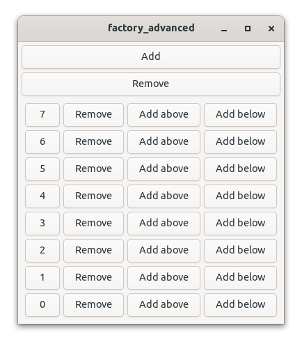
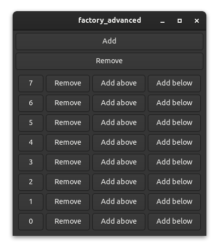
Advanced factories
In this chapter we will build an even more advanced UI for modifying the available counters:
Additionally, certain counters can now be removed or inserted above or below an existing counter.
The FactoryVec we used in the previous chapter is sufficient for simple applications where elements only need to be added and removed from the back. Yet a common use case would be to add elements before another one or to remove a specific element. That introduces additional complexity that needs to be taken care of but fortunately this is mostly handled by Relm4.
To show this, we'll create a similar counter app to the one of the previous chapter, but this time on steroids: we'll add functionality to add counters before and after a specific counter and to remove a certain counter. To get the required flexibility, we'll use the FactoryVecDeque type instead of a FactoryVec.
The app we will write in this chapter is also available here. Run
cargo run --example factory_advancedfrom the example directory if you want to see the code in action.
Indices
The indices of a FactoryVec were just numbers of type usize. That's great unless elements can move and change their index. This tragedy starts when we, for example, add an element to the front: the new element now has index 0, the element that had index 0 before now has index 1 and so on. Adding one element will shift the indices of all following elements. If we naively create a signal handler similar to the previous chapter were we just copied the index at start and moved it into the closure, we will quickly end up with quite wrong or even out-of-bounds indices as elements are added and removed at arbitrary positions.
One solution would be to recreate all signal handlers with the updated indices once an element's index has been changed. However, that's complicated because you need to remove the old signal handlers first and therefore you have to store all signal handler IDs.
The solution Relm4 chose was dynamic indices. These indices are updated automatically to always point at the same element.
The message type
type MsgIndex = WeakDynamicIndex;

#[derive(Debug)]
enum AppMsg {
    AddFirst,
    RemoveLast,
    CountAt(MsgIndex),
    RemoveAt(MsgIndex),
    InsertBefore(MsgIndex),
    InsertAfter(MsgIndex),
}
As you can see, we use a lot of MsgIndex aka WeakDynamicIndex. This allows us to always hold a reference to the dynamic index value.
The reason we use the weak index here is that we don’t want to hold references to invalid indices. We don’t know if our messages are handled immediately or queued up instead, so the data the index was pointing at could have been replaced by a new data in the meantime. Usually this happens so rarely that this can be ignored, but with the weak index we guarantee that the indices are not kept alive in the message queue and we will never use a stale index.
The model
The model is very similar to the previous chapter. The only difference is that we use FactoryVecDeque as a data structure now.
struct Counter {
    value: u8,
}

struct AppModel {
    counters: FactoryVecDeque<Counter>,
    received_messages: u8,
}
The update function
The update function now handles quite a lot of events. We want to
- Add elements at the start
- Remove elements from the back
- Decrement (count) a counter at a specific index
- Insert a new counter before another counter
- Insert a new counter after another counter
impl AppUpdate for AppModel {
    fn update(&mut self, msg: AppMsg, _components: &(), _sender: Sender<AppMsg>) -> bool {
        match msg {
            AppMsg::AddFirst => {
                self.counters.push_front(Counter {
                    value: self.received_messages,
                });
            }
            AppMsg::RemoveLast => {
                self.counters.pop_back();
            }
            AppMsg::CountAt(weak_index) => {
                if let Some(index) = weak_index.upgrade() {
                    if let Some(counter) = self.counters.get_mut(index.current_index()) {
                        counter.value = counter.value.wrapping_sub(1);
                    }
                }
            }
            AppMsg::RemoveAt(weak_index) => {
                if let Some(index) = weak_index.upgrade() {
                    self.counters.remove(index.current_index());
                }
            }
            AppMsg::InsertBefore(weak_index) => {
                if let Some(index) = weak_index.upgrade() {
                    self.counters.insert(
                        index.current_index(),
                        Counter {
                            value: self.received_messages,
                        },
                    );
                }
            }
            AppMsg::InsertAfter(weak_index) => {
                if let Some(index) = weak_index.upgrade() {
                    self.counters.insert(
                        index.current_index() + 1,
                        Counter {
                            value: self.received_messages,
                        },
                    );
                }
            }
        }
        self.received_messages += 1;
        true
    }
}
To get the current index value from the dynamic index, we simply call index.current_index().
The factory implementation
The factory implementation is mostly the same, so we'll just have a look at what has changed.
The widgets type
Because we have four actions per counter now, we also need an additional box to store these buttons.
To be able to provide the root widget via the root_widget function we need to store the box in the widgets type.
#[derive(Debug)]
struct FactoryWidgets {
    hbox: gtk::Box,
    counter_button: gtk::Button,
}
The init_view function
For the init_view function, we need to first generate the new buttons and the box.
    fn init_view(&self, index: &DynamicIndex, sender: Sender<AppMsg>) -> FactoryWidgets {
        let hbox = gtk::Box::builder()
            .orientation(gtk::Orientation::Horizontal)
            .spacing(5)
            .build();

        let counter_button = gtk::Button::with_label(&self.value.to_string());
        let index: DynamicIndex = index.clone();

        let remove_button = gtk::Button::with_label("Remove");
        let ins_above_button = gtk::Button::with_label("Add above");
        let ins_below_button = gtk::Button::with_label("Add below");
Then we need to place the buttons inside of the box.
        hbox.append(&counter_button);
        hbox.append(&remove_button);
        hbox.append(&ins_above_button);
        hbox.append(&ins_below_button);
Now we can connect the messages. We always send a weak pointer of our dynamic index.
        {
            let sender = sender.clone();
            let index = index.clone();
            counter_button.connect_clicked(move |_| {
                send!(sender, AppMsg::CountAt(index.downgrade()));
            });
        }

        {
            let sender = sender.clone();
            let index = index.clone();
            remove_button.connect_clicked(move |_| {
                send!(sender, AppMsg::RemoveAt(index.downgrade()));
            });
        }

        {
            let sender = sender.clone();
            let index = index.clone();
            ins_above_button.connect_clicked(move |_| {
                send!(sender, AppMsg::InsertBefore(index.downgrade()));
            });
        }

        ins_below_button.connect_clicked(move |_| {
            send!(sender, AppMsg::InsertAfter(index.downgrade()));
        });

        FactoryWidgets {
            hbox,
            counter_button,
        }
And that's it! All the other complex operations that keep track of changes are implemented in Relm4 already, we just need to use dynamic indices to make out program work :)
The complete code
Let's review our code in one piece one more time to see how all these parts work together:
Unlike the example in the previous chapter, the following code does not use the widget macro from relm4-macros but implements the
Widgetstrait manually. Yet, the generated code from the macro and the manual code should be almost identical.
use gtk::glib::Sender;
use gtk::prelude::{BoxExt, ButtonExt, GtkWindowExt};
use relm4::factory::{DynamicIndex, Factory, FactoryPrototype, FactoryVecDeque, WeakDynamicIndex};
use relm4::*;
type MsgIndex = WeakDynamicIndex;
#[derive(Debug)]
enum AppMsg {
AddFirst,
RemoveLast,
CountAt(MsgIndex),
RemoveAt(MsgIndex),
InsertBefore(MsgIndex),
InsertAfter(MsgIndex),
}
struct Counter {
value: u8,
}
struct AppModel {
counters: FactoryVecDeque<Counter>,
received_messages: u8,
}
impl Model for AppModel {
type Msg = AppMsg;
type Widgets = AppWidgets;
type Components = ();
}
impl AppUpdate for AppModel {
fn update(&mut self, msg: AppMsg, _components: &(), _sender: Sender<AppMsg>) -> bool {
match msg {
AppMsg::AddFirst => {
self.counters.push_front(Counter {
value: self.received_messages,
});
}
AppMsg::RemoveLast => {
self.counters.pop_back();
}
AppMsg::CountAt(weak_index) => {
if let Some(index) = weak_index.upgrade() {
if let Some(counter) = self.counters.get_mut(index.current_index()) {
counter.value = counter.value.wrapping_sub(1);
}
}
}
AppMsg::RemoveAt(weak_index) => {
if let Some(index) = weak_index.upgrade() {
self.counters.remove(index.current_index());
}
}
AppMsg::InsertBefore(weak_index) => {
if let Some(index) = weak_index.upgrade() {
self.counters.insert(
index.current_index(),
Counter {
value: self.received_messages,
},
);
}
}
AppMsg::InsertAfter(weak_index) => {
if let Some(index) = weak_index.upgrade() {
self.counters.insert(
index.current_index() + 1,
Counter {
value: self.received_messages,
},
);
}
}
}
self.received_messages += 1;
true
}
}
#[derive(Debug)]
struct FactoryWidgets {
hbox: gtk::Box,
counter_button: gtk::Button,
}
impl FactoryPrototype for Counter {
type Factory = FactoryVecDeque<Self>;
type Widgets = FactoryWidgets;
type Root = gtk::Box;
type View = gtk::Box;
type Msg = AppMsg;
fn init_view(&self, index: &DynamicIndex, sender: Sender<AppMsg>) -> FactoryWidgets {
let hbox = gtk::Box::builder()
.orientation(gtk::Orientation::Horizontal)
.spacing(5)
.build();
let counter_button = gtk::Button::with_label(&self.value.to_string());
let index: DynamicIndex = index.clone();
let remove_button = gtk::Button::with_label("Remove");
let ins_above_button = gtk::Button::with_label("Add above");
let ins_below_button = gtk::Button::with_label("Add below");
hbox.append(&counter_button);
hbox.append(&remove_button);
hbox.append(&ins_above_button);
hbox.append(&ins_below_button);
{
let sender = sender.clone();
let index = index.clone();
counter_button.connect_clicked(move |_| {
send!(sender, AppMsg::CountAt(index.downgrade()));
});
}
{
let sender = sender.clone();
let index = index.clone();
remove_button.connect_clicked(move |_| {
send!(sender, AppMsg::RemoveAt(index.downgrade()));
});
}
{
let sender = sender.clone();
let index = index.clone();
ins_above_button.connect_clicked(move |_| {
send!(sender, AppMsg::InsertBefore(index.downgrade()));
});
}
ins_below_button.connect_clicked(move |_| {
send!(sender, AppMsg::InsertAfter(index.downgrade()));
});
FactoryWidgets {
hbox,
counter_button,
}
}
fn position(&self, _index: &DynamicIndex) {}
fn view(&self, _index: &DynamicIndex, widgets: &FactoryWidgets) {
widgets.counter_button.set_label(&self.value.to_string());
}
fn root_widget(widget: &FactoryWidgets) -> >k::Box {
&widget.hbox
}
}
struct AppWidgets {
main: gtk::ApplicationWindow,
gen_box: gtk::Box,
}
impl Widgets<AppModel, ()> for AppWidgets {
type Root = gtk::ApplicationWindow;
fn init_view(_model: &AppModel, _components: &(), sender: Sender<AppMsg>) -> Self {
let main = gtk::builders::ApplicationWindowBuilder::new()
.default_width(300)
.default_height(200)
.build();
let main_box = gtk::Box::builder()
.orientation(gtk::Orientation::Vertical)
.margin_end(5)
.margin_top(5)
.margin_start(5)
.margin_bottom(5)
.spacing(5)
.build();
let gen_box = gtk::Box::builder()
.orientation(gtk::Orientation::Vertical)
.margin_end(5)
.margin_top(5)
.margin_start(5)
.margin_bottom(5)
.spacing(5)
.build();
let add = gtk::Button::with_label("Add");
let remove = gtk::Button::with_label("Remove");
main_box.append(&add);
main_box.append(&remove);
main_box.append(&gen_box);
main.set_child(Some(&main_box));
let cloned_sender = sender.clone();
add.connect_clicked(move |_| {
cloned_sender.send(AppMsg::AddFirst).unwrap();
});
remove.connect_clicked(move |_| {
sender.send(AppMsg::RemoveLast).unwrap();
});
AppWidgets { main, gen_box }
}
fn view(&mut self, model: &AppModel, sender: Sender<AppMsg>) {
model.counters.generate(&self.gen_box, sender);
}
fn root_widget(&self) -> gtk::ApplicationWindow {
self.main.clone()
}
}
fn main() {
let model = AppModel {
counters: FactoryVecDeque::new(),
received_messages: 0,
};
let relm = RelmApp::new(model);
relm.run();
}Components
I've already mentioned components several times in the previous chapters. Now we'll finally have a look at them.
In short, components are independent parts of your application that can communicate with each other through messages. They are used in a parent-child model: The main app can have components and each component can have child components that again can have child components. This means that each component has a parent, whereas the main app is at the top of this tree structure and therefore does not have a parent. Also, each component can send and receive messages from both parent and children.
To showcase this, we will create a small application which opens a dialog when it gets closed. The headerbar and the dialog will be implemented as standalone components. The communication to the main application will be done via messages.


When to use components
Components are mainly useful for separating parts of the UI into smaller, more manageable parts. They are not necessary but for larger applications, they can be very helpful.
Example application
Let's write a small example app to see how components can be used in action. For this example, we write parts of an app that can edit images.
The app we will write in this chapter is also available here. Run
cargo run --example componentsfrom the example directory if you want to see the code in action.
The header bar
Our first component will be a header bar. There are not a lot of advantages for writing this component except for reducing the complexity in other parts of our UI.
The header bar will have three buttons for three modes that our application can have:
- View: View the image.
- Edit: Edit the image.
- Export: Export the image in different formats.
We will not implement the actual functionality, but use placeholders instead to keep things simple.
The model
Usually you want to store everything that only affects your component in the state of the component. In this case however, there is no state that can be stored in the component, but only state that affects the root component (app). Therefore, we leave the model empty and only send messages to the root component.
struct HeaderModel {}The message type allows us to switch between the modes.
enum HeaderMsg {
    View,
    Edit,
    Export,
}
For components we also need to implement the Model trait. The Components type is empty here because it refers to child components. We don't have any child components for our header bar so we use a ().
impl Model for HeaderModel {
    type Msg = HeaderMsg;
    type Widgets = HeaderWidgets;
    type Components = ();
}
The update function is rather minimal. If our header bar was more complex, storing state in this component would make sense, but because we just handle a few buttons, we can simply forward messages. For that we can use the parent_sender. You can see that the message type of the main application is AppMsg and that there's an enum AppMode. Both were not introduced yet, but will be explained later. For now, we just need to know that this component will send SetMode messages to the app.
impl ComponentUpdate<AppModel> for HeaderModel {
    fn init_model(_parent_model: &AppModel) -> Self {
        HeaderModel {}
    }

    fn update(
        &mut self,
        msg: HeaderMsg,
        _components: &(),
        _sender: Sender<HeaderMsg>,
        parent_sender: Sender<AppMsg>,
    ) {
        match msg {
            HeaderMsg::View => {
                send!(parent_sender, AppMsg::SetMode(AppMode::View));
            }
            HeaderMsg::Edit => {
                send!(parent_sender, AppMsg::SetMode(AppMode::Edit));
            }
            HeaderMsg::Export => {
                send!(parent_sender, AppMsg::SetMode(AppMode::Export));
            }
        }
    }
}
We don't use the
_parent_modelargument of theinit_modelin this example. Yet you can use it if you need to access information from the parent model during initialization, for example for passing a resource shared with the component.
The widgets
There's nothing special about widgets of a component. The only difference to the main app is that the root widget doesn't need to be a gtk::ApplicationWindow. Instead, we use a gtk::HeaderBar here, but theoretically the root widget doesn't even need to be a widget at all (which can be useful in special cases).
#[relm4::widget]
impl Widgets<HeaderModel, AppModel> for HeaderWidgets {
view! {
gtk::HeaderBar {
set_title_widget = Some(>k::Box) {
add_css_class: "linked",
append: group = >k::ToggleButton {
set_label: "View",
set_active: true,
connect_toggled(sender) => move |btn| {
if btn.is_active() {
send!(sender, HeaderMsg::View);
}
},
},
append = >k::ToggleButton {
set_label: "Edit",
set_group: Some(&group),
connect_toggled(sender) => move |btn| {
if btn.is_active() {
send!(sender, HeaderMsg::Edit);
}
},
},
append = >k::ToggleButton {
set_label: "Export",
set_group: Some(&group),
connect_toggled(sender) => move |btn| {
if btn.is_active() {
send!(sender, HeaderMsg::Export);
}
},
},
}
}
}
}The close alert
Like a normal application that's used to edit files, we want to notify the user before accidentally closing the application and discarding all progress. For this — you might have guessed it already — we will use another component.
The model
The state of the dialog only needs to store whether or not it's hidden.
struct DialogModel {
    hidden: bool,
}
The message contains three options:
- Show is used by the parent to display the dialog.
- Accept is used internally to indicate that the user agreed to close the application.
- Cancel is used internally to indicate that the user changes his mind and doesn't want to close the application.
enum DialogMsg {
    Show,
    Accept,
    Cancel,
}
The update function updates the state of the dialog and sends a close message if the user accepted.
impl ComponentUpdate<AppModel> for DialogModel {
    fn init_model(_parent_model: &AppModel) -> Self {
        DialogModel { hidden: true }
    }

    fn update(
        &mut self,
        msg: DialogMsg,
        _components: &(),
        _sender: Sender<DialogMsg>,
        parent_sender: Sender<AppMsg>,
    ) {
        match msg {
            DialogMsg::Show => self.hidden = false,
            DialogMsg::Accept => {
                self.hidden = true;
                send!(parent_sender, AppMsg::Close);
            }
            DialogMsg::Cancel => self.hidden = true,
        }
    }
}
The widgets
You've probably seen enough widget implementations by now to know roughly how this should look like, but because we haven't had window components let's have a look at it either way.
#[relm4::widget]
impl Widgets<DialogModel, AppModel> for DialogWidgets {
    view! {
        gtk::MessageDialog {
            set_transient_for: parent!(Some(&parent_widgets.main_window)),
            set_modal: true,
            set_visible: watch!(!model.hidden),
            set_text: Some("Do you want to close before saving?"),
            set_secondary_text: Some("All unsaved changes will be lost"),
            add_button: args!("Close", gtk::ResponseType::Accept),
            add_button: args!("Cancel", gtk::ResponseType::Cancel),
            connect_response(sender) => move |_, resp| {
                send!(sender, if resp == gtk::ResponseType::Accept {
                    DialogMsg::Accept
                } else {
                    DialogMsg::Cancel
                });
            }
        }
    }
}
Most notably there is the args! macro. It allows us to pass values to functions that take more than one argument. The macro would otherwise interpret the comma for a second argument as new property, so we need to use args! here.
Also, we set the set_transient_for property, which actually uses the main window from the parent widgets. So far parent_widgets was an unused argument in our implementations. However in this case, it's neat to have access to the parent widgets. The dialog should set his parent window so that GTK can handle the dialog better. The GTK docs state: "[set_transient_for] allows window managers to e.g. keep the dialog on top of the main window, or center the dialog over the main window". So we definitely want that and conveniently Relm4 gives us the widgets we need from the parents.
The main app
Now all parts come together to form a single app. You might remember that there was a components type we always set to (). Now we actually make use of this type.
The components
Because each app and each component can have any amount of child components we need to define a struct that stores all of our components.
struct AppComponents {
    header: RelmComponent<HeaderModel, AppModel>,
    dialog: RelmComponent<DialogModel, AppModel>,
}
To do this, just implement a struct with the components wrapped into a RelmComponent (which is similar to RelmApp). The first generic type of RelmComponent is the model of the component and the second one the parent model.
To make this work and to initialize our components, we need to implement the Components trait for our struct.
impl Components<AppModel> for AppComponents {
    fn init_components(parent_model: &AppModel, parent_sender: Sender<AppMsg>) -> Self {
        AppComponents {
            header: RelmComponent::new(parent_model, parent_sender.clone()),
            dialog: RelmComponent::new(parent_model, parent_sender),
        }
    }

    fn connect_parent(&mut self, _parent_widgets: &AppWidgets) {}
}
We just need to pass the arguments of the init_components function over to the RelmComponent::new function and the rest will be handled by Relm4.
The model
Now we're looking at something familiar again, the model of the main app.
#[derive(Debug)]
enum AppMode {
    View,
    Edit,
    Export,
}

enum AppMsg {
    SetMode(AppMode),
    CloseRequest,
    Close,
}

struct AppModel {
    mode: AppMode,
}
The AppMode struct stores the modes the application can be in. The SetMode message is used by our header bar component to update the state of the main application when someone presses a button in the header bar. The Close message is used by the dialog component to indicate that the window should be closed.
And now we finally use the Components type of the Model trait.
impl Model for AppModel {
    type Msg = AppMsg;
    type Widgets = AppWidgets;
    type Components = AppComponents;
}
The update function of the model is pretty straight forward.
impl AppUpdate for AppModel {
    fn update(&mut self, msg: AppMsg, components: &AppComponents, _sender: Sender<AppMsg>) -> bool {
        match msg {
            AppMsg::SetMode(mode) => {
                self.mode = mode;
            }
            AppMsg::CloseRequest => {
                components.dialog.send(DialogMsg::Show).unwrap();
            }
            AppMsg::Close => {
                return false;
            }
        }
        true
    }
}
You see we can use components.NAME.send() to send messages to a child component, similar to the parent_sender we used to send messages in the other direction. Also we return false if our dialog component sends the Close message to tell Relm4 to close the application.
The widgets
We're almost done! We only need to define the widgets of the main app.
#[relm4::widget]
impl Widgets<AppModel, ()> for AppWidgets {
view! {
main_window = gtk::ApplicationWindow {
set_default_width: 500,
set_default_height: 250,
set_titlebar: Some(components.header.root_widget()),
set_child = Some(>k::Label) {
set_label: watch!(&format!("Placeholder for {:?}", model.mode)),
},
connect_close_request(sender) => move |_| {
send!(sender, AppMsg::CloseRequest);
gtk::Inhibit(true)
}
}
}
}We just need to get our header bar component in place. Our dialog component does not need to be attached anywhere because the dialog lives in a separate window.
Widgets from components are added after everything else. Because Relm4 initializes components after their parents we can only add components after the rest is already in place. This means that you sometimes might have to use methods like
prependto keep the right order because withappendthe a component will always be added at the end. Yet, everything else is initialized in the right order.
Conclusion
You now know most of the secrets that Relm4 offers. Components can be powerful and if they are implemented correctly, they are even reusable across different apps. The relm4-components crate offers several reusable components you can use in your applications. In the following chapters, we'll look at an even simpler component type called worker, how to implement reusable components yourself and how to use components with async code and multiple threads.
The complete code
Let's review our code in one piece one more time to see how all these parts work together:
use gtk::prelude::{BoxExt, ButtonExt, DialogExt, GtkWindowExt, ToggleButtonExt, WidgetExt};
use relm4::Sender;
use relm4::*;
enum HeaderMsg {
View,
Edit,
Export,
}
struct HeaderModel {}
impl Model for HeaderModel {
type Msg = HeaderMsg;
type Widgets = HeaderWidgets;
type Components = ();
}
impl ComponentUpdate<AppModel> for HeaderModel {
fn init_model(_parent_model: &AppModel) -> Self {
HeaderModel {}
}
fn update(
&mut self,
msg: HeaderMsg,
_components: &(),
_sender: Sender<HeaderMsg>,
parent_sender: Sender<AppMsg>,
) {
match msg {
HeaderMsg::View => {
send!(parent_sender, AppMsg::SetMode(AppMode::View));
}
HeaderMsg::Edit => {
send!(parent_sender, AppMsg::SetMode(AppMode::Edit));
}
HeaderMsg::Export => {
send!(parent_sender, AppMsg::SetMode(AppMode::Export));
}
}
}
}
#[relm4::widget]
impl Widgets<HeaderModel, AppModel> for HeaderWidgets {
view! {
gtk::HeaderBar {
set_title_widget = Some(>k::Box) {
add_css_class: "linked",
append: group = >k::ToggleButton {
set_label: "View",
set_active: true,
connect_toggled(sender) => move |btn| {
if btn.is_active() {
send!(sender, HeaderMsg::View);
}
},
},
append = >k::ToggleButton {
set_label: "Edit",
set_group: Some(&group),
connect_toggled(sender) => move |btn| {
if btn.is_active() {
send!(sender, HeaderMsg::Edit);
}
},
},
append = >k::ToggleButton {
set_label: "Export",
set_group: Some(&group),
connect_toggled(sender) => move |btn| {
if btn.is_active() {
send!(sender, HeaderMsg::Export);
}
},
},
}
}
}
}
struct DialogModel {
hidden: bool,
}
enum DialogMsg {
Show,
Accept,
Cancel,
}
impl Model for DialogModel {
type Msg = DialogMsg;
type Widgets = DialogWidgets;
type Components = ();
}
impl ComponentUpdate<AppModel> for DialogModel {
fn init_model(_parent_model: &AppModel) -> Self {
DialogModel { hidden: true }
}
fn update(
&mut self,
msg: DialogMsg,
_components: &(),
_sender: Sender<DialogMsg>,
parent_sender: Sender<AppMsg>,
) {
match msg {
DialogMsg::Show => self.hidden = false,
DialogMsg::Accept => {
self.hidden = true;
send!(parent_sender, AppMsg::Close);
}
DialogMsg::Cancel => self.hidden = true,
}
}
}
#[relm4::widget]
impl Widgets<DialogModel, AppModel> for DialogWidgets {
view! {
gtk::MessageDialog {
set_transient_for: parent!(Some(&parent_widgets.main_window)),
set_modal: true,
set_visible: watch!(!model.hidden),
set_text: Some("Do you want to close before saving?"),
set_secondary_text: Some("All unsaved changes will be lost"),
add_button: args!("Close", gtk::ResponseType::Accept),
add_button: args!("Cancel", gtk::ResponseType::Cancel),
connect_response(sender) => move |_, resp| {
send!(sender, if resp == gtk::ResponseType::Accept {
DialogMsg::Accept
} else {
DialogMsg::Cancel
});
}
}
}
}
struct AppComponents {
header: RelmComponent<HeaderModel, AppModel>,
dialog: RelmComponent<DialogModel, AppModel>,
}
impl Components<AppModel> for AppComponents {
fn init_components(parent_model: &AppModel, parent_sender: Sender<AppMsg>) -> Self {
AppComponents {
header: RelmComponent::new(parent_model, parent_sender.clone()),
dialog: RelmComponent::new(parent_model, parent_sender),
}
}
fn connect_parent(&mut self, _parent_widgets: &AppWidgets) {}
}
#[derive(Debug)]
enum AppMode {
View,
Edit,
Export,
}
enum AppMsg {
SetMode(AppMode),
CloseRequest,
Close,
}
struct AppModel {
mode: AppMode,
}
impl Model for AppModel {
type Msg = AppMsg;
type Widgets = AppWidgets;
type Components = AppComponents;
}
#[relm4::widget]
impl Widgets<AppModel, ()> for AppWidgets {
view! {
main_window = gtk::ApplicationWindow {
set_default_width: 500,
set_default_height: 250,
set_titlebar: Some(components.header.root_widget()),
set_child = Some(>k::Label) {
set_label: watch!(&format!("Placeholder for {:?}", model.mode)),
},
connect_close_request(sender) => move |_| {
send!(sender, AppMsg::CloseRequest);
gtk::Inhibit(true)
}
}
}
}
impl AppUpdate for AppModel {
fn update(&mut self, msg: AppMsg, components: &AppComponents, _sender: Sender<AppMsg>) -> bool {
match msg {
AppMsg::SetMode(mode) => {
self.mode = mode;
}
AppMsg::CloseRequest => {
components.dialog.send(DialogMsg::Show).unwrap();
}
AppMsg::Close => {
return false;
}
}
true
}
}
fn main() {
let model = AppModel {
mode: AppMode::View,
};
let relm = RelmApp::new(model);
relm.run();
}Workers
Workers are simply components that don't have any widgets. They don't have any advantages over components apart from being simpler and a few performance benefits they get from not having to call the view function (because they don't have widgets).
You might wonder why they even exist. We're talking about a GUI library all the time, right? Well, they can be quite useful for applications that need to handle long tasks while remaining responsive. Imagine your web browser would be completely frozen while it loads content from a slow website. This would in fact happen if you would send the HTTP requests in your update function. If you use a worker for that instead, it could handle the requests from a different thread and send a message back once finished.
Implementing a worker
A worker is implemented similar to a component. One difference is that you use () as a placeholder for the Widgets type in the Model trait. Also, since you don't have widgets for the worker, you don't need to implement the Widgets trait.
impl Model for WorkerModel {
    type Msg = WorkerMsg;
    type Widgets = ();
    type Components = ();
}
The last difference is that worker don't need the parent widgets in the RelmWorker::new function. So to initialize a worker with the Components trait you only pass two arguments.
impl Components<AppModel> for AppComponents {
    fn init_components(
        parent_model: &AppModel,
        parent_sender: Sender<AppMsg>,
    ) -> Self {
        AppComponents {
            worker: RelmWorker::new(parent_model, parent_sender),
        }
    }
}
Apart from that workers are just like components so I won't discuss an example here. You just need to define the messages you want the parent to send to the worker and handle them in the update function. There you can also send messages back to the parent component or the main app to signal that the worker has finished its work.
Message handlers
We've already seen that workers are basically components without widgets. In this chapter, we will talk about message handlers that are even simpler: like workers but without a model.
The motivation
You might wonder why we even need message handlers. Components and workers are already some kind of message handlers, right? That's true, but components and workers do more than just handling messages: they also have a model that represents their state.
The problem with the state is that Rust doesn't like sharing mutable data. Only one mutable reference can exist at the time to prevent race conditions and other bugs. However, both components and workers can update their state in the update function while handling messages. This means that components and workers can only handle one message at the time. Otherwise, there would be multiple mutable references to the model.
Handling one message at the time is perfectly fine in most cases. However, if you, for example, want to handle a lot of HTTP requests and you send one message to a worker for each request you want to handle, that'd mean that one message is sent after another. This could cause a huge delay. Fortunately, message handlers can solve this issue.
Implementing a message handler
To keep it simple, we will create another counter app. Yet this time, every click will be delayed by one second. If a user clicks the increment button, the counter will be incremented exactly one second later.
The app we will write in this chapter is also available here. Run
cargo run --example non_blocking_asyncfrom the example directory if you want to see the code in action.
The timing
Let's have a look at a simple timing diagram that shows what would happen if we used a worker for our app.

All three clicks happen in one second. But because we can only handle one message at a time in a worker, we have to wait one second, only for processing the first message. The second and the third message are then handled too late because our worker was blocking while handling the first message (see the striped parts in the diagram).
But how would our ideal timing diagram look like?

In the second diagram, there's no blocking. The second and the third message are handled instantly, so they can increment the counter exactly one second after the user clicked the button for the second and third time.
Alright, let's implement it!
The includes
In this example, the includes are a little special because we have two kinds of senders. We've already seen relm4::Sender (aka glib::Sender) several times as it's used by Relm4 to send messages to components and workers. The other one is tokio::sync::mpsc::Sender, the sender we use for the message handler. We could use any sender type we want for the message handler because we're implementing all of the message handling ourselves. Yet, because we want a sender that supports async Rust, the sender from tokio is a reasonable choice.
Since both senders are called Sender by default we rename the latter to TokioSender in the last line of the includes.
use gtk::prelude::{BoxExt, ButtonExt, GtkWindowExt, OrientableExt};
use relm4::{
    send, AppUpdate, Components, MessageHandler, Model, RelmApp, RelmMsgHandler, Sender,
    WidgetPlus, Widgets,
};

use tokio::runtime::{Builder, Runtime};
use tokio::sync::mpsc::{channel, Sender as TokioSender};
Relm4 runs updates for workers and components on the glib main event loop that's provided by GTK. Therefore, Relm4 uses
relm4::Senderakaglib::Senderto send messages to workers and components.
The model
The model and the message type are the same as in our first app.
struct AppModel {
    counter: u8,
}

#[derive(Debug)]
enum AppMsg {
    Increment,
    Decrement,
}
The update function is identical, too.
impl AppUpdate for AppModel {
    fn update(
        &mut self,
        msg: AppMsg,
        _components: &AppComponents,
        _sender: Sender<AppMsg>,
    ) -> bool {
        match msg {
            AppMsg::Increment => {
                self.counter = self.counter.wrapping_add(1);
            }
            AppMsg::Decrement => {
                self.counter = self.counter.wrapping_sub(1);
            }
        }
        true
    }
}
The message handler
Our message handler needs to store our sender and also the tokio runtime we use to process our messages (to keep the runtime alive).
And of course, we need a message type as well.
struct AsyncHandler {
    _rt: Runtime,
    sender: TokioSender<AsyncHandlerMsg>,
}

#[derive(Debug)]
enum AsyncHandlerMsg {
    DelayedIncrement,
    DelayedDecrement,
}
Then we need to implement the MessageHandler trait for our message handler.
impl MessageHandler<AppModel> for AsyncHandler {
    type Msg = AsyncHandlerMsg;
    type Sender = TokioSender<AsyncHandlerMsg>;

    fn init(_parent_model: &AppModel, parent_sender: Sender<AppMsg>) -> Self {
        let (sender, mut rx) = channel::<AsyncHandlerMsg>(10);

        let rt = Builder::new_multi_thread()
            .worker_threads(8)
            .enable_time()
            .build()
            .unwrap();

        rt.spawn(async move {
            while let Some(msg) = rx.recv().await {
                let parent_sender = parent_sender.clone();
                tokio::spawn(async move {
                    tokio::time::sleep(std::time::Duration::from_secs(1)).await;
                    match msg {
                        AsyncHandlerMsg::DelayedIncrement => {
                            send!(parent_sender, AppMsg::Increment);
                        }
                        AsyncHandlerMsg::DelayedDecrement => {
                            send!(parent_sender, AppMsg::Decrement);
                        }
                    }
                });
            }
        });

        AsyncHandler { _rt: rt, sender }
    }

    fn send(&self, msg: Self::Msg) {
        self.sender.blocking_send(msg).unwrap();
    }

    fn sender(&self) -> Self::Sender {
        self.sender.clone()
    }
}
First we define the message type. Then we specify the sender type. You could, for example, use std::sync::mpsc::Sender, tokio::sync::mpsc::Sender or any other sender type you want.
The init function simply initializes the message handler. In the first part, we create a new tokio runtime that will process our messages. Then we check for messages in a loop.
while let Some(msg) = rx.recv().await {When using components and workers, this loop runs in the background. Here we need to define it ourselves. The important part here is the await. Because we wait for new messages here, the tokio runtime can process our messages in the meantime. Therefore, we can handle a lot of messages at the same time.
If you want to learn more about async in Rust, you can find more information here.
Inside the loop, we process the message by waiting one second and then sending a message back to the parent component.
The send method defines a convenient interface for sending messages to this message handler and the sender method provides a sender to connect events later.
The components
Next, we need to add the message handler to our components. It's very similar to adding workers.
struct AppComponents {
    async_handler: RelmMsgHandler<AsyncHandler, AppModel>,
}

impl Components<AppModel> for AppComponents {
    fn init_components(parent_model: &AppModel, parent_sender: Sender<AppMsg>) -> Self {
        AppComponents {
            async_handler: RelmMsgHandler::new(parent_model, parent_sender),
        }
    }

    fn connect_parent(&mut self, _parent_widgets: &AppWidgets) {}
}
The widgets
The last part we need is the widgets type. It should look familiar except for the events.
#[relm4_macros::widget]
impl Widgets<AppModel, ()> for AppWidgets {
view! {
gtk::ApplicationWindow {
set_title: Some("Simple app"),
set_default_width: 300,
set_default_height: 100,
set_child = Some(>k::Box) {
set_orientation: gtk::Orientation::Vertical,
set_margin_all: 5,
set_spacing: 5,
append = >k::Button {
set_label: "Increment",
                        connect_clicked[sender = components.async_handler.sender()] => move |_| {
                            sender.blocking_send(AsyncHandlerMsg::DelayedIncrement)
                                .expect("Receiver dropped");
                        },
},
append = >k::Button::with_label("Decrement") {
connect_clicked[sender = components.async_handler.sender()] => move |_| {
sender.blocking_send(AsyncHandlerMsg::DelayedDecrement)
.expect("Receiver dropped");
},
},
append = >k::Label {
set_margin_all: 5,
set_label: watch! { &format!("Counter: {}", model.counter) },
}
},
}
}
}We're connecting the event directly to the message handler. You could pass the message through the update function of your app and forward it to the message handler, but the macro provides a special syntax to connect events directly.
connect_clicked[sender = components.async_handler.sender()] => move |_| {
sender.blocking_send(AsyncHandlerMsg::DelayedIncrement)
.expect("Receiver dropped");
},You'll notice that we use brackets instead of parentheses here. That tells the macro that we want to connect an event with a sender from a component. The syntax looks like this.
connect_name[sender_name = components.component_name.sender()] => move |_| { ... }Conclusion
That's it! We've implemented our first message handler.
The complete code
Let's review our code in one piece one more time to see how all these parts work together:
use gtk::prelude::{BoxExt, ButtonExt, GtkWindowExt, OrientableExt};
use relm4::{
send, AppUpdate, Components, MessageHandler, Model, RelmApp, RelmMsgHandler, Sender,
WidgetPlus, Widgets,
};
use tokio::runtime::{Builder, Runtime};
use tokio::sync::mpsc::{channel, Sender as TokioSender};
struct AppModel {
counter: u8,
}
#[derive(Debug)]
enum AppMsg {
Increment,
Decrement,
}
impl Model for AppModel {
type Msg = AppMsg;
type Widgets = AppWidgets;
type Components = AppComponents;
}
impl AppUpdate for AppModel {
fn update(
&mut self,
msg: AppMsg,
_components: &AppComponents,
_sender: Sender<AppMsg>,
) -> bool {
match msg {
AppMsg::Increment => {
self.counter = self.counter.wrapping_add(1);
}
AppMsg::Decrement => {
self.counter = self.counter.wrapping_sub(1);
}
}
true
}
}
struct AsyncHandler {
_rt: Runtime,
sender: TokioSender<AsyncHandlerMsg>,
}
#[derive(Debug)]
enum AsyncHandlerMsg {
DelayedIncrement,
DelayedDecrement,
}
impl MessageHandler<AppModel> for AsyncHandler {
type Msg = AsyncHandlerMsg;
type Sender = TokioSender<AsyncHandlerMsg>;
fn init(_parent_model: &AppModel, parent_sender: Sender<AppMsg>) -> Self {
let (sender, mut rx) = channel::<AsyncHandlerMsg>(10);
let rt = Builder::new_multi_thread()
.worker_threads(8)
.enable_time()
.build()
.unwrap();
rt.spawn(async move {
while let Some(msg) = rx.recv().await {
let parent_sender = parent_sender.clone();
tokio::spawn(async move {
tokio::time::sleep(std::time::Duration::from_secs(1)).await;
match msg {
AsyncHandlerMsg::DelayedIncrement => {
send!(parent_sender, AppMsg::Increment);
}
AsyncHandlerMsg::DelayedDecrement => {
send!(parent_sender, AppMsg::Decrement);
}
}
});
}
});
AsyncHandler { _rt: rt, sender }
}
fn send(&self, msg: Self::Msg) {
self.sender.blocking_send(msg).unwrap();
}
fn sender(&self) -> Self::Sender {
self.sender.clone()
}
}
struct AppComponents {
async_handler: RelmMsgHandler<AsyncHandler, AppModel>,
}
impl Components<AppModel> for AppComponents {
fn init_components(parent_model: &AppModel, parent_sender: Sender<AppMsg>) -> Self {
AppComponents {
async_handler: RelmMsgHandler::new(parent_model, parent_sender),
}
}
fn connect_parent(&mut self, _parent_widgets: &AppWidgets) {}
}
#[relm4_macros::widget]
impl Widgets<AppModel, ()> for AppWidgets {
view! {
gtk::ApplicationWindow {
set_title: Some("Simple app"),
set_default_width: 300,
set_default_height: 100,
set_child = Some(>k::Box) {
set_orientation: gtk::Orientation::Vertical,
set_margin_all: 5,
set_spacing: 5,
append = >k::Button {
set_label: "Increment",
connect_clicked[sender = components.async_handler.sender()] => move |_| {
sender.blocking_send(AsyncHandlerMsg::DelayedIncrement)
.expect("Receiver dropped");
},
},
append = >k::Button::with_label("Decrement") {
connect_clicked[sender = components.async_handler.sender()] => move |_| {
sender.blocking_send(AsyncHandlerMsg::DelayedDecrement)
.expect("Receiver dropped");
},
},
append = >k::Label {
set_margin_all: 5,
set_label: watch! { &format!("Counter: {}", model.counter) },
}
},
}
}
}
fn main() {
let model = AppModel { counter: 0 };
let app = RelmApp::new(model);
app.run();
}Overview
| Category | Components | Workers | Message handlers |
|---|---|---|---|
| Run on different thread | ✅ | ✅ | ✅ |
| Async | ❌ | ✅ | ✅ |
| Non-blocking message handling | ❌ | ❌ | ✅ |
When to use ...
-
components:
- Abstract parts of your UI
- The update function should be run on a different thread
-
workers:
- Handle IO-bound or CPU-intensive tasks one at the time on a different thread
- You need a model to store state for processing messages
-
message handlers:
- Handle multiple IO-bound or CPU-intensive tasks at the time
- All the information you need is sent inside the message
Threads
Workers are usually used to run tasks on a different thread to allow the main thread to run the UI. Let's see how this works!
Running a component on a different thread
You might remember this section of code from the example application in the components chapter.
impl Components<AppModel> for AppComponents {
    fn init_components(parent_model: &AppModel, parent_sender: Sender<AppMsg>) -> Self {
        AppComponents {
            header: RelmComponent::new(parent_model, parent_sender.clone()),
            dialog: RelmComponent::new(parent_model, parent_sender),
        }
    }

    fn connect_parent(&mut self, _parent_widgets: &AppWidgets) {}
}
In order to run the dialog component on a new thread, we just need to change one line:
impl Components<AppModel> for AppComponents {
    fn init_components(
        parent_model: &AppModel,
        parent_sender: Sender<AppMsg>,
    ) -> Self {
        AppComponents {
            header: RelmComponent::new(parent_model, parent_sender.clone()),
            dialog: RelmComponent::with_new_thread(parent_model, parent_sender),
        }
    }

    // [...]
}
Instead of RelmComponent::new we used RelmComponent::with_new_thread. The same is true for workers. RelmWorker::new runs the worker on the same thread and RelmWorker::with_new_thread spawns a new thread for the worker.
Components have widgets that, in the case of GTK4, neither implement
SendnorSync. That means we can't run the view function from a different thread, but only the update function that just operates on the model. Internally, Relm4 sends the model from a new thread that handles the update function to the main thread that then handles the view function and back to the new thread again. This is not optimal regarding performance and therefore only recommended if you don't send a lot of messages to the component. Alternatively, you can always do the heavy work in a worker or a message handler because they don't have this problem.
Async
Async update functions are exclusive for workers and message handlers currently (if you need async components please open an issue). If you enable the tokio-rt feature, you can use an AsyncRelmWorker type that uses an async update function from the AsyncComponentUpdate trait. Apart from that, they are just like normal workers that run in a new thread. The "tokio" example shows how this can be used with for async HTTP requests.
Non blocking async
Technically, even async workers will block the execution between messages. They can run non-blocking code from their update function but they can not handle more than one message at the time. This can be too slow in some cases.
For example, if you have an app that fetches the avatar images of many users and you send one message to your worker for every avatar image, the worker will fetch the images one after the other. This wouldn't be much better than blocking requests and may take some time.
There are three ways to improve this:
- Create your own async runtime in message handler. This is shown in the non_blocking_async example.
- Send a vector with all avatar images you need to your worker, so it can send all asynchronous requests at once.
- Spawn a new thread for each message that sends a HTTP request and sends a message back.
The message queue problem
Because workers tend to take a lot of time during the update function you should make sure to not bombard them with messages. Imagine you have a button in your application that allows the user to update a web page. If the user presses the button, a new request is sent by a worker that responds with a message once the request is completed. If the button can be clicked and a message is sent for each click while the worker is fetching the web page you could quickly have a lot of unprocessed messages in the queue of your worker. To avoid this, make sure to only send the message once and wait until the worker is finished.
Multiple threads and async without workers
One reason you always get a new sender passed into your update function is that you can spawn a new thread and move a cloned sender into it. This can sometimes be more flexible than defining a worker or even a message handler. You can simply use std::thread::spawn for this or spawn any async runtime you want.
For example you could do this in your update function:
std::thread::spawn(move || {
    send_request();
    send!(sender, AppMsg::RequestComplete);
});
Async inside the main event loop
GTK uses an event loop from glib to handle asynchronous events. In fact the senders we've been using all the time use channels on that event loop. This event loop also allows us to execute futures. Relm4 provides a spawn_future function to do exactly that. The only drawback of this is that most crates relying on a tokio runtime won't work and that the future is run on the main thread. The "future" example shows how this can be used.
Reusable components
In this chapter, we will implement a simple alert dialog as a reusable component.
The alert example in the Relm4 repository implements a simple app for the reusable alert component we will write in this chapter. It's an other variant of a counter app, yet this time a dialog will be displayed if the counter does not match 42 when being closed. The main difference in the implementation is, that the dialog is implemented as component that can be reused in other applications.

This is how the dialog looks like in the alert example:

If you want to see an alert component, very similar to the one we will write in this chapter, used inside a Relm4 application have a look at the “alert” example. Run
cargo run --example alertfrom the example directory if you want to see the code in action.
Reusable components don’t know their parent component at the time they are implemented. So if they want to interact with their parent component, they must assume that their parent model implements a trait as an interface for the component.
The parent traits
First, we’ll have a look at the traits the parent component, that will eventually use this component, has to implement.
Because we want our component to be flexible and able to display different messages, we first define a data type for configuring our component.
pub struct AlertSettings {
    /// Large text
    pub text: String,
    /// Optional secondary, smaller text
    pub secondary_text: Option<String>,
    /// Modal dialogs freeze other windows as long they are visible
    pub is_modal: bool,
    /// Sets color of the accept button to red if the theme supports it
    pub destructive_accept: bool,
    /// Text for confirm button
    pub confirm_label: String,
    /// Text for cancel button
    pub cancel_label: String,
    /// Text for third option button. If [`None`] the third button won't be created.
    pub option_label: Option<String>,
}
Next, we define a trait for our parent model that defines the messages our component will send to respond to the parent. The trait also defines a function that passes a new configuration to our component.
/// Interface for the parent model
pub trait AlertParent: Model
where
    Self::Widgets: AlertParentWidgets,
{
    /// Configuration for alert component.
    fn alert_config(&self) -> AlertSettings;

    /// Message sent to parent if user clicks confirm button
    fn confirm_msg() -> Self::Msg;

    /// Message sent to parent if user clicks cancel button
    fn cancel_msg() -> Self::Msg;

    /// Message sent to parent if user clicks third option button
    fn option_msg() -> Self::Msg;
}
Because you usually want to tell GTK to which window a dialog belongs to, we also add a trait that allows us to pass the parent window.
/// Get the parent window that allows setting the parent window of the dialog with
/// [`gtk::prelude::GtkWindowExt::set_transient_for`].
pub trait AlertParentWidgets {
    fn parent_window(&self) -> Option<gtk::Window>;
}
The model
Our model stores whether the component is visible and the configuration.
pub struct AlertModel {
    settings: AlertSettings,
    is_active: bool,
}
The message type only exposes the Show message to the parent component. The Response message is used internally for handling user interactions, so we hide it with #[doc(hidden)].
pub enum AlertMsg {
    /// Message sent by the parent to view the dialog
    Show,
    #[doc(hidden)]
    Response(gtk::ResponseType),
}
The ComponentUpdate trait would usually expect the parent component as a generic type. We don’t know the parent component yet, so we add trait bounds to a new generic type.
impl<ParentModel> ComponentUpdate<ParentModel> for AlertModel
where
    ParentModel: AlertParent,
    ParentModel::Widgets: AlertParentWidgets,
{
For initializing our model, we get the configuration from our parent component and set is_active to false.
    fn init_model(parent_model: &ParentModel) -> Self {
        AlertModel {
            settings: parent_model.alert_config(),
            is_active: false,
        }
    }
The update function handles the Show message from our parent component and the Response messages generated by user interactions. It also sends the appropriate messages to the parent.
    fn update(
        &mut self,
        msg: AlertMsg,
        _components: &(),
        _sender: Sender<AlertMsg>,
        parent_sender: Sender<ParentModel::Msg>,
    ) {
        match msg {
            AlertMsg::Show => {
                self.is_active = true;
            }
            AlertMsg::Response(ty) => {
                self.is_active = false;
                parent_sender
                    .send(match ty {
                        gtk::ResponseType::Accept => ParentModel::confirm_msg(),
                        gtk::ResponseType::Other(_) => ParentModel::option_msg(),
                        _ => ParentModel::cancel_msg(),
                    })
                    .unwrap();
            }
        }
    }
The widgets
The widgets have a generic type for the parent component with the expected trait bounds, too. Because they are part of a public interface, we also add the pub attribute to the widget macro. Apart from that, there is nothing special.
#[relm4_macros::widget(pub)]
impl<ParentModel> relm4::Widgets<AlertModel, ParentModel> for AlertWidgets
where
    ParentModel: AlertParent,
    ParentModel::Widgets: AlertParentWidgets,
{
    view! {
        dialog = gtk::MessageDialog {
            set_transient_for: parent!(parent_widgets.parent_window().as_ref()),
            set_message_type: gtk::MessageType::Question,
            set_visible: watch!(model.is_active),
            connect_response(sender) => move |_, response| {
                send!(sender, AlertMsg::Response(response));
            },

            // Apply configuration
            set_text: Some(&model.settings.text),
            set_secondary_text: model.settings.secondary_text.as_deref(),
            set_modal: model.settings.is_modal,
            add_button: args!(&model.settings.confirm_label, gtk::ResponseType::Accept),
            add_button: args!(&model.settings.cancel_label, gtk::ResponseType::Cancel),
        }
    }

    fn post_init() {
        if let Some(option_label) = &model.settings.option_label {
            dialog.add_button(option_label, gtk::ResponseType::Other(0));
        }
        if model.settings.destructive_accept {
            let accept_widget = dialog
                .widget_for_response(gtk::ResponseType::Accept)
                .expect("No button for accept response set");
            accept_widget.add_css_class("destructive-action");
        }
    }
}
Conclusion
We’re done! That’s your first reusable component.
You can find more examples of reusable components in the relm4-components crate here. You can also contribute your own reusable components to relm4-components :)
The complete code
Let’s review our code in one piece one more time to see how all these parts work together:
use gtk::prelude::{DialogExt, GtkWindowExt, WidgetExt};
use relm4::{send, ComponentUpdate, Model, Sender};

pub struct AlertSettings {
    /// Large text
    pub text: String,
    /// Optional secondary, smaller text
    pub secondary_text: Option<String>,
    /// Modal dialogs freeze other windows as long they are visible
    pub is_modal: bool,
    /// Sets color of the accept button to red if the theme supports it
    pub destructive_accept: bool,
    /// Text for confirm button
    pub confirm_label: String,
    /// Text for cancel button
    pub cancel_label: String,
    /// Text for third option button. If [`None`] the third button won't be created.
    pub option_label: Option<String>,
}

pub struct AlertModel {
    settings: AlertSettings,
    is_active: bool,
}

pub enum AlertMsg {
    /// Message sent by the parent to view the dialog
    Show,
    #[doc(hidden)]
    Response(gtk::ResponseType),
}

impl Model for AlertModel {
    type Msg = AlertMsg;
    type Widgets = AlertWidgets;
    type Components = ();
}

/// Interface for the parent model
pub trait AlertParent: Model
where
    Self::Widgets: AlertParentWidgets,
{
    /// Configuration for alert component.
    fn alert_config(&self) -> AlertSettings;

    /// Message sent to parent if user clicks confirm button
    fn confirm_msg() -> Self::Msg;

    /// Message sent to parent if user clicks cancel button
    fn cancel_msg() -> Self::Msg;

    /// Message sent to parent if user clicks third option button
    fn option_msg() -> Self::Msg;
}

/// Get the parent window that allows setting the parent window of the dialog with
/// [`gtk::prelude::GtkWindowExt::set_transient_for`].
pub trait AlertParentWidgets {
    fn parent_window(&self) -> Option<gtk::Window>;
}

impl<ParentModel> ComponentUpdate<ParentModel> for AlertModel
where
    ParentModel: AlertParent,
    ParentModel::Widgets: AlertParentWidgets,
{
    fn init_model(parent_model: &ParentModel) -> Self {
        AlertModel {
            settings: parent_model.alert_config(),
            is_active: false,
        }
    }

    fn update(
        &mut self,
        msg: AlertMsg,
        _components: &(),
        _sender: Sender<AlertMsg>,
        parent_sender: Sender<ParentModel::Msg>,
    ) {
        match msg {
            AlertMsg::Show => {
                self.is_active = true;
            }
            AlertMsg::Response(ty) => {
                self.is_active = false;
                parent_sender
                    .send(match ty {
                        gtk::ResponseType::Accept => ParentModel::confirm_msg(),
                        gtk::ResponseType::Other(_) => ParentModel::option_msg(),
                        _ => ParentModel::cancel_msg(),
                    })
                    .unwrap();
            }
        }
    }
}

#[relm4_macros::widget(pub)]
impl<ParentModel> relm4::Widgets<AlertModel, ParentModel> for AlertWidgets
where
    ParentModel: AlertParent,
    ParentModel::Widgets: AlertParentWidgets,
{
    view! {
        dialog = gtk::MessageDialog {
            set_transient_for: parent!(parent_widgets.parent_window().as_ref()),
            set_message_type: gtk::MessageType::Question,
            set_visible: watch!(model.is_active),
            connect_response(sender) => move |_, response| {
                send!(sender, AlertMsg::Response(response));
            },

            // Apply configuration
            set_text: Some(&model.settings.text),
            set_secondary_text: model.settings.secondary_text.as_deref(),
            set_modal: model.settings.is_modal,
            add_button: args!(&model.settings.confirm_label, gtk::ResponseType::Accept),
            add_button: args!(&model.settings.cancel_label, gtk::ResponseType::Cancel),
        }
    }

    fn post_init() {
        if let Some(option_label) = &model.settings.option_label {
            dialog.add_button(option_label, gtk::ResponseType::Other(0));
        }
        if model.settings.destructive_accept {
            let accept_widget = dialog
                .widget_for_response(gtk::ResponseType::Accept)
                .expect("No button for accept response set");
            accept_widget.add_css_class("destructive-action");
        }
    }
}
gtk-rs overview
So far, we only discussed which features Relm4 provides. Yet, Relm4 is based on GTK, which itself has many useful features. Let’s have a look at it!
This is just an overview. I’ve linked the relevant sections of the gtk-rs book but if you want to get familiar with all the features, I recommend reading the book from the start.
GObjects
GTK is an object-oriented framework that uses the GObject library to implement objects. GObjects have some really useful features that we will discuss in the following sections.
Subclassing
Like many other OOP frameworks or languages, GObjects can inherit from other GObjects. This is called subclassing. In the case of GTK, that’s really helpful because it allows us to create custom widgets.
For example, you could use subclassing to create your own button widget that acts as a counter. Or you can create a custom application window that better suits your application.
Read more about subclassing in the gtk-rs book.
Properties
Each GObject can have properties that work similar to the fields of a structure in Rust. You can set them and you can read (get) them. But one thing that's particularly cool is that properties can be bound to other properties.
For example, you could bind the "visible" property of a widget to the "active" property of a gtk::ToggleButton. This would allow you to show or hide the widget using the toggle button and the best part is, that it's done fully automatically!
Read more about properties in the gtk-rs book.
Signals
GObjects can not only have properties but also signals. Actually, we've been using signals all the time, for example, by using the connect_clicked method on a button. This method simply adds an event handler function for the "click" signal.
You can create your own signals in custom widgets. You can also use emit to emit signals on you widgets manually.
Read more about signals in the gtk-rs book.
Settings
Most applications need to store settings at some point. GTK makes that pretty simple. You can use gtk::Settings to store your settings and keep them stored after your app has been closed.
Read more about settings in the gtk-rs book.
Lists
Relm4 has factories for generating widgets from collections of data. GTK has a similar mechanism that should be used for large list. Because GTK knows which widgets of a list are actually shown it can optimize the rendering and memory usage a lot better.
Read more about lists in the gtk-rs book.
Composite Templates
Relm4 leaves it up to you how to create you UI. You can do it manually like in our first app, you can do with the widget macro or you can use the composite templates from GTK.
With the composite templates, you can use a XML file to specify your widgets and properties.
Read more about the composite templates in the gtk-rs book.
The widget macro reference
There are quite a lot of examples where the widget macro is used in this book. Yet, we haven't covered everything in the previous chapters and having all the information in one place is nice, too.
Property names
The widget macros uses setter methods of gtk4-rs. You can find them at the gtk4-rs docs.
Many properties are also part of a trait. Make sure that this trait is in scope. In many cases you need to use gtk::prelude::TraitName.
For example, if you want to use the set_default_width method of the GtkWindowExt trait you need to use gtk::prelude::GtkWindowExt.
Trait disambiguation
Sometimes you use several traits that implement the same method for a type so you need to tell Rust which trait it should use. For example the set_child function is implemented by both gtk::prelude::GtkWindowExt and libadwaita::traits::ApplicationWindowExt. If we use the regular syntax, the Rust compiler will get confused and tells us to specify the trait. So instead we use the TraitName::method syntax that's similar to Rust's fully qualified syntax for trait disambiguation.
You can also use the full path of the trait.
libadwaita::traits::ApplicationWindowExt::set_child = Some(>k::Box) { ... }Public widgets
If you want to make the widgets struct generated by the macro public, you can simply use pub as an attribute for the macro.
#[relm4::widget(pub)]Assign properties
Initialize a property with a value:
property_name: value,Initialize an optional property only if it's Some and ignore if it's none:
property_name?: value,Initialize a property that has multiple properties:
property_name: args!(value1, value2, ...),Initialize and automatically update a property:
property_name: watch!(value1, value2, ...),Initialize and automatically update a property with a tracker. The track_expression can be any expression that returns a bool. If it's true, it indicates, that the property should be updated:
property_name: track!(track_expression, value1, value2, ...),Initialize a property by iterating over an iterator. You can use this for repeated calls to setter functions, like add_class_name in case you have multiple class names in a Vec.
property_name: iterate!(iterator),Add widgets
Without name:
property_name = gtk::Box { ... }A common mistake is to accidentally use
:instead of=for assigning widgets.
With name:
property_name: name = gtk::Box { ... }As reference:
property_name = >k::Box { ... }As Option:
property_name = Some(gtk::Box) { ... }As reference in an Option:
property_name = Some(>k::Box) { ... }Pass additional arguments with the widget. This will call widget.property_name(box_widget, value1, value2, ...) and can be used to call attach on a gtk::Grid for example.
property_name(value1, value2, ...) = gtk::Box { ... }
property_name(value1, value2, ...): name = gtk::Box { ... }
The type of the widget created in all the examples above will always be gtk::Box. However, some properties are set with references or references in Options where this syntax becomes handy.
Functions
Sometimes there's no default implementation for a widget, so you need a constructor or you want to pass a function that returns the widget.
If the function is associated with a type, you can simply use this syntax. The macro will assume the type of gtk::Box::new() is gtk::Box:
property_name = gtk::Box::new() { ... }For some functions, the macro can't guess the type or might even assume a wrong type. In such a case, add the type your function:
property_name = new_box() -> gtk::Box { ... }Connecting events
When connecting events you can clone elements you need in the closure by putting it into the parentheses.
connect_name(cloned_var1, cloned_var2, ...) => move |arg1, arg2, ...| { ... }Connecting to components
For connecting events directly to components you need to use brackets. In the brackets you can create new sender variables from the senders of your components.
connect_name[sender1 = components.name1.sender(),
    sender2 = components.name2.sender(), ...] => move |arg1, arg2, ...|
The send macro
The send macro simply provides some syntactical sugar. This code
send!(sender, AppMsg::Increment)expands to this code:
sender.send(AppMsg::Increment).expect("Receiver was dropped!")The unwrap is save because send errors should never happen, especially because Relm4 usually keeps the receiver alive.
Factories
property_name = gtk::Box {
    factory!(model.data)
}
Manual
Sometimes the macro isn't flexible enough. In this case, you can always use manual code that will not be modified by the macro.
Here's a list of all the options available.
#[relm4::widget]
impl Widgets<AppModel, ()> for AppWidgets {
    view! {
        // ...
    }

    additional_fields! {
        // ...
    }

    fn pre_init() {
        // ...
    }

    fn post_init() {
        // ...
    }

    fn pre_view() {
        // ...
    }

    fn post_view() {
        // ...
    }
}
Run custom initialization code
You can use the pre_init function inside the widgets macro to run code before the initialization of the view macro starts. This is useful if you want to generate values you later use in the view macro.
fn pre_init() {
    // ...
}
You can use the post_init function to run code after the initialization of the view macro. This can be used to modify the widgets generated by the view macro for manual initialization. All variables and widget names used in the view macro and the pre_init function can still be used here.
fn post_init() {
    // ...
}
Add more fields to your widgets
The widgets struct is automatically generated by the macro, but sometimes you want to add your own fields. To do so, use the additional_fields! macro:
additional_fields! {
    test: u8,
}
To initialize the variable, you can use either pre_init or post_init. Simply name a local variable like your custom field. I this case we could simply do this:
fn post_init() {
    let test = 0;
}
The macro will then put all parts together to create the widgets struct and the init_view function.
struct AppWidgets {
    ...
    test: u8,
}

impl Widgets<AppModel, ()> for AppWidgets {
    ...
    fn init_view(model: &AppModel, components: &(), sender: Sender<AppMsg>) -> Self {
        ...
        let test = 0;
        AppWidgets {
            ...
            test,
        }
    }
    ...
}
Manual view
You can also implement your own view logic that's added to the view code the view macro generates, before and after, respectively with pre_view() and post_view() To refer to the widgets, use self and model for the model.
fn pre_view() {
    // ...
}
fn post_view() {
// ...
}Macro expansion
To better understand the widget macro, we will have a look at how the different parts of the widget macro are translated into real Rust code (aka the macro expansion). Therefore, we will write a small app that uses as many widget macro features as possible.
The app we will write in this chapter is also available here. Run
cargo run --example macro_testfrom the example directory if you want to see the code in action.
The boilerplate
First, let's have a look at the parts of the code that are later used by the macro.
The model
The model stores a counter, several class names and a decrement field that will indicate if the counter was last decremented or not. This will be used later in a tracker that only updates when the user decrements the counter.
struct AppModel {
    counter: u8,
    classes: Vec<&'static str>,
    decrement: bool,
}
The message type
The message type is the same as in our first app.
enum AppMsg {
    Increment,
    Decrement,
}
The update function
The update function is very simple, too. The only difference is that we set the decrement field to true if the Decrement message was sent.
impl AppUpdate for AppModel {
    fn update(
        &mut self,
        msg: AppMsg,
        _components: &AppComponents,
        _sender: Sender<AppMsg>,
    ) -> bool {
        match msg {
            AppMsg::Increment => {
                self.counter = self.counter.wrapping_add(1);
                self.decrement = false;
            }
            AppMsg::Decrement => {
                self.counter = self.counter.wrapping_sub(1);
                self.decrement = true;
            }
        }
        true
    }
}
The component
We will use a minimal button component that just has a button as widget to showcase the component! macro later.
enum ButtonMsg {}

struct ButtonModel {}

impl Model for ButtonModel {
    type Msg = ButtonMsg;
    type Widgets = ButtonWidgets;
    type Components = ();
}

impl ComponentUpdate<AppModel> for ButtonModel {
    fn init_model(_parent_model: &AppModel) -> Self {
        ButtonModel {}
    }

    fn update(
        &mut self,
        _msg: ButtonMsg,
        _components: &(),
        _sender: Sender<ButtonMsg>,
        _parent_sender: Sender<AppMsg>,
    ) {
    }
}

#[relm4_macros::widget]
impl Widgets<ButtonModel, AppModel> for ButtonWidgets {
    view! {
        gtk::Button {
            set_label: "ButtonComponent!",
        }
    }
}

pub struct AppComponents {
    button1: RelmComponent<ButtonModel, AppModel>,
    button2: RelmComponent<ButtonModel, AppModel>,
}
A custom widget function
Also, we add a small function that simply returns a gtk::Label.
fn new_label() -> gtk::Label {
    gtk::Label::new(Some("test"))
}
The macro
Let's have a look at the whole macro before we will break it down into smaller parts. If you're unfamiliar with the macro syntax, have a look at the previous chapter.
#[relm4_macros::widget]
impl Widgets<AppModel, ()> for AppWidgets {
view! {
main_window = gtk::ApplicationWindow {
gtk::prelude::GtkWindowExt::set_title: Some("Simple app"),
set_default_width: 300,
set_default_height: 100,
set_child = Some(>k::Box) {
set_orientation: gtk::Orientation::Vertical,
set_margin_all?: Some(5),
set_spacing: 5,
append: components.button1.root_widget(),
append: inc_button = >k::Button {
set_label: "Increment",
connect_clicked(sender) => move |_| {
send!(sender, AppMsg::Increment);
},
add_css_class: iterate!(&model.classes),
},
append = >k::Button::new() {
set_label: track!(model.decrement, &format!("Last decrement at {}", model.counter)),
connect_clicked(sender) => move |_| {
send!(sender, AppMsg::Decrement);
},
},
append = &new_label() -> gtk::Label {
set_margin_all: 5,
set_label: watch! { &format!("Counter: {}", model.counter) },
},
append = >k::Grid {
set_vexpand: true,
set_hexpand: true,
set_row_spacing: 10,
set_column_spacing: 10,
set_column_homogeneous: true,
attach(1, 1, 1, 1) = >k::Label {
set_label: "grid test 1",
},
attach(1, 2, 1, 1) = >k::Label {
set_label: "grid test 2",
},
attach(2, 1, 1, 1) = >k::Label {
set_label: "grid test 3",
},
attach(2, 2, 1, 1): components.button2.root_widget()
}
},
}
}
additional_fields! {
test_field: u8,
}
fn pre_init() {
let mut test_field = 0;
println!("Pre init! test_field: {}", test_field);
}
fn post_init() {
relm4::set_global_css(b".first { color: green; } .second { border: 1px solid orange; }");
test_field = 42;
println!("Post init! test_field: {}", test_field);
}
fn post_view() {
self.test_field += 1;
println!("Post view! test_field: {}", self.test_field);
}
}The expansion
The macro expansion is not supposed to be readable, so the code might look a bit ugly.
The widgets struct
The fields of the widgets struct cover all widgets we created, plus the additional fields we added manually. Names fields like main_window and inc_button keep their names. Unnamed fields will get automatically generated names with an unique ID. You should never refer to unnamed fields in your code because their names might change. At the end, we can find the additional field called test_field that we added manually.
#[allow(dead_code)]
struct AppWidgets {
    main_window: gtk::ApplicationWindow,
    _gtk_box_7: gtk::Box,
    inc_button: gtk::Button,
    _gtk_button_new_1: gtk::Button,
    _new_label_2: gtk::Label,
    _gtk_grid_6: gtk::Grid,
    _gtk_label_3: gtk::Label,
    _gtk_label_4: gtk::Label,
    _gtk_label_5: gtk::Label,
    test_field: u8,
}
The Widgets trait implementation
The next thing the macro does is generating the Widgets trait implementation block.
The start of the implementation block is very similar to the implementation block we use in the macro. Most notably, the Root type is automatically inserted. All attributes and comments you add to the widget macro before the impl block should be kept as well.
impl Widgets<AppModel, ()> for AppWidgets {
    type Root = gtk::ApplicationWindow;
Pre-initialization
At the start of the view initialization, we find — to no surprise — the code of the pre_init() function.
    /// Initialize the UI.
    fn init_view(
        model: &AppModel,
        components: &AppComponents,
        sender: ::gtk::glib::Sender<AppMsg>,
    ) -> Self {
        let mut test_field = 0;
        println!("Pre init! test_field: {}", test_field);
It's exactly the the code of the pre_init() function.
    fn pre_init() {
        let mut test_field = 0;
        println!("Pre init! test_field: {}", test_field);
    }
Widget initialization
The macro now initializes all widgets. Widgets that were defined by their type are initialized with the relm4::util::default_widgets::DefaultWidget trait that basically calls Widget::builder().build() to initialize a widget with default configuration. Obviously, that only works for widgets that support this builder pattern.
We also see gtk::Button::new() and new_label() used to initialize widgets. These widgets were explicitly initialized with a function.
        let main_window = gtk::ApplicationWindow::default();
        let _gtk_box_7 = gtk::Box::default();
        let inc_button = gtk::Button::default();
        let _gtk_button_new_1 = gtk::Button::new();
        let _new_label_2 = new_label();
Assigning properties
Assigning properties looks pretty normal as well.
        gtk::prelude::GtkWindowExt::set_title(&main_window, Some("Simple app"));
        main_window.set_default_width(300);
        main_window.set_default_height(100);
        _gtk_box_7.set_orientation(gtk::Orientation::Vertical);
        if let Some(__p_assign) = Some(5) {
            _gtk_box_7.set_margin_all(__p_assign);
        }
        _gtk_box_7.set_spacing(5);
        inc_button.set_label("Increment");
        for __elem in &model.classes {
            inc_button.add_css_class(__elem);
        }
At the start, we find the code for the assignment from the macro that uses a trait function.
gtk::prelude::GtkWindowExt::set_title: Some("Simple app"),In the middle we have the optional assign, that uses an if let statement to only assign properties that match Some(data). In the macro we marked this line with a ?.
set_margin_all?: Some(5),At the end we have our iterator from the macro.
add_css_class: iterate!(&model.classes),There are some properties missing here because I only showed the relevant section for the purpose of this book.
Events
Now the macro generates the code for connecting events.
        {
            #[allow(clippy::redundant_clone)]
            let sender = sender.clone();
            inc_button.connect_clicked(move |_| {
                send!(sender, AppMsg::Increment);
            });
        }
        {
            #[allow(clippy::redundant_clone)]
            let sender = sender.clone();
            _gtk_button_new_1.connect_clicked(move |_| {
                send!(sender, AppMsg::Decrement);
            });
        }
The code looks very similar to what we wrote in the macro.
                        connect_clicked(sender) => move |_| {
                            send!(sender, AppMsg::Decrement);
                        },
Most notably, the sender we put in the parenthesis is cloned as we requested.
Post-initialization
At the end, we find the code of our post_init() function.
        relm4::set_global_css(b".first { color: green; } .second { border: 1px solid orange; }");
        test_field = 42;
        println!("Post init! test_field: {}", test_field);
Again, the code is exactly the same.
    fn post_init() {
        relm4::set_global_css(b".first { color: green; } .second { border: 1px solid orange; }");
        test_field = 42;
        println!("Post init! test_field: {}", test_field);
    }
Return
At the end, we return the widgets struct with all initialized widgets.
        Self {
            main_window,
            _gtk_box_7,
            inc_button,
            _gtk_button_new_1,
            _new_label_2,
            _gtk_grid_6,
            _gtk_label_3,
            _gtk_label_4,
            _gtk_label_5,
            test_field,
        }
    }
Assigning widgets and components
To keep every widget in order, all widgets are assigned in connect_components function. In the first stable version of Relm4 (0.1.0), regular widgets were already assigned in the init_view function. This caused problems with the ordering of elements because components were added after all other widgets were already in place. For Relm4 0.2 this behavior was changed so that all widgets are now added at the same place so that components keep their correct order.
        main_window.set_child(Some(&_gtk_box_7));
        _gtk_box_7.append(components.button1.root_widget());
        _gtk_box_7.append(&inc_button);
        _gtk_box_7.append(&_gtk_button_new_1);
        _gtk_box_7.append(&_new_label_2);
        _gtk_box_7.append(&_gtk_grid_6);
        _gtk_grid_6.attach(&_gtk_label_3, 1, 1, 1, 1);
        _gtk_grid_6.attach(&_gtk_label_4, 1, 2, 1, 1);
        _gtk_grid_6.attach(&_gtk_label_5, 2, 1, 1, 1);
        _gtk_grid_6.attach(components.button2.root_widget(), 2, 2, 1, 1);
At the beginning, we find the code for the set_child property we used in the macro.
set_child = Some(>k::Box) {In the macro we used the nested component! macro to add a component to our UI. This component can now be found in the last line of the connect_components function.
attach(2, 2, 1, 1): components.button2.root_widget()Root widget
The macro also implements the root_widget function that returns the outermost widget that is also the first we use in the view! macro.
    /// Return the root widget.
    fn root_widget(&self) -> Self::Root {
        self.main_window.clone()
    }
Manual UI updates
The last step of the macro is to generate the update logic with the view function. At the start of this function, we can find the code from the post_view() function of the macro.
    /// Update the view to represent the updated model.
    fn view(
        &mut self,
        model: &AppModel,
        _sender: ::gtk::glib::Sender<<AppModel as ::relm4::Model>::Msg>,
    ) {
        self.test_field += 1;
        println!("Post view! test_field: {}", self.test_field);
Just like with pre_init() and post_init() the code is exactly the same, too.
    fn post_view() {
        self.test_field += 1;
        println!("Post view! test_field: {}", self.test_field);
    }
Generated UI updates
After the manually defined update logic, the macro generates its own code.
        self._new_label_2
            .set_label(&format!("Counter: {}", model.counter));

        if model.decrement {
            self._gtk_button_new_1
                .set_label(&format!("Last decrement at {}", model.counter));
        }
The first update comes from the nested watch! macro and is unconditional.
set_label: watch! { &format!("Counter: {}", model.counter) },The second update rule sits behind an if statement because it comes from the nested track! macro. In this case, the condition for the tracker is simply the model.decrement field.
set_label: track!(model.decrement, &format!("Last decrement at {}", model.counter)),Conclusion
Congrats for making it this far 🎉! You're now a real expert of Relm4!
As you have seen, the macro is nothing magical. It simply works with the information you give to it.
The whole macro expansion
If you want to look at the whole macro expansion at once, here it is.
use gtk::prelude::{BoxExt, ButtonExt, GridExt, GtkWindowExt, OrientableExt, WidgetExt};
use relm4::{
    send, AppUpdate, ComponentUpdate, Components, Model, RelmApp, RelmComponent, Sender,
    WidgetPlus, Widgets,
};

struct AppModel {
    counter: u8,
    classes: Vec<&'static str>,
    decrement: bool,
}

enum AppMsg {
    Increment,
    Decrement,
}

impl Model for AppModel {
    type Msg = AppMsg;
    type Widgets = AppWidgets;
    type Components = AppComponents;
}

impl AppUpdate for AppModel {
    fn update(
        &mut self,
        msg: AppMsg,
        _components: &AppComponents,
        _sender: Sender<AppMsg>,
    ) -> bool {
        match msg {
            AppMsg::Increment => {
                self.counter = self.counter.wrapping_add(1);
                self.decrement = false;
            }
            AppMsg::Decrement => {
                self.counter = self.counter.wrapping_sub(1);
                self.decrement = true;
            }
        }
        true
    }
}

enum ButtonMsg {}

struct ButtonModel {}

impl Model for ButtonModel {
    type Msg = ButtonMsg;
    type Widgets = ButtonWidgets;
    type Components = ();
}

impl ComponentUpdate<AppModel> for ButtonModel {
    fn init_model(_parent_model: &AppModel) -> Self {
        ButtonModel {}
    }
    fn update(
        &mut self,
        _msg: ButtonMsg,
        _components: &(),
        _sender: Sender<ButtonMsg>,
        _parent_sender: Sender<AppMsg>,
    ) {
    }
}

#[allow(dead_code)]
struct ButtonWidgets {
    _gtk_button_0: gtk::Button,
}

impl Widgets<ButtonModel, AppModel> for ButtonWidgets {
    type Root = gtk::Button;
    /// Initialize the UI.
    fn init_view(
        _model: &ButtonModel,
        _parent_widgets: &(),
        _sender: ::gtk::glib::Sender<<ButtonModel as ::relm4::Model>::Msg>,
    ) -> Self {
        let _gtk_button_0 = gtk::Button::default();
        _gtk_button_0.set_label("ButtonComponent!");
        Self { _gtk_button_0 }
    }
    /// Return the root widget.
    fn root_widget(&self) -> Self::Root {
        self._gtk_button_0.clone()
    }
    /// Update the view to represent the updated model.
    fn view(
        &mut self,
        _model: &ButtonModel,
        _sender: ::gtk::glib::Sender<<ButtonModel as ::relm4::Model>::Msg>,
    ) {
    }
}

pub struct AppComponents {
    button1: RelmComponent<ButtonModel, AppModel>,
    button2: RelmComponent<ButtonModel, AppModel>,
}

impl Components<AppModel> for AppComponents {
    fn init_components(model: &AppModel, sender: Sender<AppMsg>) -> Self {
        AppComponents {
            button1: RelmComponent::new(model, sender.clone()),
            button2: RelmComponent::new(model, sender),
        }
    }
    fn connect_parent(&mut self, _parent_widgets: &AppWidgets) {}
}

fn new_label() -> gtk::Label {
    gtk::Label::new(Some("test"))
}

#[allow(dead_code)]
struct AppWidgets {
    main_window: gtk::ApplicationWindow,
    _gtk_box_7: gtk::Box,
    inc_button: gtk::Button,
    _gtk_button_new_1: gtk::Button,
    _new_label_2: gtk::Label,
    _gtk_grid_6: gtk::Grid,
    _gtk_label_3: gtk::Label,
    _gtk_label_4: gtk::Label,
    _gtk_label_5: gtk::Label,
    test_field: u8,
}

impl Widgets<AppModel, ()> for AppWidgets {
    type Root = gtk::ApplicationWindow;
    /// Initialize the UI.
    fn init_view(
        model: &AppModel,
        components: &AppComponents,
        sender: ::gtk::glib::Sender<AppMsg>,
    ) -> Self {
        let mut test_field = 0;
        println!("Pre init! test_field: {}", test_field);
        let main_window = gtk::ApplicationWindow::default();
        let _gtk_box_7 = gtk::Box::default();
        let inc_button = gtk::Button::default();
        let _gtk_button_new_1 = gtk::Button::new();
        let _new_label_2 = new_label();
        let _gtk_grid_6 = gtk::Grid::default();
        let _gtk_label_3 = gtk::Label::default();
        let _gtk_label_4 = gtk::Label::default();
        let _gtk_label_5 = gtk::Label::default();
        gtk::prelude::GtkWindowExt::set_title(&main_window, Some("Simple app"));
        main_window.set_default_width(300);
        main_window.set_default_height(100);
        _gtk_box_7.set_orientation(gtk::Orientation::Vertical);
        if let Some(__p_assign) = Some(5) {
            _gtk_box_7.set_margin_all(__p_assign);
        }
        _gtk_box_7.set_spacing(5);
        inc_button.set_label("Increment");
        for __elem in &model.classes {
            inc_button.add_css_class(__elem);
        }
        _gtk_button_new_1.set_label(&format!("Last decrement at {}", model.counter));
        _new_label_2.set_margin_all(5);
        _new_label_2.set_label(&format!("Counter: {}", model.counter));
        _gtk_grid_6.set_vexpand(true);
        _gtk_grid_6.set_hexpand(true);
        _gtk_grid_6.set_row_spacing(10);
        _gtk_grid_6.set_column_spacing(10);
        _gtk_grid_6.set_column_homogeneous(true);
        _gtk_label_3.set_label("grid test 1");
        _gtk_label_4.set_label("grid test 2");
        _gtk_label_5.set_label("grid test 3");
        {
            #[allow(clippy::redundant_clone)]
            let sender = sender.clone();
            inc_button.connect_clicked(move |_| {
                send!(sender, AppMsg::Increment);
            });
        }
        {
            #[allow(clippy::redundant_clone)]
            let sender = sender.clone();
            _gtk_button_new_1.connect_clicked(move |_| {
                send!(sender, AppMsg::Decrement);
            });
        }

        main_window.set_child(Some(&_gtk_box_7));
        _gtk_box_7.append(components.button1.root_widget());
        _gtk_box_7.append(&inc_button);
        _gtk_box_7.append(&_gtk_button_new_1);
        _gtk_box_7.append(&_new_label_2);
        _gtk_box_7.append(&_gtk_grid_6);
        _gtk_grid_6.attach(&_gtk_label_3, 1, 1, 1, 1);
        _gtk_grid_6.attach(&_gtk_label_4, 1, 2, 1, 1);
        _gtk_grid_6.attach(&_gtk_label_5, 2, 1, 1, 1);
        _gtk_grid_6.attach(components.button2.root_widget(), 2, 2, 1, 1);

        relm4::set_global_css(b".first { color: green; } .second { border: 1px solid orange; }");
        test_field = 42;
        println!("Post init! test_field: {}", test_field);
        Self {
            main_window,
            _gtk_box_7,
            inc_button,
            _gtk_button_new_1,
            _new_label_2,
            _gtk_grid_6,
            _gtk_label_3,
            _gtk_label_4,
            _gtk_label_5,
            test_field,
        }
    }

    /// Return the root widget.
    fn root_widget(&self) -> Self::Root {
        self.main_window.clone()
    }

    /// Update the view to represent the updated model.
    fn view(
        &mut self,
        model: &AppModel,
        _sender: ::gtk::glib::Sender<<AppModel as ::relm4::Model>::Msg>,
    ) {
        self.test_field += 1;
        println!("Post view! test_field: {}", self.test_field);

        self._new_label_2
            .set_label(&format!("Counter: {}", model.counter));

        if model.decrement {
            self._gtk_button_new_1
                .set_label(&format!("Last decrement at {}", model.counter));
        }
    }
}

fn main() {
    let model = AppModel {
        counter: 0,
        classes: vec!["first", "second"],
        decrement: false,
    };
    let app = RelmApp::new(model);
    app.run();
}
Templates
The following chapter contains templates for implementing apps, components and workers that help you develop your apps even faster.
The structs have names like AppModel or ComponentWidgets. You can use search and replace to insert your own names.
App template
use gtk::prelude::{WidgetExt};
use relm4::*;

struct AppComponents {
    component: RelmComponent<ComponentModel, AppModel>,
}

impl Components<AppModel> for AppComponents {
    fn init_components(
        parent_model: &AppModel,
        parent_sender: Sender<AppMsg>,
    ) -> Self {
        AppComponents {
            component: RelmComponent::new(parent_model, parent_sender.clone()),
        }
    }
}

enum AppMsg {

}

struct AppModel {

}

impl Model for AppModel {
    type Msg = AppMsg;
    type Widgets = AppWidgets;
    type Components = AppComponents;
}

impl AppUpdate for AppModel {
    fn update(&mut self, msg: AppMsg, components: &AppComponents, sender: Sender<AppMsg>) -> bool {
        match msg {

        }
        true
    }
}

#[relm4::widget]
impl Widgets<AppModel, ()> for AppWidgets {
    view! {
        main_window = gtk::ApplicationWindow {

        }
    }
}

fn main() {
    let model = AppModel {

    };
    let relm = RelmApp::new(model);
    relm.run();
}
Component template
use gtk::prelude::{WidgetExt};
use relm4::*;

struct ComponentModel {

}

enum ComponentMsg {

}

impl Model for ComponentModel {
    type Msg = ComponentMsg;
    type Widgets = ComponentWidgets;
    type Components = ();
}

impl ComponentUpdate<AppModel> for ComponentModel {
    fn init_model(_parent_model: &AppModel) -> Self {
        ComponentModel {

        }
    }

    fn update(
        &mut self,
        msg: ComponentMsg,
        _components: &(),
        sender: Sender<ComponentMsg>,
        parent_sender: Sender<AppMsg>,
    ) {
        match msg {

        }
    }
}

#[relm4::widget]
impl Widgets<ComponentModel, AppModel> for ComponentWidgets {
    view! {

    }
}
Worker template
use gtk::prelude::{WidgetExt};
use relm4::*;

struct WorkerModel {

}

enum WorkerMsg {

}

impl Model for WorkerModel {
    type Msg = WorkerMsg;
    type Widgets = ();
    type Components = ();
}

impl ComponentUpdate<AppModel> for WorkerModel {
    fn init_model(_parent_model: &AppModel) -> Self {
        WorkerModel {

        }
    }

    fn update(
        &mut self,
        msg: WorkerMsg,
        _components: &(),
        sender: Sender<WorkerMsg>,
        parent_sender: Sender<AppMsg>,
    ) {
        match msg {

        }
    }
}
Migration guides
The sections of this chapter will help you to migrate your code from a previous version of Relm4 to the latest version.
Migration from v0.2 to v0.4
Fortunately, there aren't many big breaking changes in version 0.4 despite a lot of improvements under the hood.
In case you're wondering what happened to version 0.3, Relm4 now tries to follow the version number of gtk4-rs and therefore skipped v0.3.
FactoryPrototype
The methods of FactoryPrototype were renamed to better match the rest of Relm4's traits.
generate=>init_viewupdate=>viewget_root=>root_widget
widget macro
manual_viewwas renamed topost_viewandpre_viewwas added to run code before the macro generated code in the view function.component!was removed, components are now accessible without extra code.parent!was added to access the parent widgets which previously required no extra code.
Components
The Components trait now has a new method called connect_parent.
This method doesn't do much more than passing the parent widgets down to individual components and originated unintentionally in the rework of the initialization process.
Because this method is usually just repetitive code, you can now use the derive macro instead:
The derive macro will always use RelmWorker::with_new_thread() for workers.
Also, RelmComponent::with_new_thread() was removed due to the restructuring.
It's recommended to use workers or message handlers for blocking operations instead.
If there's anything missing, let me know. You can simply open an issue on GitHub or write a message in the Matrix room.