Child components
In this chapter, we will implement a simple alert dialog as a reusable child component.
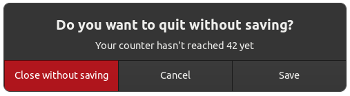
The alert example in the Relm4 repository implements a simple app for the alert component that we will write in this chapter. It's an other variant of a counter app, yet this time a dialog will be displayed if the counter does not match 42 when closing. The main difference in the implementation is, that the dialog is implemented as component that can be reused in other applications.
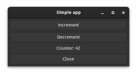
This is how the dialog looks like in the alert example:
If you want to see an alert component very similar to the one we will write in this chapter, have a look at the “alert” example. Run
cargo run --example alertfrom the relm4-components/examples directory if you want to see the code in action.
The alert component
The alert component is defined similar to the other components we've implemented in this book.
Our model stores whether the component is visible and the configuration.
/// Alert dialog component.
pub struct Alert {
    settings: AlertSettings,
    is_active: bool,
}
We define a Widgets, Init, Input and Output type as usual.
    type Widgets = AlertWidgets;
    type Init = AlertSettings;
    type Input = AlertMsg;
    type Output = AlertResponse;
The Init param is a settings object that is used to configure the component.
This maximizes the reusability of the component by letting it adapt to different use-cases.
/// Configuration for the alert dialog component
pub struct AlertSettings {
    /// Large text
    pub text: String,
    /// Optional secondary, smaller text
    pub secondary_text: Option<String>,
    /// Modal dialogs freeze other windows as long they are visible
    pub is_modal: bool,
    /// Sets color of the accept button to red if the theme supports it
    pub destructive_accept: bool,
    /// Text for confirm button
    pub confirm_label: String,
    /// Text for cancel button
    pub cancel_label: String,
    /// Text for third option button. If [`None`] the third button won't be created.
    pub option_label: Option<String>,
}
In the Input type, this component uses #[doc(hidden)] on the Response variant. This is a useful pattern for component-internal messages that are not intended to be sent by outside callers. This allows us to update the component when the underlying dialog reports a response, but not display the Response variant in the component's documentation.
/// Messages that can be sent to the alert dialog component
#[derive(Debug)]
pub enum AlertMsg {
    /// Message sent by the parent to view the dialog
    Show,

    #[doc(hidden)]
    Response(gtk::ResponseType),
}
The Output type allows us to report the user's response back to a parent component.
/// User action performed on the alert dialog.
#[derive(Debug)]
pub enum AlertResponse {
    /// User clicked confirm button.
    Confirm,

    /// User clicked cancel button.
    Cancel,

    /// User clicked user-supplied option.
    Option,
}
The update function handles the Show message from our parent component and the Response messages generated by user interactions. It also sends the appropriate messages to the parent through the output sender.
    fn update(&mut self, input: AlertMsg, sender: ComponentSender<Self>) {
        match input {
            AlertMsg::Show => {
                self.is_active = true;
            }
            AlertMsg::Response(ty) => {
                self.is_active = false;
                sender
                    .output(match ty {
                        gtk::ResponseType::Accept => AlertResponse::Confirm,
                        gtk::ResponseType::Other(_) => AlertResponse::Option,
                        _ => AlertResponse::Cancel,
                    })
                    .unwrap();
            }
        }
    }
When initializing the model, we conditionally set up some widgets based on the settings passed by the caller. We set is_active to false since the dialog is not currently displayed.
    fn init(
        settings: AlertSettings,
        root: Self::Root,
        sender: ComponentSender<Self>,
    ) -> ComponentParts<Self> {
        let model = Alert {
            settings,
            is_active: false,
        };

        let widgets = view_output!();

        if let Some(option_label) = &model.settings.option_label {
            widgets
                .dialog
                .add_button(option_label, gtk::ResponseType::Other(0));
        }

        if model.settings.destructive_accept {
            let accept_widget = widgets
                .dialog
                .widget_for_response(gtk::ResponseType::Accept)
                .expect("No button for accept response set");
            accept_widget.add_css_class("destructive-action");
        }

        ComponentParts { model, widgets }
    }
Lastly, the view. Note that the component connects to the response
signal of the underlying dialog and sends an input to itself when a response is received.
    view! {
        #[name = "dialog"]
        gtk::MessageDialog {
            set_message_type: gtk::MessageType::Question,
            #[watch]
            set_visible: model.is_active,
            connect_response[sender] => move |_, response| {
                sender.input(AlertMsg::Response(response));
            },

            // Apply configuration
            set_text: Some(&model.settings.text),
            set_secondary_text: model.settings.secondary_text.as_deref(),
            set_modal: model.settings.is_modal,
            add_button: (&model.settings.confirm_label, gtk::ResponseType::Accept),
            add_button: (&model.settings.cancel_label, gtk::ResponseType::Cancel),
        }
    }
Usage
With the component complete, let's use it!
struct App {
    counter: u8,
    alert_toggle: bool,
    dialog: Controller<Alert>,
    second_dialog: Controller<Alert>,
}
#[derive(Debug)]
enum AppMsg {
Increment,
Decrement,
CloseRequest,
Save,
Close,
Ignore,
}
#[relm4::component]
impl SimpleComponent for App {
type Input = AppMsg;
type Output = ();
type Init = ();
view! {
main_window = gtk::ApplicationWindow {
set_title: Some("Simple app"),
set_default_width: 300,
set_default_height: 100,
connect_close_request[sender] => move |_| {
sender.input(AppMsg::CloseRequest);
gtk::glib::Propagation::Stop
},
gtk::Box {
set_orientation: gtk::Orientation::Vertical,
set_margin_all: 5,
set_spacing: 5,
append = >k::Button {
set_label: "Increment",
connect_clicked[sender] => move |_| {
sender.input(AppMsg::Increment);
},
},
append = >k::Button {
set_label: "Decrement",
connect_clicked[sender] => move |_| {
sender.input(AppMsg::Decrement);
},
},
append = >k::Label {
set_margin_all: 5,
#[watch]
set_label: &format!("Counter: {}", model.counter),
},
append = >k::Button {
set_label: "Close",
connect_clicked[sender] => move |_| {
sender.input(AppMsg::CloseRequest);
},
},
},
}
}
fn update(&mut self, msg: AppMsg, _sender: ComponentSender<Self>) {
match msg {
AppMsg::Increment => {
self.counter = self.counter.wrapping_add(1);
}
AppMsg::Decrement => {
self.counter = self.counter.wrapping_sub(1);
}
AppMsg::CloseRequest => {
if self.counter == 42 {
relm4::main_application().quit();
} else {
self.alert_toggle = !self.alert_toggle;
if self.alert_toggle {
self.dialog.emit(AlertMsg::Show);
} else {
self.second_dialog.emit(AlertMsg::Show);
}
}
}
AppMsg::Save => {
println!("* Open save dialog here *");
}
AppMsg::Close => {
relm4::main_application().quit();
}
AppMsg::Ignore => (),
}
}
    fn init(_: (), root: Self::Root, sender: ComponentSender<Self>) -> ComponentParts<Self> {
        let model = App {
            counter: 0,
            alert_toggle: false,
            dialog: Alert::builder()
                .transient_for(&root)
                .launch(AlertSettings {
                    text: String::from("Do you want to quit without saving? (First alert)"),
                    secondary_text: Some(String::from("Your counter hasn't reached 42 yet")),
                    confirm_label: String::from("Close without saving"),
                    cancel_label: String::from("Cancel"),
                    option_label: Some(String::from("Save")),
                    is_modal: true,
                    destructive_accept: true,
                })
                .forward(sender.input_sender(), convert_alert_response),
            second_dialog: Alert::builder()
                .transient_for(&root)
                .launch(AlertSettings {
                    text: String::from("Do you want to quit without saving? (Second alert)"),
                    secondary_text: Some(String::from("Your counter hasn't reached 42 yet")),
                    confirm_label: String::from("Close without saving"),
                    cancel_label: String::from("Cancel"),
                    option_label: Some(String::from("Save")),
                    is_modal: true,
                    destructive_accept: true,
                })
                .forward(sender.input_sender(), convert_alert_response),
        };

        let widgets = view_output!();

        ComponentParts { model, widgets }
    }
}
fn convert_alert_response(response: AlertResponse) -> AppMsg {
match response {
AlertResponse::Confirm => AppMsg::Close,
AlertResponse::Cancel => AppMsg::Ignore,
AlertResponse::Option => AppMsg::Save,
}
}
fn main() {
let app = RelmApp::new("relm4.example.alert");
app.run::<App>(());
}This is mostly stuff that we've already done in previous chapters, but there are a few additional things to know about interacting with child components.
Notably, we need to wrap the types of the child components in Controllers to be able to store them in the App model.
struct App {
counter: u8,
alert_toggle: bool,
dialog: Controller<Alert>,
second_dialog: Controller<Alert>,
}We initialize them with the builder pattern in the init method.
fn init(_: (), root: Self::Root, sender: ComponentSender<Self>) -> ComponentParts<Self> {
let model = App {
counter: 0,
alert_toggle: false,
dialog: Alert::builder()
.transient_for(&root)
.launch(AlertSettings {
text: String::from("Do you want to quit without saving? (First alert)"),
secondary_text: Some(String::from("Your counter hasn't reached 42 yet")),
confirm_label: String::from("Close without saving"),
cancel_label: String::from("Cancel"),
option_label: Some(String::from("Save")),
is_modal: true,
destructive_accept: true,
})
.forward(sender.input_sender(), convert_alert_response),
second_dialog: Alert::builder()
.transient_for(&root)
.launch(AlertSettings {
text: String::from("Do you want to quit without saving? (Second alert)"),
secondary_text: Some(String::from("Your counter hasn't reached 42 yet")),
confirm_label: String::from("Close without saving"),
cancel_label: String::from("Cancel"),
option_label: Some(String::from("Save")),
is_modal: true,
destructive_accept: true,
})
.forward(sender.input_sender(), convert_alert_response),
};
let widgets = view_output!();
ComponentParts { model, widgets }
}We call transient_for(root) on the builder to indicate to GTK that our root widget is transient for the main application window. This allows window managers to handle the dialog window differently, e.g. by drawing it on top of other windows.
See the set_transient_for documentation for more information.
            AppMsg::CloseRequest => {
                if self.counter == 42 {
                    relm4::main_application().quit();
                } else {
                    self.alert_toggle = !self.alert_toggle;
                    if self.alert_toggle {
                        self.dialog.emit(AlertMsg::Show);
                    } else {
                        self.second_dialog.emit(AlertMsg::Show);
                    }
                }
            }
That's it! You can find more examples of reusable components in the relm4-components crate here. You can also contribute your own reusable components to relm4-components :)
The complete code
Let’s review all our code in one piece one more time to see how all these parts work together:
use gtk::prelude::*;
use relm4::prelude::*;
use relm4::Controller;
/// Configuration for the alert dialog component
pub struct AlertSettings {
/// Large text
pub text: String,
/// Optional secondary, smaller text
pub secondary_text: Option<String>,
/// Modal dialogs freeze other windows as long they are visible
pub is_modal: bool,
/// Sets color of the accept button to red if the theme supports it
pub destructive_accept: bool,
/// Text for confirm button
pub confirm_label: String,
/// Text for cancel button
pub cancel_label: String,
/// Text for third option button. If [`None`] the third button won't be created.
pub option_label: Option<String>,
}
/// Alert dialog component.
pub struct Alert {
settings: AlertSettings,
is_active: bool,
}
/// Messages that can be sent to the alert dialog component
#[derive(Debug)]
pub enum AlertMsg {
/// Message sent by the parent to view the dialog
Show,
#[doc(hidden)]
Response(gtk::ResponseType),
}
/// User action performed on the alert dialog.
#[derive(Debug)]
pub enum AlertResponse {
/// User clicked confirm button.
Confirm,
/// User clicked cancel button.
Cancel,
/// User clicked user-supplied option.
Option,
}
/// Widgets of the alert dialog component.
#[relm4::component(pub)]
impl SimpleComponent for Alert {
type Widgets = AlertWidgets;
type Init = AlertSettings;
type Input = AlertMsg;
type Output = AlertResponse;
view! {
#[name = "dialog"]
gtk::MessageDialog {
set_message_type: gtk::MessageType::Question,
#[watch]
set_visible: model.is_active,
connect_response[sender] => move |_, response| {
sender.input(AlertMsg::Response(response));
},
// Apply configuration
set_text: Some(&model.settings.text),
set_secondary_text: model.settings.secondary_text.as_deref(),
set_modal: model.settings.is_modal,
add_button: (&model.settings.confirm_label, gtk::ResponseType::Accept),
add_button: (&model.settings.cancel_label, gtk::ResponseType::Cancel),
}
}
fn init(
settings: AlertSettings,
root: Self::Root,
sender: ComponentSender<Self>,
) -> ComponentParts<Self> {
let model = Alert {
settings,
is_active: false,
};
let widgets = view_output!();
if let Some(option_label) = &model.settings.option_label {
widgets
.dialog
.add_button(option_label, gtk::ResponseType::Other(0));
}
if model.settings.destructive_accept {
let accept_widget = widgets
.dialog
.widget_for_response(gtk::ResponseType::Accept)
.expect("No button for accept response set");
accept_widget.add_css_class("destructive-action");
}
ComponentParts { model, widgets }
}
fn update(&mut self, input: AlertMsg, sender: ComponentSender<Self>) {
match input {
AlertMsg::Show => {
self.is_active = true;
}
AlertMsg::Response(ty) => {
self.is_active = false;
sender
.output(match ty {
gtk::ResponseType::Accept => AlertResponse::Confirm,
gtk::ResponseType::Other(_) => AlertResponse::Option,
_ => AlertResponse::Cancel,
})
.unwrap();
}
}
}
}
struct App {
counter: u8,
alert_toggle: bool,
dialog: Controller<Alert>,
second_dialog: Controller<Alert>,
}
#[derive(Debug)]
enum AppMsg {
Increment,
Decrement,
CloseRequest,
Save,
Close,
Ignore,
}
#[relm4::component]
impl SimpleComponent for App {
type Input = AppMsg;
type Output = ();
type Init = ();
view! {
main_window = gtk::ApplicationWindow {
set_title: Some("Simple app"),
set_default_width: 300,
set_default_height: 100,
connect_close_request[sender] => move |_| {
sender.input(AppMsg::CloseRequest);
gtk::glib::Propagation::Stop
},
gtk::Box {
set_orientation: gtk::Orientation::Vertical,
set_margin_all: 5,
set_spacing: 5,
append = >k::Button {
set_label: "Increment",
connect_clicked[sender] => move |_| {
sender.input(AppMsg::Increment);
},
},
append = >k::Button {
set_label: "Decrement",
connect_clicked[sender] => move |_| {
sender.input(AppMsg::Decrement);
},
},
append = >k::Label {
set_margin_all: 5,
#[watch]
set_label: &format!("Counter: {}", model.counter),
},
append = >k::Button {
set_label: "Close",
connect_clicked[sender] => move |_| {
sender.input(AppMsg::CloseRequest);
},
},
},
}
}
fn update(&mut self, msg: AppMsg, _sender: ComponentSender<Self>) {
match msg {
AppMsg::Increment => {
self.counter = self.counter.wrapping_add(1);
}
AppMsg::Decrement => {
self.counter = self.counter.wrapping_sub(1);
}
AppMsg::CloseRequest => {
if self.counter == 42 {
relm4::main_application().quit();
} else {
self.alert_toggle = !self.alert_toggle;
if self.alert_toggle {
self.dialog.emit(AlertMsg::Show);
} else {
self.second_dialog.emit(AlertMsg::Show);
}
}
}
AppMsg::Save => {
println!("* Open save dialog here *");
}
AppMsg::Close => {
relm4::main_application().quit();
}
AppMsg::Ignore => (),
}
}
fn init(_: (), root: Self::Root, sender: ComponentSender<Self>) -> ComponentParts<Self> {
let model = App {
counter: 0,
alert_toggle: false,
dialog: Alert::builder()
.transient_for(&root)
.launch(AlertSettings {
text: String::from("Do you want to quit without saving? (First alert)"),
secondary_text: Some(String::from("Your counter hasn't reached 42 yet")),
confirm_label: String::from("Close without saving"),
cancel_label: String::from("Cancel"),
option_label: Some(String::from("Save")),
is_modal: true,
destructive_accept: true,
})
.forward(sender.input_sender(), convert_alert_response),
second_dialog: Alert::builder()
.transient_for(&root)
.launch(AlertSettings {
text: String::from("Do you want to quit without saving? (Second alert)"),
secondary_text: Some(String::from("Your counter hasn't reached 42 yet")),
confirm_label: String::from("Close without saving"),
cancel_label: String::from("Cancel"),
option_label: Some(String::from("Save")),
is_modal: true,
destructive_accept: true,
})
.forward(sender.input_sender(), convert_alert_response),
};
let widgets = view_output!();
ComponentParts { model, widgets }
}
}
fn convert_alert_response(response: AlertResponse) -> AppMsg {
match response {
AlertResponse::Confirm => AppMsg::Close,
AlertResponse::Cancel => AppMsg::Ignore,
AlertResponse::Option => AppMsg::Save,
}
}
fn main() {
let app = RelmApp::new("relm4.example.alert");
app.run::<App>(());
}